import numpy as np
import polars as pl

from funs import *
from plotnine import *
from polars import col as c
theme_set(theme_minimal())

page_citation = pl.read_csv("data/wiki_uk_citations.csv")
page_cocitation = pl.read_csv("data/wiki_uk_cocitations.csv")18 Network Data
18.1 Setup
Load all of the modules and datasets needed for the chapter.
18.2 Introduction
A network consists of a set of objects and a collection of links identifying relationships between pairs of these objects [1]. Networks form a very generic data model with extensive applications across the humanities and social sciences [2]. They can be a powerful way to understand connections and relationships between a wide range of entities. For example, one might want to explore friendship relationships between people, citations between books, or connections between computers. Whenever there exists a set of relationships that connects objects to each other, a network can be a useful tool for visualization and data exploration.
A critical step in interpreting network data is deciding exactly what elements correspond to the nodes (the objects) and the edges (links between the nodes). For example, consider a study of citations. A node might be an author and an edge may connect two authors when one cites the other. The SignsAt40 project is a great example: they examine 40 years of feminist scholarship through network and text analysis, including co-citation networks. Being very clear about how nodes and edges are defined is key to exploring networks.
In this chapter, we start by working with network data taken from Wikipedia using the same set of pages we saw in the previous chapter. Wikipedia pages contain many internal links between pages; we collected information about each time one of the pages in our dataset provided a link to another page in our collection. Only links within the main body of the text were used.
The DSNetwork.process function is a helper that takes an edge list and returns node and edge DataFrames suitable for visualization, along with network metrics. We will use it throughout this chapter.
18.3 Creating a Network Object
We can describe a network structure with a tabular dataset. Specifically, we can create a dataset with one row for each edge in the network. This dataset needs one column giving an identifier for the starting node of the edge and another column giving the ending node. The set of links between the Wikipedia pages is read into Python and displayed by the following block of code. Notice that we are using the same values in the doc_id column that were used as unique identifiers for each page text in Chapter 19.
page_citation
shape: (377, 2)
| doc_id | doc_id2 |
|---|---|
| str | str |
| "Marie de France" | "Geoffrey Chaucer" |
| "Geoffrey Chaucer" | "William Langland" |
| "Geoffrey Chaucer" | "John Gower" |
| "Geoffrey Chaucer" | "John Dryden" |
| "Geoffrey Chaucer" | "Philip Sidney" |
| … | … |
| "Rex Warner" | "Stephen Spender" |
| "Seamus Heaney" | "W. B. Yeats" |
| "Seamus Heaney" | "George Bernard Shaw" |
| "Seamus Heaney" | "Samuel Beckett" |
| "Seamus Heaney" | "Mary Robinson" |
Looking at the first few rows, we see that Marie de France has only one link (to Geoffrey Chaucer). Chaucer, on the other hand, has links to six other authors. As a starting way to analyze the data, we can see how many pages link into each author’s page. Arranging the data by the count will give a quick understanding of how central each author’s page is to the other authors.
(
    page_citation
    .group_by(c.doc_id2)
    .agg(count = pl.len())
    .sort(c.count, descending=True)
)
shape: (64, 2)
| doc_id2 | count |
|---|---|
| str | u32 |
| "William Shakespeare" | 25 |
| "William Wordsworth" | 23 |
| "T. S. Eliot" | 19 |
| "W. H. Auden" | 13 |
| "John Dryden" | 12 |
| … | … |
| "Samuel Pepys" | 1 |
| "Rex Warner" | 1 |
| "Beatrix Potter" | 1 |
| "George Herbert" | 1 |
| "Christina Rossetti" | 1 |
By summarizing links into each page rather than out of each page, we avoid a direct bias towards focusing on longer author pages.
Looking at the counts, we see that there are more links into the Shakespeare page than any other in our collection. While that is perhaps not surprising, it is interesting to see that Wordsworth is only two links short of Shakespeare, with 23 links. While raw counts are a useful starting point, they can only get us so far. These say nothing, for example, about how easily we can hop between two pages by following 2, 3, or 4 links. In order to understand the dataset we need a way of visualizing and modelling all of the connections at once. This requires considering the entire network structure of our dataset.
Before we create a network structure from a dataset, we need to decide on what kind of network we will create. Specifically, networks can be either directed, in which case we distinguish between the starting and ending vertex, or undirected, in which we do not. For example, in our counts above, we took the direction into account for the links. Next, let’s start by treating our dataset of Wikipedia page links as undirected; all we want to consider is whether there is at least one way to click on a link and go between the two pages. Later in the chapter, we will show what changes when we add direction into the data. Any directed network can be considered undirected by ignoring the direction; undirected networks cannot in general be converted into a directed format. So, it will be a good starting point to consider approaches that can be applied to any network dataset.
The dataset that we have in Python is called an edge list [3]. It consists of a dataset where each observation is an edge. We can use the igraph library to create network objects and compute various network metrics [4]. Let’s create our network using our wrapper method DSNetwork.process.
node, edge, G = DSNetwork.process(page_citation, directed=False)
node
shape: (72, 10)
| id | x | y | component | component_size | cluster | degree | eigen | between | close |
|---|---|---|---|---|---|---|---|---|---|
| str | f64 | f64 | i64 | i64 | str | i64 | f64 | f64 | f64 |
| "Marie de France" | -3.55016 | -4.39342 | 1 | 72 | "0" | 1 | 0.024402 | 0.0 | 0.324201 |
| "Geoffrey Chaucer" | -1.340645 | -1.751455 | 1 | 72 | "1" | 16 | 0.409418 | 147.136045 | 0.47651 |
| "William Langland" | -3.440257 | -1.503452 | 1 | 72 | "1" | 3 | 0.062166 | 4.723756 | 0.375661 |
| "John Gower" | -2.274343 | -2.621029 | 1 | 72 | "1" | 5 | 0.11872 | 7.74378 | 0.408046 |
| "John Dryden" | 1.006255 | -1.026776 | 1 | 72 | "1" | 25 | 0.730764 | 197.454422 | 0.5546875 |
| … | … | … | … | … | … | … | … | … | … |
| "Cecil Day-Lewis" | -2.500999 | 2.30231 | 1 | 72 | "6" | 11 | 0.209379 | 20.181833 | 0.415205 |
| "Christopher Isherwood" | -3.403174 | 2.131408 | 1 | 72 | "6" | 9 | 0.149254 | 0.893551 | 0.364103 |
| "Louis MacNeice" | -2.372964 | 0.929166 | 1 | 72 | "6" | 12 | 0.259567 | 26.553664 | 0.435583 |
| "Rex Warner" | -3.278381 | 3.411476 | 1 | 72 | "6" | 4 | 0.072261 | 0.0 | 0.356784 |
| "Edward Upward" | -3.76382 | 2.790534 | 1 | 72 | "6" | 6 | 0.094188 | 0.0 | 0.358586 |
The node dataset contains extracted information about each of the objects in our collection. We will describe each of these throughout the remainder of this chapter. Note that we also have metadata about the nodes, which is something that we can join into the data to help deepen our understanding of subsequent analyses.
The first column gives a label for the row. In the next two columns, named x and y, is a computed way to layout the objects in two-dimensions that maximizes linked pages being close to one another while minimizing the amount that all of the nodes are bunched together [5]. This is an example of a network drawing (also known as graph drawing in mathematics) algorithm. As with the PCA and UMAP dimensions in Chapter 19, there is no exact meaning of the individual variables. Rather, its the relationships that they show that are interesting. Using the first three variables, we could plot the pages as a scatter plot with labels to see what pages appear to be closely related to one another.
Before actually looking at this plot, it will be useful to first make some additions. The relationships that would be shown in this plot generally try to put pages that have links between them close to one another. It would be helpful to additionally put these links onto the plot as well. This is where the edge dataset becomes useful. The edge dataset contains one row for each edge in the dataset. The dataset has four columns. These describe the x and y values of one node in the edge and variables xend and yend to indicate where in the scatter plot the ending point of the edge is.
edge
shape: (377, 4)
| x | y | xend | yend |
|---|---|---|---|
| f64 | f64 | f64 | f64 |
| -3.55016 | -4.39342 | -1.340645 | -1.751455 |
| -1.340645 | -1.751455 | -3.440257 | -1.503452 |
| -1.340645 | -1.751455 | -2.274343 | -2.621029 |
| -1.340645 | -1.751455 | 1.006255 | -1.026776 |
| -1.340645 | -1.751455 | -0.401516 | -3.13306 |
| … | … | … | … |
| -2.449875 | 1.87291 | -3.278381 | 3.411476 |
| -1.036394 | -0.16203 | -2.959843 | 0.941084 |
| -1.817824 | 0.140807 | -2.959843 | 0.941084 |
| -3.965985 | 0.457462 | -2.959843 | 0.941084 |
| -0.494419 | 1.582791 | -2.959843 | 0.941084 |
We can include edges into the plot by adding a geom layer of type geom_segment. This geometry takes four aesthetics, named exactly the same as the names in the edge dataset. The plot gets busy with all of these lines, so we will set the opacity (alpha) of them lower so as to not clutter the visual space with the connections.
(
    node
    .pipe(ggplot, aes("x", "y"))
    + geom_segment(
        aes(x="x", y="y", xend="xend", yend="yend"),
        data=edge,
        alpha=0.1
    )
    + geom_point(alpha=0.5)
    + geom_text(aes(label="id"), size=6)
    + theme_void()
    + labs(title="Wikipedia Page Link Network")
)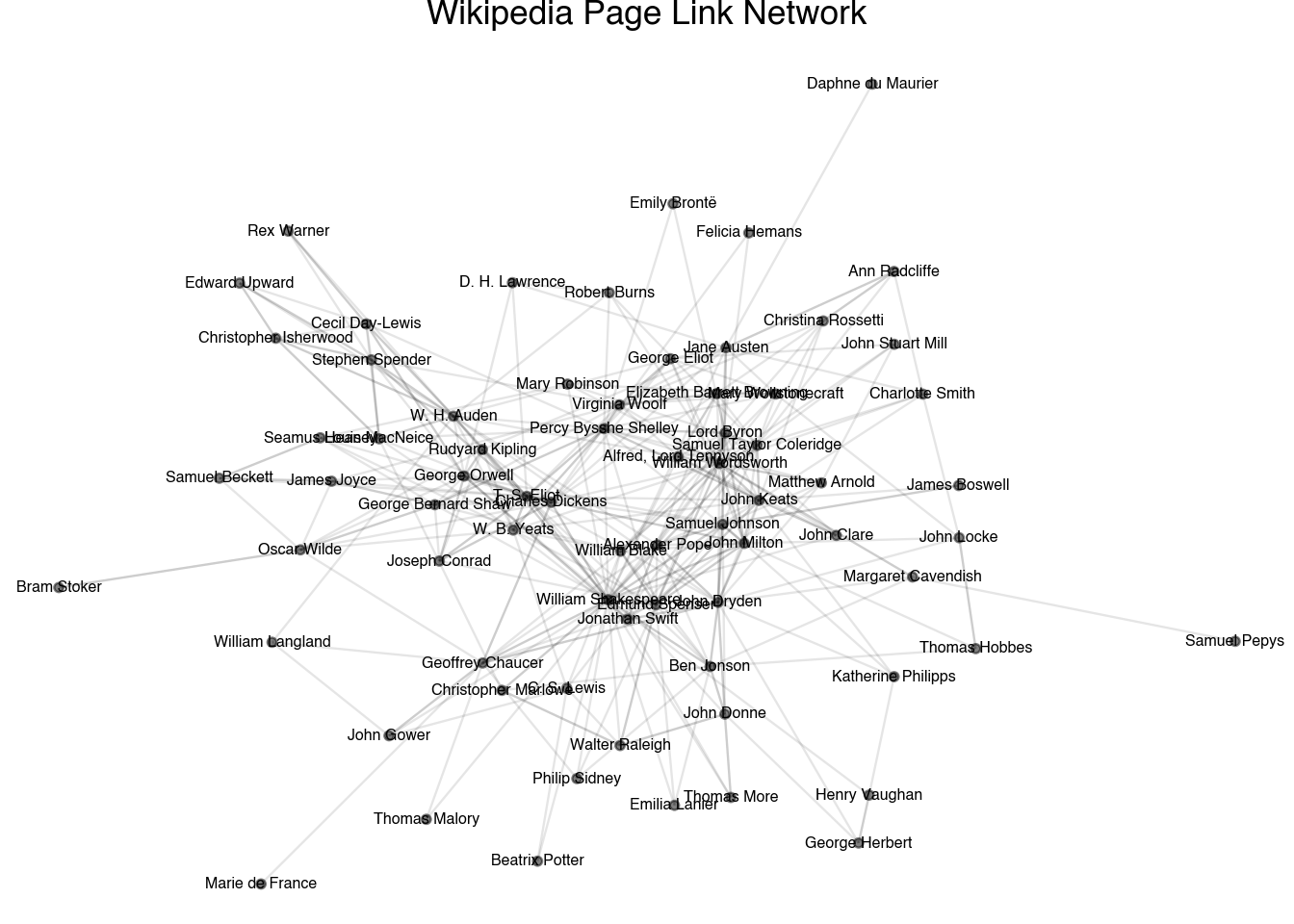
The output of the plot shows the underlying data that describes the plot as well as the relationships between the pages. Notice that the relationship between the pages is quite different than the textual-based ones in the previous chapter. When using textual distances, we saw a clustering based on the time period in which each author wrote and the formats that they wrote in. Here, the pattern is driven much more strongly by the general popularity of each author. The most well-known authors of each era—Shakespeare, Chaucer, Jonathan Swift—are clustered in the middle of the plot. Lesser known authors, such as Daphne du Maurier and Samuel Pepys, are pushed to the exterior. In the next section, we will see if we can more formally study the centrality of different pages in our collection.
18.4 Centrality
One of the core questions that arises when working with network data is trying to identify the relative centrality of each node in the network. Several of the derived measurements in the node dataset capture various forms of centrality. Let’s move through each of these measurements to see how they reveal different aspects of our network’s centrality.
A component of a network is a collection of all the nodes that can be reached by following along the edges. The node dataset contains a variable called component describing each of the components in the network. These are ordered in descending order of size, so component 1 will always be the largest (or at least, tied for the largest) component of the network. The total size of each component is the first measurement of the centrality of a node. Those nodes that are in the largest component can, in some sense, be said to have a larger centrality than other nodes that are completely cut-off from this cluster. All of the nodes on our network are contained in one large cluster, so this measurement is not particularly helpful in this specific case. Networks that have a single component are known as connected networks. All of the other metrics for centrality are defined in terms of a connected network. In order to apply them to networks with multiple components, each algorithm is applied separately to each component.
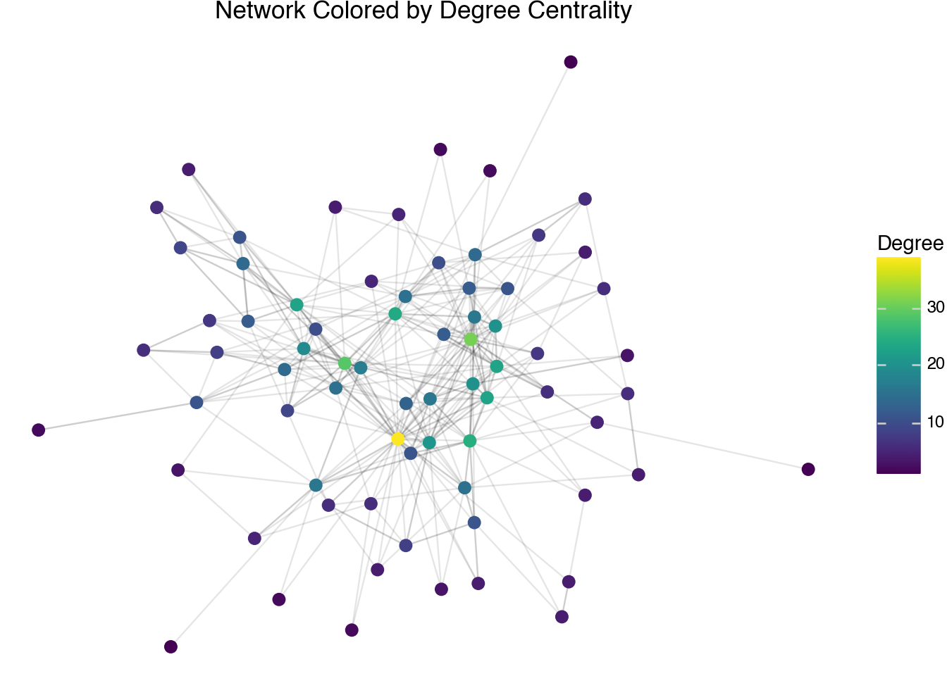
Another measurement of centrality is a node’s degree. The degree of a node is the number of neighbors it has. In other words, it counts how many edges the node is a part of. The degree of each node has been computed in the node table. This is similar to the counts that were produced in the first section by counting occurrences in the raw edge list. The difference here is that we are counting all edges, not just those edges going into a node. As a visualization technique, we can plot the degree centrality scores on a plot of the network to show that the nodes with the highest degree do seem to sit in the middle of the plot and correspond to having a large number of edges.
(
    node
    .pipe(ggplot, aes("x", "y"))
    + geom_segment(
        aes(x="x", y="y", xend="xend", yend="yend"),
        data=edge,
        alpha=0.1
    )
    + geom_point(aes(color="degree"), size=3)
    + scale_color_cmap(cmap_name="viridis")
    + theme_void()
    + labs(
        title="Network Colored by Degree Centrality",
        color="Degree"
    )
)
The degree of a node only accounts for direct neighbors. A more holistic measurement is given by a quantity called the eigenvalue centrality. This metric is provided in the node table. It provides a centrality score for each node that is proportional to the sum of the scores of its neighbors. Mathematically, it assigns a set of scores \(s_j\) for each node such that:
\[ s_j = \lambda \cdot \sum_{i \in \text{Neighbors}(j)} s_i \]
The eigenvalue score, by convention, scales so that the largest score is 1. It is only possible to describe the eigenvalue centrality scores for a connected set of nodes on a network, so the computation is done individually for each component. For comparison, we will use the following code to plot the eigenvalue centrality scores of our network.
(
    node
    .pipe(ggplot, aes("x", "y"))
    + geom_segment(
        aes(x="x", y="y", xend="xend", yend="yend"),
        data=edge,
        alpha=0.1
    )
    + geom_point(aes(color="eigen"), size=3)
    + scale_color_cmap(cmap_name="viridis")
    + theme_void()
    + labs(
        title="Network Colored by Eigenvalue Centrality",
        color="Eigenvalue\nCentrality"
    )
)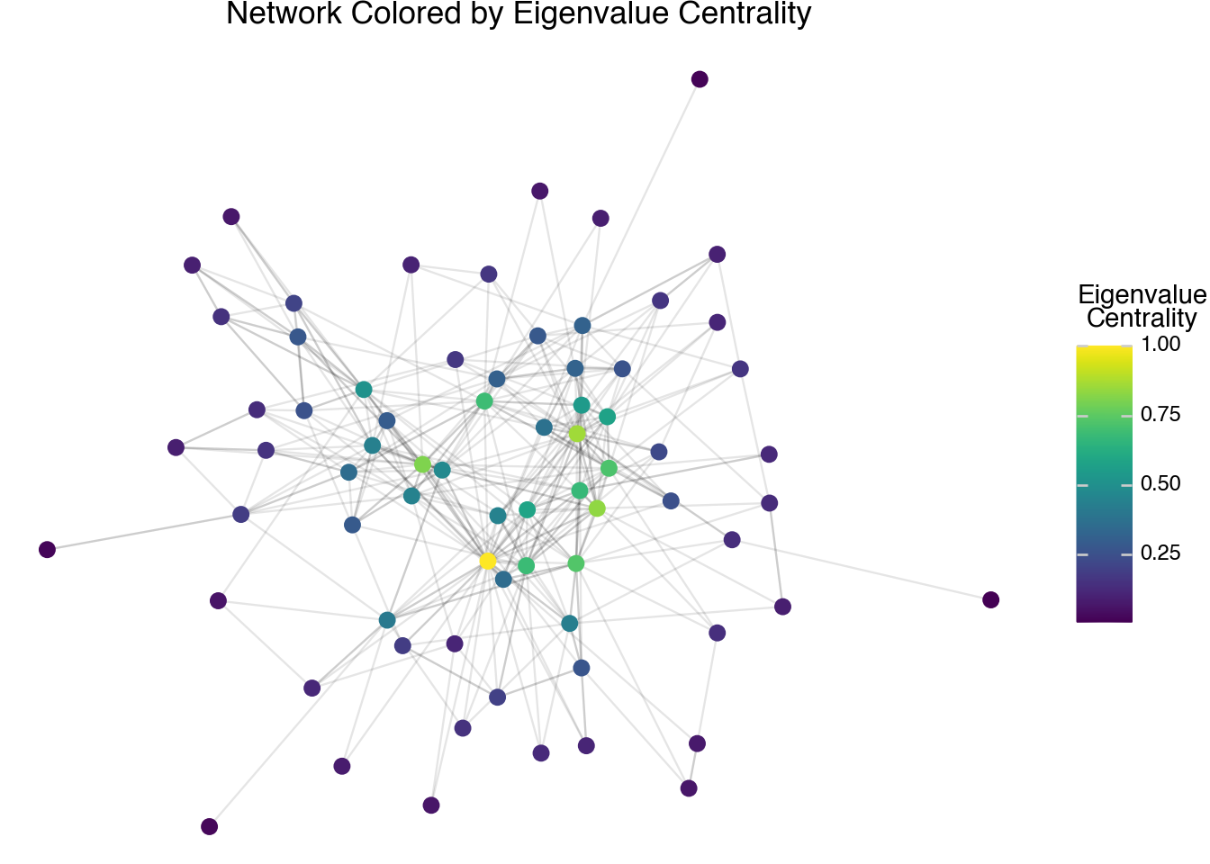
The visualization shows a slightly different pattern compared to the degree centrality scores. The biggest difference is that the eigenvalue centrality is more concentrated on the most central connections, whereas degree centrality is more spread out. We will see in the next few sections that this is primarily a result of using a linear scale to plot the colors. If we transform the eigenvalue centrality scores with another function first, we would see that the pattern more gradually shows differences across the entire network.
Another measurement of centrality is given by the closeness centrality score. For each node in the network, consider the minimum number of edges that are needed to go from this node to any other node within its component. Adding the reciprocal of these scores together gives a measurement of how close a node is to all of the other nodes in the network. The closeness centrality score for a node is given as the variable close in our node table. Again, we will plot these scores with the following code to compare to the other types of centrality scores.
(
    node
    .filter(c.component == 1)
    .pipe(ggplot, aes("x", "y"))
    + geom_segment(
        aes(x="x", y="y", xend="xend", yend="yend"),
        data=edge,
        alpha=0.1
    )
    + geom_point(aes(color="close"), size=3)
    + scale_color_cmap(cmap_name="viridis")
    + theme_void()
    + labs(
        title="Network Colored by Closeness Centrality",
        color="Closeness\nCentrality"
    )
)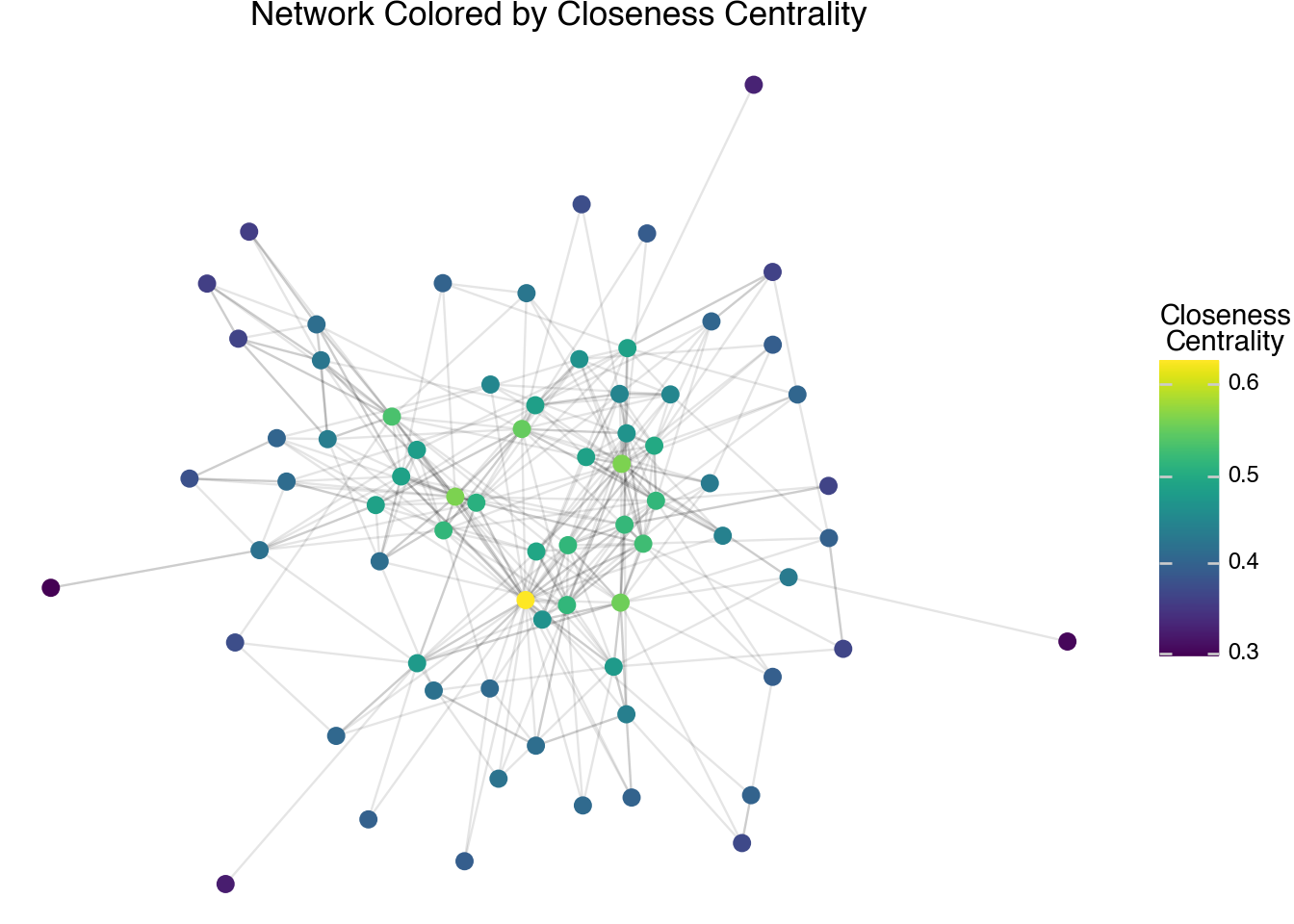
The output of the closeness centrality scores shows different patterns than the eigenvalue centrality scores. Here we see a much smoother transition from the most central to the least central nodes. We will look at different kinds of networks later in the chapter that illustrate further differences between each type of centrality score.
The final measurement of centrality we have in our table, betweenness centrality, also comes from considering minimal paths. For every two nodes in a connected component, consider all of the possible ways to go from one to the other along edges in the network. Then, consider all of the paths (there may be only one) between the two nodes that require a minimal number of hops. The betweenness centrality score measures how many of these minimal paths go through each node (there is some normalization to account for the case when there are many minimal paths, so the counts are not exact integers). This score is stored in the variable between. A plot of the betweenness score is given by the following code.
(
    node
    .pipe(ggplot, aes("x", "y"))
    + geom_segment(
        aes(x="x", y="y", xend="xend", yend="yend"),
        data=edge,
        alpha=0.1
    )
    + geom_point(aes(color="between"), size=3)
    + scale_color_cmap(cmap_name="viridis")
    + theme_void()
    + labs(
        title="Network Colored by Betweenness Centrality",
        color="Betweenness\nCentrality"
    )
)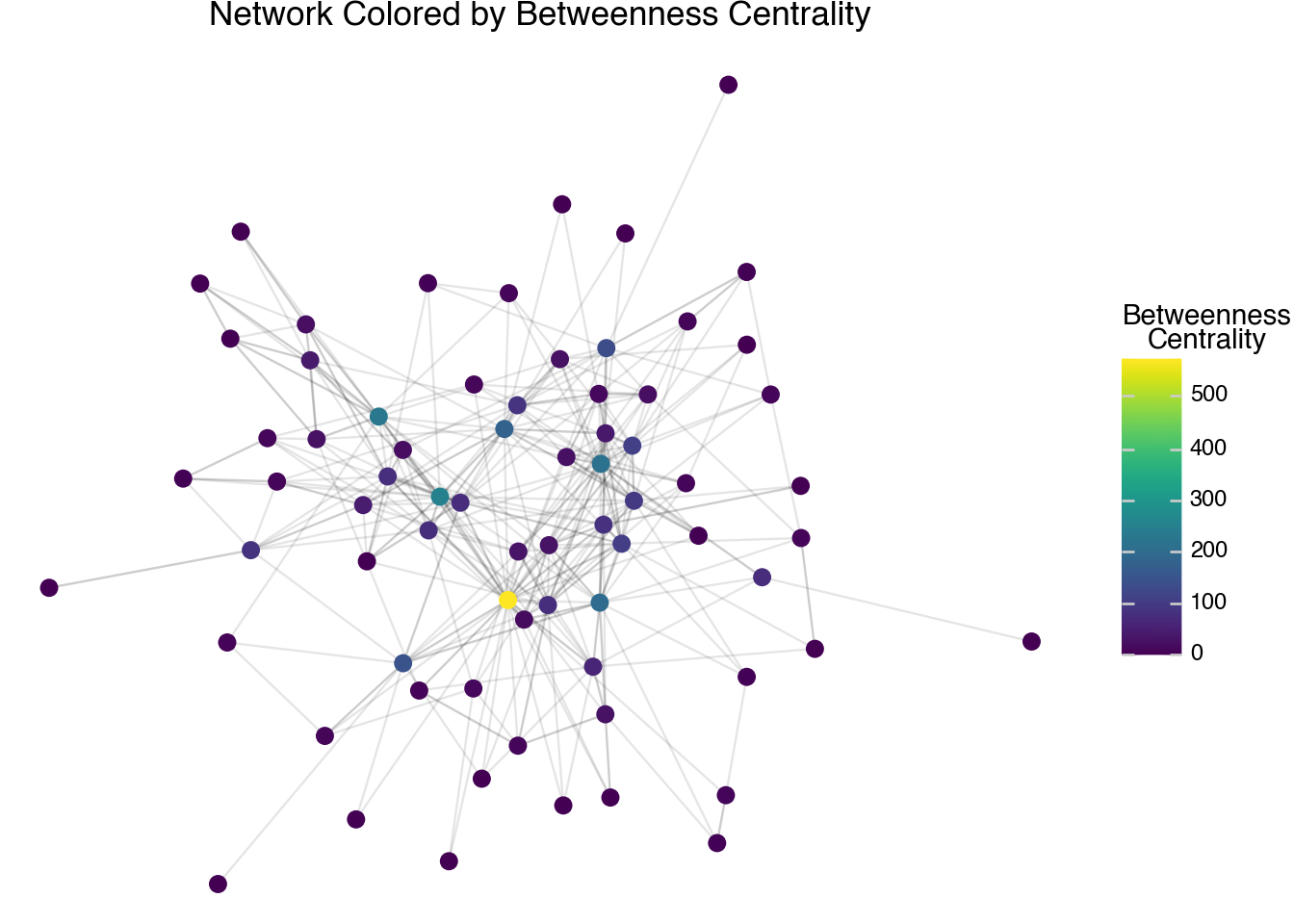
The betweenness score often tends to have a different pattern than the other centrality scores. It gives a high score to bridges between different parts of the network, rather than giving high weight to how central a node is within a particular cluster. One challenge with the page link network over this small set of pages is that we need to create a different kind of network in order to really see the differences between the betweenness centrality and the other types of centrality that we’ve discussed so far. To better understand the centrality scores, we will delve further into another set of networks such as co-citation and nearest neighbor networks.
18.5 Clusters
The centrality of a node is not the only thing that we can measure when looking at networks. Another algorithm that we can perform is that of clustering. Here, we try to split the nodes into groups such that a large number of the edges are between nodes within a group rather than across groups. When we created our network, a clustering of the nodes based on the edges was automatically performed. The identifiers for the clusters are in the column called cluster. We can visualize the clusters defined on our Wikipedia-page network using the following code.
(
    node
    .pipe(ggplot, aes("x", "y"))
    + geom_segment(
        aes(x="x", y="y", xend="xend", yend="yend"),
        data=edge,
        alpha=0.1
    )
    + geom_point(aes(color="cluster"), size=3)
    + theme_void()
    + labs(
        title="Network Colored by Cluster",
        color="Cluster"
    )
)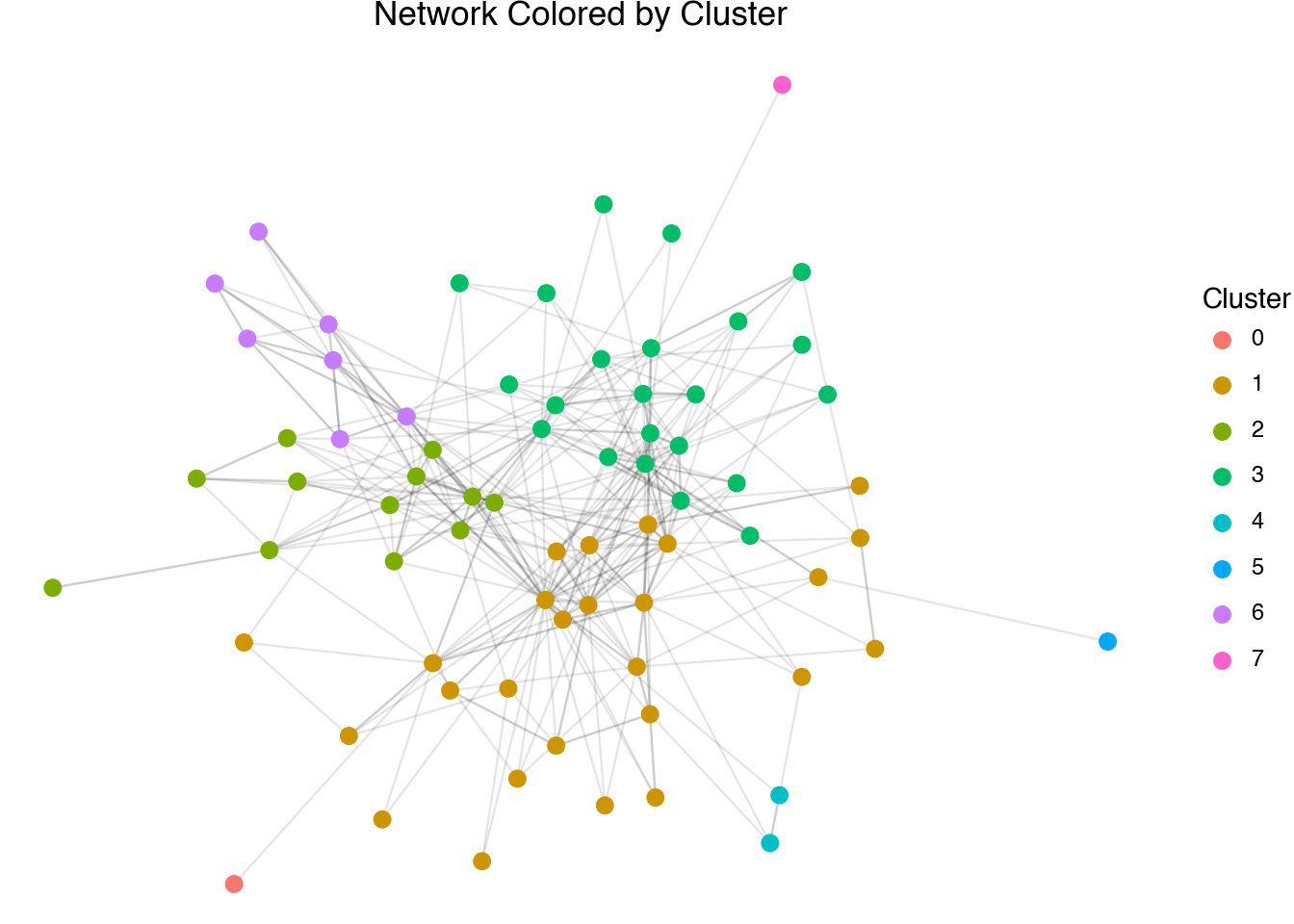
The output of the cluster visualization shows the different communities detected in the network. We are running out of space to put labels on the plot. This is one major consideration when thinking of networks as a form of visual exploration and communication; bigger is not necessarily better. Even on a large screen, networks with hundreds of nodes or more become unwieldy to plot. As an alternative, we can summarize the network data in the form of tables. For example, we can paste together the nodes within a cluster to try to further understand the internal structure of the relationships.
(
    node
    .group_by(c.cluster)
    .agg(members = c.id.str.concat("; "))
)
shape: (8, 2)
| cluster | members |
|---|---|
| str | str |
| "4" | "George Herbert; Henry Vaughan" |
| "6" | "W. H. Auden; Stephen Spender; … |
| "2" | "Charles Dickens; T. S. Eliot; … |
| "3" | "William Wordsworth; John Keats… |
| "0" | "Marie de France" |
| "1" | "Geoffrey Chaucer; William Lang… |
| "7" | "Daphne du Maurier" |
| "5" | "Samuel Pepys" |
Network clusters can be very insightful for understanding the structure of a large network. The example data that we have been working with so far is relatively small and forms a larger single cluster around a few well-known authors. Because of the length and richness of the textual information, this set of 75 authors produced interesting results on its own in the previous chapter. It is also a great size to visualize and illustrate the core computed metrics associated with network analysis since it is small enough to plot every node and edge. To go farther and show the full power of these methods as analytic tools, we need to expand our collection.
18.6 Co-citation Networks
The network structure we have been working with is a form called a citation network. Pages are joined whenever one page links to another. This is a popular method in understanding academic articles, friendship networks on social media (i.e., tracking mentions on Twitter), or investigating the relative importance of court cases. There are some drawbacks of using citation counts, however. They are sensitive to the time-order of publication, they are affected by the relative length of each document, and they are easily affected by small changes. Wikipedia articles are continually edited, so there is no clear temporal ordering of the pages, and there is relatively little benefit for someone to artificially inflate the network centrality of an article. The length of Wikipedia articles, though, are highly variable and not always well correlated with the notoriety of the subject matter. So, partially to avoid biasing our results due to page length, and more so to illustrate the general concept when applying these techniques to other sets of citation data, let’s look at an alternative that helps to avoid all of these issues.
A co-citation network is a method of showing links across a citation network while avoiding some of the pitfalls that arise when using direct links. A co-citation is formed between two pages whenever a third entry cites both of them. The idea is that if a third source talks about two sources in the same reference, there is likely a relationship between the documents. We can create a co-citation dataset from Wikipedia by first downloading all of the pages linked to from any of the author pages in our collection. We can then count how often any pair of pages in our dataset were both linked into from the same source. Here, we will load the dataset into Python as a structured table. Co-citations are, by definition, undirected. In the dataset below, we have sorted the edges so that doc_id always comes alphabetically before doc_id_out. The column count tells how many third pages cite both of the respective articles.
page_cocitation
shape: (2_114, 3)
| doc_id | doc_id_out | count |
|---|---|---|
| str | str | i64 |
| "Marie de France" | "Matthew Arnold" | 1 |
| "Marie de France" | "Oscar Wilde" | 2 |
| "Marie de France" | "Samuel Pepys" | 1 |
| "Marie de France" | "T. S. Eliot" | 1 |
| "Marie de France" | "Thomas Malory" | 1 |
| … | … | … |
| "Seamus Heaney" | "Virginia Woolf" | 2 |
| "Seamus Heaney" | "W. B. Yeats" | 4 |
| "Seamus Heaney" | "W. H. Auden" | 5 |
| "Seamus Heaney" | "William Shakespeare" | 1 |
| "Seamus Heaney" | "William Wordsworth" | 1 |
When working with co-citations, it is useful to only include links between two pages when the count is above some threshold. In the code below, we will filter our new edge list to include only the links that have a count of at least 6 different citations. We then create a new network, node, and edge set.
filtered_cocitations = (
    page_cocitation
    .filter(c.count > 6)
    .rename({"doc_id_out": "doc_id2"})
)

cocite_node, cocite_edge, cocite_G = DSNetwork.process(
    filtered_cocitations,
    directed=False
)
In the code block below, we will look at the nodes with the largest eigenvalue centrality scores, with the top ten printed in the text. As with the previous network, there is only one component in this network; otherwise, we would want to filter the data such that we are looking at pages in the largest component, which will always be component number 1.
(
    cocite_node
    .sort(c.eigen, descending=True)
    .head(10)
    .select(c.id, c.eigen, c.degree)
)
shape: (10, 3)
| id | eigen | degree |
|---|---|---|
| str | f64 | i64 |
| "John Milton" | 1.0 | 36 |
| "Charles Dickens" | 0.890534 | 30 |
| "John Dryden" | 0.772376 | 23 |
| "George Orwell" | 0.769806 | 25 |
| "William Shakespeare" | 0.769678 | 23 |
| "William Blake" | 0.768104 | 23 |
| "Samuel Johnson" | 0.766416 | 21 |
| "T. S. Eliot" | 0.730718 | 23 |
| "Samuel Taylor Coleridge" | 0.695994 | 21 |
| "John Keats" | 0.60477 | 16 |
The most central nodes in the co-citation network show a similar set of pages showing up in the top-10 list but with some notable differences in the relative ordering. Shakespeare is no longer at the top of the list. Focusing on the first name on the list, there are at least 36 other authors in our relatively small set that are cited at least six times in the same page as John Milton. Looking into the example links, we see that this is because Milton is associated with most other figures of the 17th Century, poets, and writers that have religious themes in their works. These overlapping sets creates a relatively large number of other pages that Milton is connected to. As mentioned at the start of the section, the differences between citation and co-citation are somewhat muted with the Wikipedia pages because they are constantly being modified and edited, making it possible for pages to directly link to other pages even if they were originally created before them. When working with other citation networks, such as scholarly citations or court records, the differences between the two are often striking.
18.7 Directed Networks
At the start of the chapter, we noted that networks can be given edges that are either directed or undirected. The algorithms and metrics we have looked at so far all work on undirected networks and so even in the case of the original links, which do have a well-defined direction, we have been treating the links as undirected. It is possible to create a network object that takes this relationship into account by setting the directed argument to True.
directed_node, directed_edge, directed_G = DSNetwork.process(
    page_citation,
    directed=True
)
directed_node
shape: (72, 11)
| id | x | y | component | component_size | cluster | degree_out | degree_in | degree_total | eigen | between |
|---|---|---|---|---|---|---|---|---|---|---|
| str | f64 | f64 | i64 | i64 | str | i64 | i64 | i64 | f64 | f64 |
| "Marie de France" | -4.244653 | 3.527097 | 9 | 1 | "0" | 1 | 0 | 1 | null | null |
| "Geoffrey Chaucer" | -1.561129 | 1.302218 | 10 | 60 | "1" | 6 | 10 | 16 | 0.526894 | 143.911999 |
| "William Langland" | -3.818198 | 1.524223 | 12 | 1 | "1" | 0 | 3 | 3 | null | null |
| "John Gower" | -2.592633 | 2.206674 | 10 | 60 | "1" | 3 | 2 | 5 | 0.194129 | 27.454978 |
| "John Dryden" | 0.769588 | 1.192064 | 10 | 60 | "1" | 13 | 12 | 25 | 0.588326 | 282.521198 |
| … | … | … | … | … | … | … | … | … | … | … |
| "Cecil Day-Lewis" | -3.107271 | -1.128851 | 10 | 60 | "6" | 5 | 6 | 11 | 0.129866 | 104.32109 |
| "Christopher Isherwood" | -3.833494 | -0.417671 | 10 | 60 | "6" | 5 | 4 | 9 | 0.104236 | 8.040945 |
| "Louis MacNeice" | -2.503527 | -0.134486 | 10 | 60 | "6" | 9 | 3 | 12 | 0.097687 | 34.675758 |
| "Rex Warner" | -4.410211 | -1.533203 | 10 | 60 | "6" | 3 | 1 | 4 | 0.016511 | 0.35 |
| "Edward Upward" | -4.446963 | -0.773504 | 10 | 60 | "6" | 3 | 3 | 6 | 0.05806 | 0.85 |
The node table contains a slightly different set of measurements. Closeness centrality is no longer available; eigenvalue and betweenness centrality are still computed, but are done so without using the directions of the edges. There are now three different degree counts: the out-degree (number of links on the page), the in-degree (number of links into a page), and the total of these two.
We can, if desired, use the directed structure in our plot. To visualize a directed network, we add an arrow argument to the geom_segment layer.
(
    directed_node
    .pipe(ggplot, aes("x", "y"))
    + geom_segment(
        aes(x="x", y="y", xend="xend", yend="yend"),
        data=directed_edge,
        alpha=0.7,
        arrow=arrow(length=0.02)
    )
    + geom_point()
    + theme_void()
    + labs(title="Directed Page Link Network")
)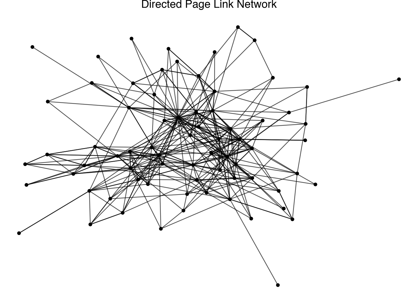
Visualizing the direction of the arrows can be helpful for illustrating concepts in smaller networks.
An interesting analysis that we can do with a directed network is to look at the in-degree as a function of the out-degree. The code below creates a plot that investigates the relationship between these two degree counts. We have highlighted a set of six authors that show interesting relationships between the two variables.
highlight_authors = [
    "William Shakespeare", "William Wordsworth", "T. S. Eliot",
    "Lord Byron", "W. H. Auden", "George Orwell"
]

directed_highlight = (
    directed_node
    .filter(c.id.is_in(highlight_authors))
)

(
    directed_node
    .filter(c.component == 1)
    .pipe(ggplot, aes("degree_out", "degree_in"))
    + geom_point()
    + geom_text(
        aes(label="id"),
        data=directed_highlight,
        nudge_y=1,
        nudge_x=-1
    )
    + geom_abline(slope=1, intercept=0, linetype="dashed")
    + labs(
        title="In-degree vs Out-degree in British Authors Network",
        x="Out-degree",
        y="In-degree"
    )
)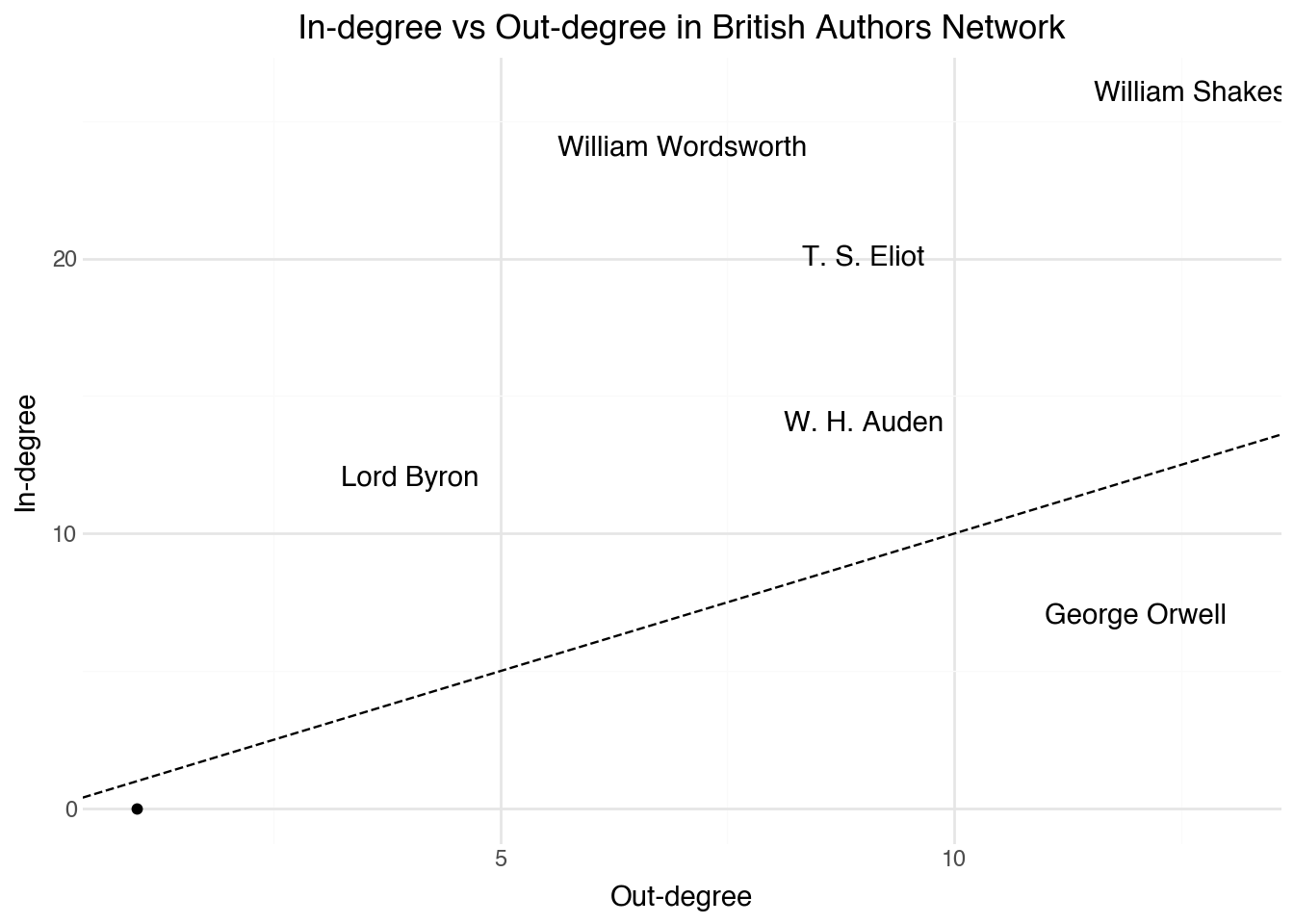
This plot reveals some interesting details about all of the citation networks that we have seen so far. It was probably not surprising to see Shakespeare as the node with the highest centrality score. Here, we see that this is only partially because many other author’s pages link into his. A parallel reason is that the Shakespeare page also has more links out to other authors than any other page. While the two metrics largely mirror one another, it is insightful to identify pages that have an unbalanced number of in or out citations. George Orwell, for example, is not referenced by many other pages in our collection, but has many outgoing links. It’s possible that this is partially a temporal effect of Orwell being a later author in the set; the page cites his literary influences and it’s not hard to see why those influences would not cite back into him. Wordsworth and Lord Byron show the opposite pattern, with more links into them than might be expected given their number of out links. Both of these are interesting observations that merit further study.
18.8 Distance Networks
For a final common type of network found in humanities research, we return to a task that we saw in Chapter 19. After having built a table of textual annotations, recall that we were able to create links between two documents whenever they are sufficiently close to one another based on the angle distance between their term-frequency scores. By choosing a suitable cutoff score for the maximal distance between pages, we can create an edge list between the pages. These edges, along with the DSNetwork.process function, can be used to construct what is called a distance network. As with co-citations, the network here has no notion of direction and therefore we will create another undirected network.
Distance networks are particularly useful when we want to explore relationships that are not explicitly encoded in the data. For example, in our Wikipedia corpus, the citation links tell us about explicit references between pages, but the distance network can reveal implicit similarities based on the content of the pages themselves.
18.9 Nearest Neighbor Networks
We finish this chapter by looking at one final network type that we can apply to our Wikipedia corpus. The example here generates a network structure that is designed to avoid a small set of central nodes by balancing the degree of the network across all of the nodes. This approach can be applied to any set of distance scores defined between pairs of objects.
The idea behind a symmetric nearest neighbors network is straightforward. For each document, we find its k nearest neighbors based on some distance metric. We then create an edge between two documents only if they are mutually in each other’s nearest neighbor set. This constraint ensures that the resulting network is symmetric and avoids the problem of popular documents accumulating too many connections.
The network we create this way can never have a degree larger than k (the number of neighbors we consider). This stops the network from focusing on lots of weak connections to popular pages and focuses on links between pages that go both ways.
The structure of the symmetric nearest neighbors network is quite different from the other networks we have explored. One way to see this is by looking at the relationship between eigenvalue centrality and betweenness centrality. In most of the other networks, these were highly correlated to one another, but in symmetric nearest neighbor networks that is often not the case. There can be several nodes that have a high betweenness score despite having a lower eigenvalue centrality score. These are the gatekeeper nodes that link other, more densely connected parts of the plot.
Since the symmetric nearest neighbors plot avoids placing too many nodes all at the center of the network, the clusters resulting from the network are also often more interesting and uniform in size than other kinds of networks. While all of the network types here have their place, when given a set of distances, using symmetric nearest neighbors is often a good choice to get interesting results that show the entire structure of the network rather than focusing on only the most centrally located nodes.
18.10 Summary
In this chapter, we explored several fundamental concepts in network analysis. We began by understanding how to represent network data as edge lists and how to compute basic statistics about network connectivity. We then examined various measures of centrality, including degree, eigenvalue, closeness, and betweenness centrality, each of which captures different aspects of a node’s importance within a network.
We also explored network clustering, which allows us to identify communities of closely connected nodes. Different types of networks—citation networks, co-citation networks, directed networks, distance networks, and nearest neighbor networks—each offer unique perspectives on the relationships within our data. The choice of which network type to use depends on the specific questions we want to answer and the nature of our underlying data.
Network analysis is particularly powerful when combined with the textual analysis techniques from the previous chapter. Together, these methods provide complementary views of the relationships between documents in a corpus.
References
[1]
Newman, M (2018 ). Networks. Oxford University Press
[3]
Kolaczyk, E D and Csárdi, G (2014 ). Statistical Analysis of Network Data with r. Springer
[4]
Csárdi, G, Nepusz, T, Traag, V, Horvát, S, Zanini, F, Noom, D and Müller, K (2023 ). igraph: Network Analysis and Visualization in r. https://CRAN.R-project.org/package=igraph
[5]
Fruchterman, T M and Reingold, E M (1991 ). Graph drawing by force-directed placement. Software: Practice and experience. Wiley Online Library. 21 1129–64