import numpy as np
import polars as pl

from funs import *
from plotnine import *
from polars import col as c
theme_set(theme_minimal())

marriage = pl.read_csv("data/inference_age_at_mar.csv")
absent = pl.read_csv("data/inference_absenteeism.csv")
sulph = pl.read_csv("data/inference_sulphinpyrazone.csv")
speed = pl.read_csv("data/inference_speed_sex_height.csv")
possum = pl.read_csv("data/inference_possum.csv")10 Inference
10.1 Setup
Load all of the modules and datasets needed for the chapter. There are a number of relatively small datasets specifically designed to satisfy the assumptions of the statistical models presented below. As always, full details for each can be found in Chapter 22.
10.2 Introduction
Throughout this text, we have focused on methods for organizing, visualizing, and describing datasets. These techniques form the foundation of exploratory data analysis, where the goal is to understand the structure and patterns present in the data we have collected. In this chapter, we turn to a different but equally important task: using data to make claims about the world beyond our immediate observations. This is the domain of statistical inference, a set of methods that allow us to draw conclusions about populations based on samples.
The distinction between a sample and a population is fundamental to everything that follows. A population consists of all individuals or observations we are interested in studying. This might include every adult in a country, every manufactured part from a factory, or every possible measurement of a particular phenomenon. In most practical situations we cannot observe the entire population directly. Instead, we collect a sample — a subset of the population that we measure and analyze. The central question of statistical inference is how to use what we learn from a sample to make inferences about the population from which it was drawn.
Before we can engage with inference, however, we need to establish a common vocabulary for describing the basic properties of data. The next two sections introduce measures of central tendency and variation, which are the building blocks of nearly all statistical analysis. Even if you have encountered these concepts before, it is worth reviewing them carefully, as a precise understanding of these measures is essential for interpreting the inferential methods that follow.
10.3 Measuring Central Tendency
When we collect numerical data, one of the first questions we ask is what value best represents the dataset as a whole. This notion of a typical value is captured by measures of central tendency, which summarize the location of a distribution’s center. The three most common measures are the mean, the median, and quantiles.
The mean, commonly called the average, is computed by summing all the values in a dataset and dividing by the number of observations. If we have n observations denoted \(x_1, x_2, \dots, x_n\), the mean is the sum of all \(x_i\) divided by \(n\). We typically denote the sample mean by \(\bar{x}\) and write the formula as follows.
\[ \bar{x} = \frac{1}{n}\sum_{i=1}^{n} x_i \]
The mean has the appealing property of using every observation in the dataset and represents the balance point of the data: if you placed the observations on a number line and put a fulcrum at the mean, the line would balance perfectly.
Note on Equations
I originally wrote this chapter with almost no mathematical notation in order to be as accessible as possible to all readers. After teaching the material several times, I noticed that the lack of precise definitions made the text difficult for those more accustomed to seeing mathematical descriptions of each concept, so I added them back into the text. I suggest that all readers treat the mathematical definitions as a reference for the textual descriptions of each method. However, if you ultimately find the mathematical definitions hard to follow, your understanding should be fine if you focus only on the text and code.
The median is the middle value when all observations are arranged in order from smallest to largest. If we denote the ordered observations as \(x_{(1)}\), \(x_{(2)}\), …, \(x_{(n)}\), where \(x_{(1)}\) is the smallest and \(x_{(n)}\) is the largest, the median depends on whether \(n\) is odd or even. When \(n\) is odd, we take the middle value as the median; when \(n\) is even, we take the average of the two middle values. As an equation, we can write the median as follows.
\[ \text{median} = \begin{cases} x_{((n+1)/2)} & \text{if } n \text{ is odd},\\ \frac{1}{2}\left(x_{(n/2)} + x_{(n/2+1)}\right) & \text{if } n \text{ is even}. \end{cases} \]
Unlike the mean, the median is not influenced by extreme values, making it a more robust measure of central tendency when dealing with data that may contain outliers or have a skewed distribution.
Quantiles generalize the concept of the median to other positions in the ordered data. For a given proportion \(p\) between \(0\) and \(1\), the \(p\)-th quantile is the value \(Q(p)\) such that a fraction \(p\) of the observations fall at or below \(Q(p)\). If we denote the ordered observations as \(x_{(1)}\), \(x_{(2)}\), …, \(x_{(n)}\), we can write this formally as follows.
\[ Q(p) = x_{(\lceil np \rceil)} \]
Here, the ceiling function returns the smallest integer greater than or equal to n * p. For example, if we have n = 100 observations and want the 0.20 quantile (p = 0.20), then n * p = 20, so the 0.20 quantile is the 20th smallest observation in the ordered data. The median is the special case p = 0.5, giving the observation at position ceiling(n/2) in the ordered data.
The median is approximately the 0.50 quantile, meaning that 50 percent of the observations fall below it. Similarly, the 0.20 quantile is the value below which 20 percent of the observations fall. Quantiles are useful for understanding the shape of a distribution beyond its center.
The code below demonstrates how to compute these measures using Polars. It uses the dataset marriage, which has a single column indicating the age at first marriage for 5,534 U.S. women from the 2010 National Survey of Family Growth (NSFG) conducted by the CDC. We calculate the mean, median, and 0.20 quantile of the age variable in the marriage dataset.
(
    marriage
    .select(
        mu=c.age.mean(),
        med=c.age.median(),
        q20=c.age.quantile(0.20)
    )
)
shape: (1, 3)
| mu | med | q20 |
|---|---|---|
| f64 | f64 | f64 |
| 23.440188 | 23.0 | 19.0 |
In this example, the mean and median are fairly close, suggesting the distribution of ages at marriage is roughly symmetric. When the two measures differ substantially, it often indicates the data are skewed, with the mean pulled toward the longer tail. To better understand the distribution, we can visualize it.
10.4 Measuring Variation
Knowing the center of a distribution tells only part of the story. Two datasets can have the same mean but look very different: one may have values clustered tightly around the mean, while the other has values spread widely. Measures of variation quantify this spread, indicating how much the observations differ from one another and from the center.
The variance is the most fundamental measure of spread. It is computed by taking the difference between each observation and the mean, squaring these differences, and then averaging the squared differences. The squaring serves two purposes: it ensures that positive and negative deviations do not cancel each other out, and it gives greater weight to observations that are far from the mean. We denote the sample variance by s^2 and write it as follows:
\[ s^2 = \frac{1}{n-1} \sum_{i=1}^{n} (x_i - \bar{x})^2 \]
Bessel’s correction
You may notice that we divide by n − 1 rather than n. This adjustment, known as Bessel’s correction, makes the sample variance an unbiased estimator of the population variance. Intuitively, this happens because we lose one degree of freedom when we use the sample mean in our calculation instead of the true population mean. Many statistics textbooks spend a disproportionate amount of time discussing this correction, which has very little effect for reasonable sample sizes. I suggest not worrying too much about the correction.
While the variance captures the spread of the data, it has an awkward property of being expressed in squared units. If the original data are measured in years, the variance is measured in years squared, which is difficult to interpret directly. The standard deviation addresses this problem by taking the square root of the variance, returning the measure of spread to the original units of measurement.
\[ s = \sqrt{s^2} = \sqrt{\frac{1}{n-1}\sum_{i=1}^{n}(x_i - \bar{x})^2} \]
The standard deviation measures the typical distance of observations from the mean.
A useful heuristic for interpreting the standard deviation comes from considering normal (bell-shaped) distributions. For data that approximately follow this shape, roughly 68 percent of observations fall within plus or minus one standard deviation of the mean, about 95 percent fall within two standard deviations of the mean, and nearly all observations fall within three standard deviations of the mean. While this rule of thumb does not apply exactly to all distributions, it provides a useful starting point for thinking about what the standard deviation tells us.
We can compute the standard deviation and variance using the .select method in Polars along with the summary methods .std() and .var(). Note that we would use .agg to compute these statistics within specific groups of the data.
(
    marriage
    .select(
        std=c.age.std(),
        var=c.age.var()
    )
)
shape: (1, 2)
| std | var |
|---|---|
| f64 | f64 |
| 4.721365 | 22.291289 |
The output shows both the standard deviation and the variance for the age-at-marriage data. Note that the variance is the square of the standard deviation. In practice, we usually report and interpret the standard deviation because it has more intuitive units (the same units as the original data).
10.5 Statistical Inference
The goal of statistical inference is to learn about a large population based on a sample drawn from that population. Generally, we can compute nearly any summary statistic from the sample data we have collected. The question is how to infer the population from the sample. We can never be certain about the exact relationship, because, due to random chance, our sample might not be representative of the larger population. Therefore, we focus on probabilistic statements about what would happen for most samples we could draw from the population.
The biggest challenge in understanding statistical inference is the need to describe probabilities precisely. This can only be done rigorously through the formal structures of a calculus-based probability course. Here we will do our best using analogies, without spending months developing the underlying mathematical structure of probability. To make this more accessible, we will focus on a specific inference task: measuring the difference in means between two populations.
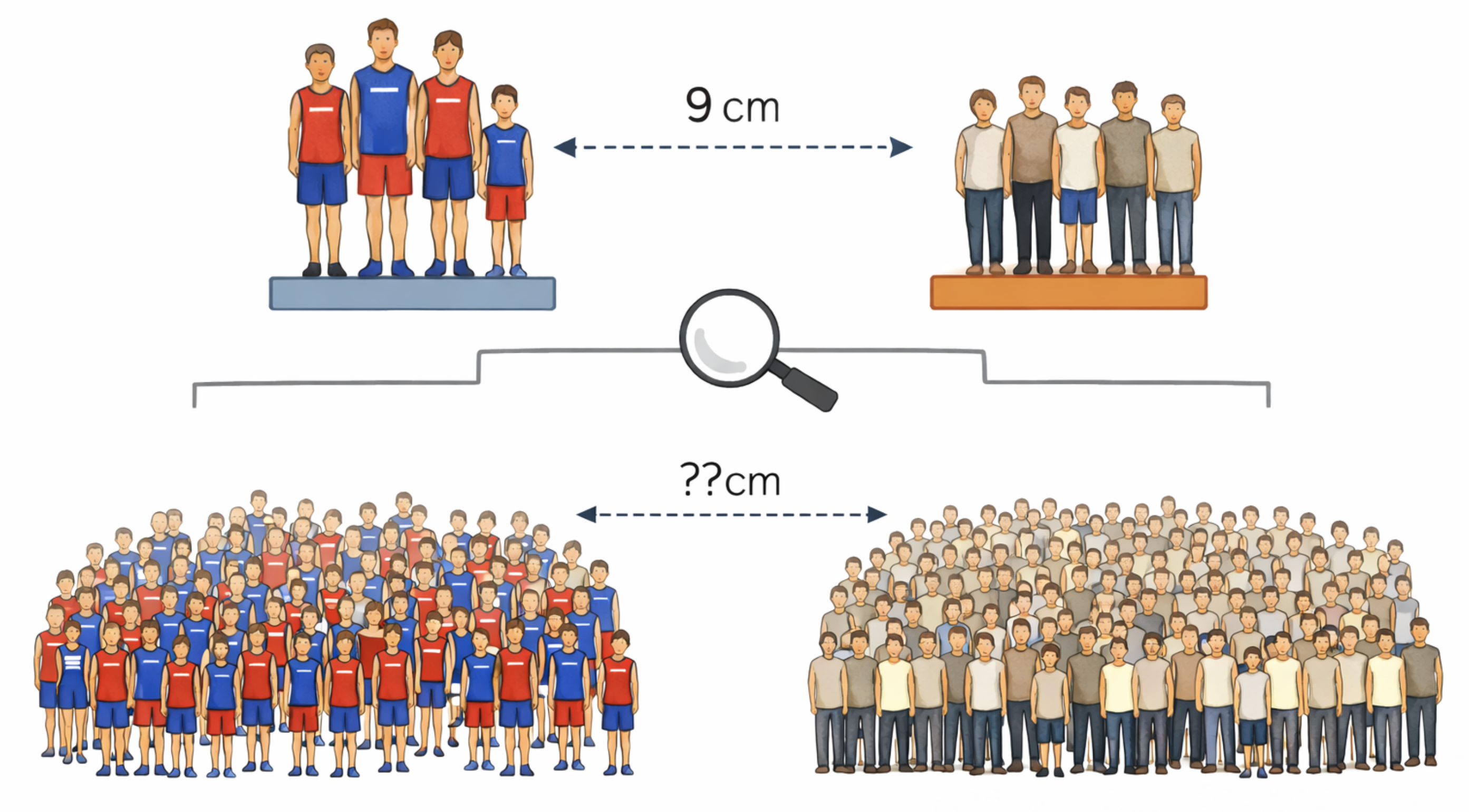
Consider a sample of the heights of 45 randomly selected Virginia residents. After summarizing the heights, we find that the 15 residents who played college athletics have an average height of 181 centimeters, and the other 30 residents who did not play college athletics have an average height of 172 centimeters. Knowing nothing else, our best guess for the difference in athlete and non-athlete heights in the entire state is 9 centimeters. This best guess is what we would call the point estimate of the unknown difference between the means. The goal of statistical inference is to determine to what extent this sample difference can serve as a good approximation of the true population difference in heights. There are generally two different approaches to doing this.
A confidence interval is a range of values used to estimate a population quantity from sample data. Confidence intervals are reported with a corresponding confidence level, most commonly 95 percent. If we denote the unknown population parameter as \(\theta\) and construct a confidence interval with lower bound \(L\) and upper bound \(U\), then a 95 percent confidence interval satisfies the following property. The symbol \(\mathbb{P}(\cdots)\) is used as a compact way of writing “the probability of \(\cdots\)”.
\[ \mathbb{P}(L \leq \theta \leq U) = 0.95 \]
This statement means that the method of calculating the interval will produce intervals that contain the true value in 95% of repeated experiments. This is a subtle but important point: the confidence level refers to the reliability of the procedure over many repetitions, not to the probability that any particular interval contains the true value. Once we compute a specific interval from our data, the true parameter either is in that interval or not; the probability statement applies to the method, not to the specific result.
The other approach is to use a statistical hypothesis test. We start with the null hypothesis, denoted \(H_0\). This is a statement about the data that we test to see whether there is strong evidence against it. In the case of our example above, a typical null hypothesis would be that there is no difference between the heights of athletes and non-athletes. The hypothesis test provides a p-value, which we can write formally as follows.
\[ \text{p-value} = \mathbb{P}(\text{observing data at least as extreme as the observed data} \mid H_0) \]
The p-value is the probability of obtaining test results at least as extreme as those observed, assuming the null hypothesis is true. If the p-value is sufficiently small (common cutoffs are 0.05 or 0.01), we reject the null hypothesis; otherwise, we fail to reject it.
It is worth pausing to understand what a p-value does and does not tell us. A small p-value indicates that the observed data would be unlikely if the null hypothesis were true and thus provides evidence against the null. However, a p-value is not the probability that the null hypothesis is true, nor is it the probability that we have made an error by rejecting the null hypothesis. These common misinterpretations can lead to flawed reasoning, so it is important to keep the precise definition in mind.
10.6 Inference for One Mean
The simplest inferential problem arises when we want to make claims about the mean of a single population based on a sample. Suppose we have collected data on the age at first marriage from a sample of individuals and want to estimate the true average age at first marriage in the population. The sample mean provides a point estimate, but we would like to know how much uncertainty surrounds that estimate.
The one-sample t-test addresses this question. The test is based on a quantity called the t-statistic, which measures how far the sample mean is from a hypothesized population mean, divided by the standard error of the mean. If we denote the hypothesized population mean by \(\mu_0\) (often zero), the t-statistic is computed as follows:
\[ t = \frac{\bar{x} - \mu_0}{s / \sqrt{n}} \]
The denominator, s divided by the square root of n, is called the standard error of the mean. It represents the standard deviation of the sampling distribution of the sample mean and decreases as the sample size increases. Larger samples provide more precise estimates.
Under certain assumptions, most importantly that the sample is large enough, the t-statistic follows a known probability distribution called the t-distribution with \(n-1\) degrees of freedom. This allows us to compute p-values and construct confidence intervals because we understand what values of \(t\) are reasonable under the assumption that the null hypothesis is true. The confidence interval for the population mean takes the form shown below, where \(t^*\) is a critical value from the t-distribution corresponding to the desired confidence level. When \(n\) is large and the confidence level is set at \(0.95\), the value of \(t^*\) will be close to \(1.96\).
\[ \bar{x} \pm t^* \cdot \frac{s}{\sqrt{n}} \]
To apply a one-sample t-test, we will use the ttest1 method from a wrapper class called DSStatsmodels, which uses the Python statsmodels package. The model-fitting process is designed to be used as part of a chain of methods called via the .pipe function, as we did in Chapter 3 with ggplot. The model-fitting function takes a string that defines a formula using the consistent model description we will use throughout this chapter. A formula has a column name followed by the ~ (tilde) symbol followed by one or more additional column names. The idea is that we are trying to “predict” the first column in terms of zero or more of the other columns. In the case of a one-sample t-test, there are no predictor variables; therefore we use the notation 1 to indicate that the left-hand column is modeled using only a single mean.
(
    marriage
    .pipe(DSStatsmodels.ttest1, "age ~ 1")
)
shape: (1, 5)
| mean | t | P>|t| | [0.025 | 0.975] |
|---|---|---|---|---|
| f64 | f64 | f64 | f64 | f64 |
| 23.440188 | 369.328715 | 0.0 | 23.315768 | 23.564608 |
The output includes the sample mean, a confidence interval for the population mean, and a p-value testing whether the population mean equals zero. In most practical applications, that null hypothesis is not especially informative. The confidence interval is more valuable: it provides a range of plausible values for the true population mean based on the sample.
10.7 Inference for Two Means
A common inferential task is comparing the means of two groups. We might want to know whether average test scores differ between students who received a new teaching intervention and those who did not, or whether average recovery times differ between patients receiving two different treatments. The two-sample t-test provides the framework for addressing such questions.
The logic of the two-sample t-test parallels that of the one-sample test. We compute the difference in sample means between the two groups, then assess how large this difference is relative to what we would expect from random sampling variation alone. If the two groups have sample means \(\bar{x}_1\) and \(\bar{x}_2\), sample sizes \(n_1\) and \(n_2\), and sample standard deviations \(s_1\) and \(s_2\), the t-statistic for the two-sample test is:
\[ t = \frac{\bar{x}_1 - \bar{x}_2}{\sqrt{\frac{s_1^2}{n_1} + \frac{s_2^2}{n_2}}} \]
The denominator is called the standard error of the difference between means. It accounts for the variability in both groups. If the observed difference is large compared to this expected variation, we have evidence that the population means differ.
The null hypothesis for a two-sample t-test is typically that the two population means are equal, or equivalently, that the difference in population means is zero. We can write this as \(H_0: \mu_1 = \mu_2\). A small p-value provides evidence against this null hypothesis, suggesting that the groups differ.
To illustrate the two-sample t-test, we will use a historical dataset of absenteeism in a school district in Australia. Here is the full description from the source:
Researchers, interested in the relationship between school absenteeism and certain demographic characteristics of children, collected data from 146 randomly sampled students in rural New South Wales, Australia, during a particular school year.
The dataset includes the number of days a student was absent during a school year, along with demographic data such as sex, age (in buckets), and learning status. We will use a two-sample t-test to determine whether absenteeism differs significantly between male and female students. We again use DSStatsmodels, this time the method .ttest2. The formula now has both a left-hand side (the column whose mean we’re interested in) and a right-hand side that indicates the two groups the data are divided into.
(
    absent
    .pipe(DSStatsmodels.ttest2, "days ~ sex")
)
shape: (1, 9)
| level1 | level2 | mean1 | mean2 | mean_diff | t | P>|t| | [0.025 | 0.975] |
|---|---|---|---|---|---|---|---|---|
| str | str | f64 | f64 | f64 | f64 | f64 | f64 | f64 |
| "F" | "M" | 15.225 | 17.954545 | 2.729545 | 1.01 | 0.314189 | -2.612188 | 8.071278 |
The output shows the difference in mean days of absenteeism between males and females, along with a confidence interval for this difference and a p-value for the null hypothesis of no difference. The confidence interval is particularly useful because it not only indicates whether there is a statistically significant difference but also provides a sense of the magnitude of that difference. In this example, there is no statistically significant evidence of a difference in absenteeism based solely on the student’s sex.
10.8 Inference for Several Means
When comparing means across more than two groups, the t-test is no longer appropriate. Instead, we use a technique called a one-way analysis of variance, commonly abbreviated as ANOVA. Despite its name, ANOVA is fundamentally a method for comparing means rather than variances. The name comes from the mathematical machinery underlying the test, which partitions the total variability in the data into components associated with between-group differences and within-group random variation.
The null hypothesis in ANOVA is that all group means are equal: for \(k\) groups with population means \(\mu_1,\ldots,\mu_k\), the null hypothesis is \(\mu_1=\mu_2=\cdots=\mu_k\).
\[ H_0: \mu_1 = \mu_2 = \cdots = \mu_k \]
The alternative hypothesis is that at least one group mean differs from the others. Notice that rejecting the null hypothesis tells us only that the groups are not all the same; it does not indicate which specific groups differ. Additional analyses, called post-hoc tests, are often needed to determine where the differences lie.
ANOVA relies on the F-statistic, which compares variability between group means to variability within groups. The F-statistic is computed as the ratio of two mean-square estimates: the between-group mean square (MSB) and the within-group mean square (MSW).
\[ F = \frac{\text{MS}_{\text{between}}}{\text{MS}_{\text{within}}} = \frac{\text{between-group variance}}{\text{within-group variance}} \]
If between-group variability is large relative to within-group variability, the F-statistic will be large and the p-value small, providing evidence against the null hypothesis that the group means are equal.
We will again use the absenteeism data to illustrate the one-way ANOVA test by determining whether the number of days absent is related to the students’ age bucket (F0, F1, F2, and F3). To do this, we use the DSStatsmodels class with the .anova() method. The formula works exactly as it did in the two-sample case: put the column whose mean you want to compare on the left-hand side and the column that describes the groups on the right-hand side.
(
    absent
    .pipe(DSStatsmodels.anova, "days ~ age")
)
shape: (2, 5)
| index | sum_sq | df | F | PR(>F) |
|---|---|---|---|---|
| str | f64 | f64 | f64 | f64 |
| "age" | 2535.132447 | 3.0 | 3.354745 | 0.020744 |
| "Residual" | 35769.120978 | 142.0 | null | null |
The output provides the F-statistic and the associated p-value for the test of whether mean absenteeism differs across age groups. The p-value is 0.02, which indicates that the observed variation is unlikely to have arisen from a population in which absenteeism is unrelated to age group. A visualization can help us understand the pattern of differences.
(
    absent
    .pipe(ggplot, aes("age", "days"))
    + geom_boxplot()
)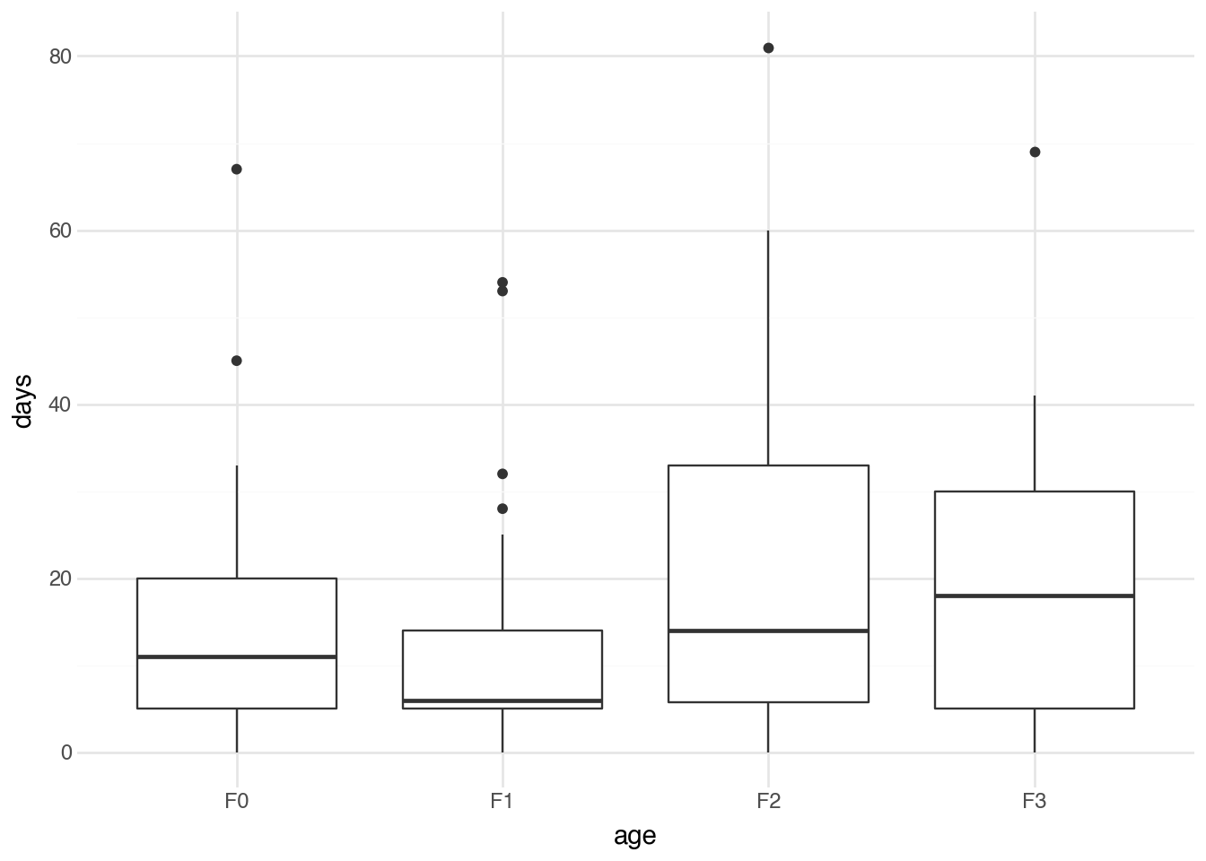
The boxplot shows the distribution of days absent for each age group, making it easier to see which groups tend to have higher or lower numbers of absent days. While ANOVA indicates whether statistically significant differences exist, the visualization helps us understand the nature and direction of those differences.
10.9 Chi-squared Test
The inferential methods we’ve discussed so far all involve comparing means of numerical variables. When both variables of interest are categorical, we need a different approach. The chi-squared test (also written chi-square or represented by the Greek letter χ²) assesses whether there is an association between two categorical variables.
We can understand how the test works by constructing a contingency table that shows the counts of observations for each combination of categories. As an example, we use experimental data that study the efficacy of treating patients who had a heart attack with a drug called sulphinpyrazone. The data indicate whether a patient was in the treatment group (given the drug) or the control group (given a placebo), and whether the patient lived or died. Using Polars functions, we can build a table showing the number of patients in each group by outcome.
(
    sulph
    .group_by(c.outcome, c.group)
    .agg(n = pl.len())
    .pivot(index=c.outcome, columns=c.group, values=c.n)
)
shape: (2, 3)
| outcome | treatment | control |
|---|---|---|
| str | u32 | u32 |
| "died" | 41 | 60 |
| "lived" | 692 | 682 |
The chi-squared test compares the observed counts in each cell to the counts expected if the two variables are independent. Under independence, knowing the value of one variable tells us nothing about the likely value of the other. If we denote the observed count in row \(i\) and column \(j\) by \(O_{ij}\) and the expected count under independence by \(E_{ij}\), the chi-squared statistic is computed as follows:
\[ \chi^2 = \sum_{i,j} \frac{(O_{ij} - E_{ij})^2}{E_{ij}} \]
Expected counts
The expected counts \(E_{ij}\) can be calculated using some basic probability theory. Let \(R_i\) be the total number of observations in row \(i\), \(C_j\) be the total number of observations in column \(j\), and \(N\) the total number of observations. The proportion of data in this row is \(R_i / N\) and the proportion of data in this column is \(C_j / N\). Probability theory states that, for independent events, the probability of both occurring is the product of their individual probabilities. Therefore, we would expect the probability that a specific observation falls in row \(i\) and column \(j\) to be \((R_i \cdot C_j) / N^2\). To get the expected count, we multiply this by the number of observations (\(N\)) to obtain the formula \(E_{ij} = (R_i \cdot C_j) / N\).
We can compute the chi-squared test using the .chi2() method of DSStatsmodels and specifying the two variables in the formula. Below is an example with the sulphinpyrazone dataset.
(
    sulph
    .pipe(DSStatsmodels.chi2, "outcome ~ group")
)
shape: (1, 3)
| χ² | df | P>|χ²| |
|---|---|---|
| f64 | i64 | f64 |
| 3.212077 | 1 | 0.073097 |
The output provides the chi-squared statistic and a p-value (0.07). The p-value is not sufficiently small to indicate evidence that the drug improves patient outcomes. Note that the order of the left- and right-hand sides of the equation is not important; flipping them produces the exact same result.
The G-test (also called the log-likelihood ratio test) is an alternative to the chi-squared test for contingency tables. Like the chi-squared test, it compares observed counts to expected counts under the assumption of independence, but it uses a different formula based on the likelihood ratio. The G-statistic is computed as follows:
\[ G = 2 \sum_{i,j} O_{ij}\log\left(\frac{O_{ij}}{E_{ij}}\right) \]
The expected counts are calculated in the same way as for the chi-squared test. The factor of 2 in front of the summation ensures that the G-statistic approximately follows the same distribution as the chi-squared statistic under the null hypothesis, allowing us to use the same critical values and p-value calculations. We can replace the method “.chi2” with “.gtest” to obtain the G-test result.
(
    sulph
    .pipe(DSStatsmodels.gtest, "outcome ~ group")
)
shape: (1, 3)
| G | df | P>|G| |
|---|---|---|
| f64 | i64 | f64 |
| 3.229159 | 1 | 0.072338 |
In practice, the G-test and chi-squared test typically give very similar results, especially for large samples. For example, this is evident in the output above. The advantages of the G-test become clearer when some rows or columns are rare. We will see a specific application where it is particularly useful Chapter 19. However, the chi-squared test is better known in the sciences and social sciences and is therefore the recommended method for reporting results of statistical inference tests on the relationship between two categorical variables.
10.10 Simple OLS
While the methods above focus on comparing group means or testing for associations, many research questions involve understanding the relationship between two numerical variables. Ordinary least squares (OLS) regression provides a framework for modeling such relationships. In its simplest form, simple linear regression describes how one variable (the response or dependent variable) varies as another (the predictor or independent variable) changes.
The basic idea is to fit a straight line to the data that best captures the relationship between the variables. The equation for this line takes the form shown below, where \(y\) is the response variable, \(x\) is the predictor variable, \(\alpha\) is the y-intercept (the predicted value of \(y\) when \(x\) equals zero), and \(\beta\) is the slope (the predicted change in \(y\) for a one-unit increase in \(x\)).
\[ y = \alpha + \beta x + \varepsilon \]
The term \(\varepsilon\) denotes the error (residual), which captures each observation’s deviation from the fitted line. The least-squares method finds the values of \(\alpha\) and \(\beta\) that minimize the sum of squared residuals.
\[ \min_{\alpha,\beta} \sum_{i=1}^n (y_i - \alpha - \beta x_i)^2 \]
Least squares refers to the method used to find the best-fitting line. Among all possible lines we could draw through the data, the least squares line is the one that minimizes the sum of the squared vertical distances from each data point to the line. These distances are called residuals; squaring them ensures that positive and negative deviations are treated equally while giving greater weight to larger deviations. The solutions to this minimization problem can be written in closed form. We will write these down for reference, but note that it is difficult to gain much insight into the mathematics here without performing the derivation yourself.
\[ \hat{\beta} = \frac{\sum_{i=1}^{n}(x_i - \bar{x})(y_i - \bar{y})}{\sum_{i=1}^{n}(x_i - \bar{x})^2}, \quad \hat{\alpha} = \bar{y} - \hat{\beta}\bar{x} \]
There are two separate hypothesis tests that we can construct with a simple linear regression. We can test the null hypothesis \(H_0: \alpha = 0\) (the intercept is zero) and the null hypothesis \(H_0: \beta = 0\). The second is usually the most important because it tests whether there is a change in the mean of the response \(y\) when there is a change in the predictor \(x\). We will not go into the specific formulas for these hypothesis tests, but note that they take the form of a \(t\)-distribution with \(n-2\) degrees of freedom.
To illustrate the application of a linear regression model, we will use a survey dataset of 1,325 UCLA students who completed a survey asking about their height, their fastest driving speed, and their gender. We will fit a model predicting their fastest driving speed (MPH) as a function of their height (inches).
Once again, running linear regression involves using DSStatsmodels function, this time with the .ols method. The formula object specifies the response variable on the left-hand side and the predictor variable on the right. This is intuitive because the formula format comes directly from the standard way of writing the equation of a line in mathematics (\(y = mx + b\)).
(
    speed
    .pipe(DSStatsmodels.ols, "speed ~ height")
)
shape: (2, 7)
| coef | std err | t | P>|t| | [0.025 | 0.975] | |
|---|---|---|---|---|---|---|
| str | f64 | f64 | f64 | f64 | f64 | f64 |
| "Intercept" | 10.3958 | 8.393 | 1.239 | 0.216 | -6.07 | 26.861 |
| "height" | 1.2391 | 0.127 | 9.787 | 0.0 | 0.991 | 1.487 |
The output shows the estimated intercept and slope, along with standard errors, t-statistics, and p-values for each coefficient. The p-value for the slope tests the null hypothesis that there is no linear relationship between the predictor and response (that is, that the true slope equals zero). As usual, a small p-value provides evidence that the relationship is statistically significant. Here we see a very small p-value (when rounded, it equals zero), indicating strong evidence of a relationship between top-driven speed and height.
We already discussed the idea of a line of best fit in Chapter 3, where we used the geom_smooth function to fit a line to a scatterplot. This line is produced by the same method shown in the model above. Let’s visualize this line here to compare it to the model.
(
    speed
    .pipe(ggplot, aes("height", "speed"))
    + geom_point(color="#bbbbbb")
    + geom_smooth(method="lm", se=False)
)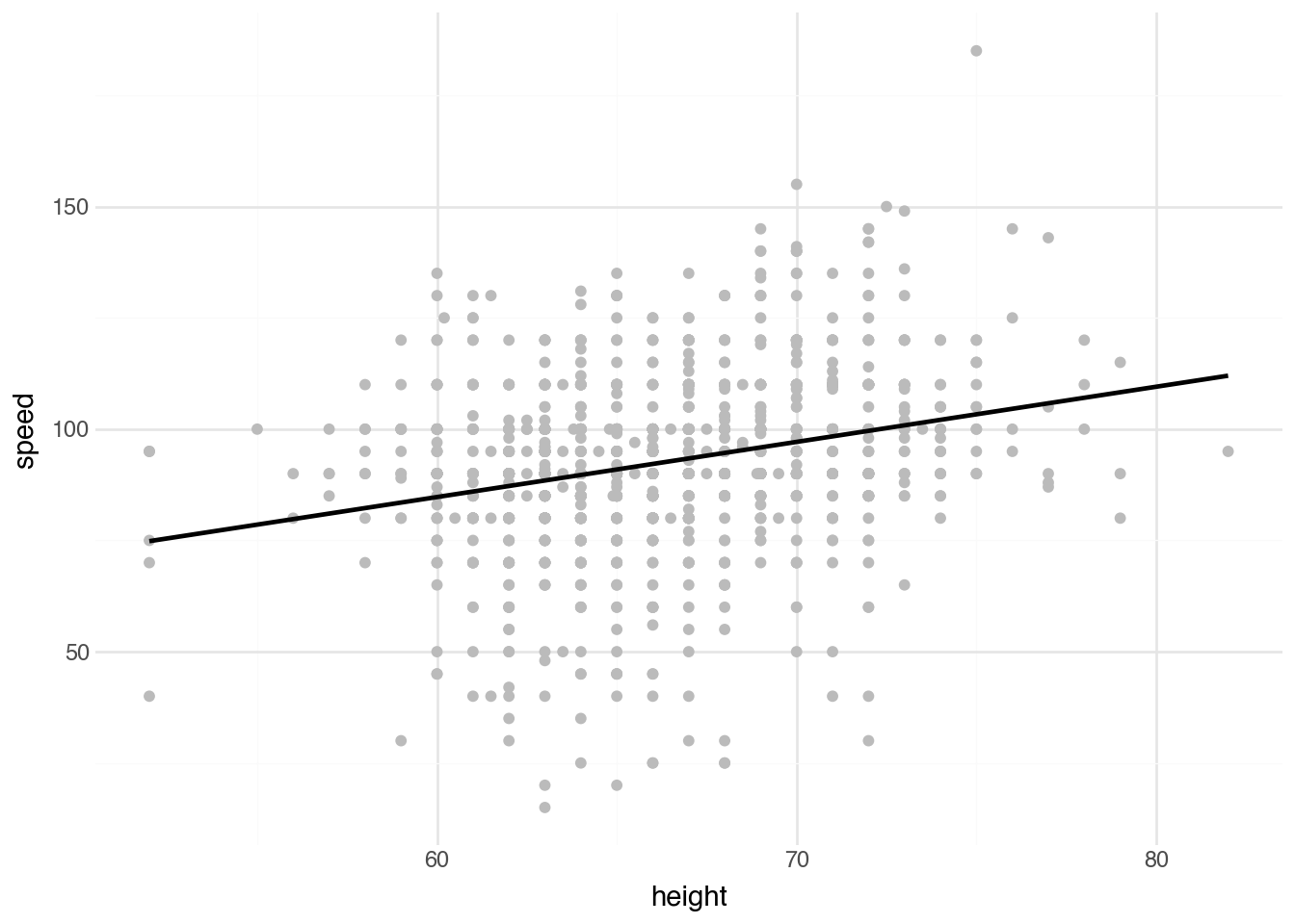
The visualization shows the data points along with the fitted regression line. Notice that, as is often true, there is no direct interpretation of the value \(\alpha\); it would represent the speed of someone with a height of zero. The interpretation of \(\beta\) directly addresses the study question: how much faster, on average, is a person’s top driving speed for each additional inch of height?
10.11 Multivariate OLS
Simple linear regression captures the relationship between one predictor variable and one response variable. Real-world relationships are often more complex. Multiple regression extends the linear model to include several predictors simultaneously, allowing us to examine the relationship between each predictor and the response while controlling for the effects of the other predictors.
The model extends to include multiple predictors as follows: we have p predictor variables \(x_1\) through \(x_p\), each with its own coefficient \(\beta_j\).
\[ y = \alpha + \beta_1 x_1 + \beta_2 x_2 + \cdots + \beta_k x_k + \varepsilon \]
Each coefficient beta_j represents the expected change in y for a one-unit increase in x_j, holding all other predictors constant. This “holding constant” interpretation is crucial: it means we are isolating the unique contribution of each predictor after accounting for the others.
Let’s look at a dataset collected from 104 possums captured in Australia and New Guinea. The dataset includes measurements of the sizes of parts of their bodies and location data about where they were captured. We will try to predict the width of the possum’s skull based on other body measurements. Using simple linear regression, we see a positive relationship between skull width and tail length: each additional millimeter of tail length is associated with about 0.4 millimeters of extra skull width.
(
    possum
    .pipe(DSStatsmodels.ols, "skull_w ~ tail_l")
)
shape: (2, 7)
| coef | std err | t | P>|t| | [0.025 | 0.975] | |
|---|---|---|---|---|---|---|
| str | f64 | f64 | f64 | f64 | f64 | f64 |
| "Intercept" | 41.8346 | 5.636 | 7.422 | 0.0 | 30.655 | 53.014 |
| "tail_l" | 0.4066 | 0.152 | 2.674 | 0.009 | 0.105 | 0.708 |
In order to run a multiple regression model, we add terms (with a plus sign) to the right-hand side of the formula object. The resulting table provides the estimates of \(\alpha\) and all of the corresponding \(\beta_j\)s. Let’s add a variable for the possum’s total length in addition to tail length.
(
    possum
    .pipe(DSStatsmodels.ols, "skull_w ~ total_l + tail_l")
)
shape: (3, 7)
| coef | std err | t | P>|t| | [0.025 | 0.975] | |
|---|---|---|---|---|---|---|
| str | f64 | f64 | f64 | f64 | f64 | f64 |
| "Intercept" | 25.2 | 5.826 | 4.325 | 0.0 | 13.643 | 36.757 |
| "total_l" | 0.4054 | 0.074 | 5.48 | 0.0 | 0.259 | 0.552 |
| "tail_l" | -0.0978 | 0.163 | -0.601 | 0.549 | -0.421 | 0.225 |
The result here is quite interesting and illustrates a challenge when interpreting multivariate models. We see that an increase in body length of 1 millimeter leads to an average increase in skull width of about 0.4 millimeters. However, the coefficient for tail length (-0.0978) is completely different: it is actually negative. Why would possums with longer tails have smaller skulls? The reason is that the coefficient indicates the change in skull width with all other variables held fixed. If we increase tail length while keeping total length fixed, that implies body length must decrease. From this perspective, in the language of multivariate regression, the negative sign becomes more reasonable. This example still highlights the difficulty of interpreting multivariate regression coefficients, particularly when there is no physical relationship between the variables to help clarify the situation, as we have in this case.
Order of coefficents
The order of the coefficients on the right-hand side of the formula object for a linear model has no effect on the results other than the ordering of the coefficients in the table. Regardless of the order and the number of terms, the interpretation is always the same: \(\beta_j\) indicates the expected change in the mean response associated with a one-unit change in the jth predictor, with all other predictor variables held fixed.
10.12 Indicator Variables
In many cases, we want to fit a multivariate regression model where some predictors are categorical rather than numeric. Fortunately, this is an easy challenge to overcome.
Consider again the speed dataset, where we are trying to estimate the average maximum speed a student reported driving based on demographic information. We already used height alone and found that taller students are more likely to report driving at higher speeds. Male students tend to be taller and are sometimes thought—particularly when younger—to be a bit more reckless on average. It’s possible that the relationship with height exists only because it’s acting as a proxy for student sex. A multivariate regression could help here, but how do we include sex in the model? A common technique is to create a numeric variable that’s 1 for one category and 0 for the other. We will create a variable called is_male and add it to the model as follows.
(
    speed
    .with_columns(
        is_male = (c.sex == "male").cast(pl.Int64)
    )
    .pipe(DSStatsmodels.ols, "speed ~ is_male + height")
)
shape: (3, 7)
| coef | std err | t | P>|t| | [0.025 | 0.975] | |
|---|---|---|---|---|---|---|
| str | f64 | f64 | f64 | f64 | f64 | f64 |
| "Intercept" | 33.6458 | 10.326 | 3.258 | 0.001 | 13.388 | 53.903 |
| "is_male" | 5.2458 | 1.371 | 3.826 | 0.0 | 2.556 | 7.935 |
| "height" | 0.8608 | 0.16 | 5.376 | 0.0 | 0.547 | 1.175 |
In the results, we see that the is_male coefficient is 5.2458. In the prediction, this coefficient is added to any prediction where the student is male (since is_male equals 1) and ignored for students who are female. This means that its statistical test and associated p-value (here, 0.0) test the following null hypothesis: “\(H_0\): sex has no effect on maximum driving speed after accounting for height”. The height coefficient is smaller (1.2391 -> 0.8608), but still positive. Its p-value (also 0.0) tests the null hypothesis: “\(H_0\): height has no effect on driving speed after accounting for sex”. The results show that there is strong evidence to reject both null hypotheses. In other words, it seems that both height and being male are associated with an increase in the maximum reported driving speed.
The new column is_male that we created above is called an indicator variable because it indicates (with a 0 or 1) whether a certain feature is present. This is such a common approach when working with categorical variables in regression that statsmodels lets us include categorical variables directly in the model and will create the indicator variables for us. Let’s repeat the above analysis by including height and sex directly in the model.
(
    speed
    .pipe(DSStatsmodels.ols, "speed ~ height + sex")
)
shape: (3, 7)
| coef | std err | t | P>|t| | [0.025 | 0.975] | |
|---|---|---|---|---|---|---|
| str | f64 | f64 | f64 | f64 | f64 | f64 |
| "Intercept" | 33.6458 | 10.326 | 3.258 | 0.001 | 13.388 | 53.903 |
| "sex[T.male]" | 5.2458 | 1.371 | 3.826 | 0.0 | 2.556 | 7.935 |
| "height" | 0.8608 | 0.16 | 5.376 | 0.0 | 0.547 | 1.175 |
Notice that the values are identical. The only difference is the name of the indicator variable (sex[T.male]), which has a specific form that makes it easy to identify the original variable (sex) and the category the indicator represents.
Why no female term?
A natural and common question about the above example is why there is no term for female students. It seems like they are being left out. This is not the case, however, because they are fully captured by the intercept term (33.6458). Male students simply have a different starting point (33.6458 + 5.2458 = 38.8916) before accounting for height. An equivalent model would use an is_female indicator with an intercept of 38.8916 and a female coefficient of -5.2458 (the p-value is the same, and the t-statistic and confidence-interval bounds have the opposite sign). You could also imagine a model with both is_male and is_female variables and no global intercept. That would make the two starting values explicit, but it has a serious downside: you lose the direct t-test of the difference between the two groups (often the parameter of primary interest). So the setup here is the standard one. By default, the alphabetically first group becomes the reference (starting point) and the other group becomes the offset.
Three or more categories
We can use the same approach with a categorical variable that has three or more categories. The output will include indicator variables for all but one category (by default, the first alphabetically). This works well when the goal is to control for that categorical variable while focusing on one or more other coefficients. It is not recommended to directly interpret the coefficients of the indicator variables themselves for statistical inference when there are more than two categories.
10.13 Logistic Regression
Indicator variables solve the problem of integrating categorical predictors into regression models. What about when the response is a categorical variable? We’ll restrict ourselves here to predicting a binary response (two categories).
One approach to building a model that predicts between two categories is to pick one category as a reference point and then fit a linear model that predicts the probability, denoted \(p\), that each observation \(y_i\) is in the reference category. Mathematically, we might have something like this for every observation:
\[ p = \alpha + \beta_1 x_1 + \beta_2 x_2 + \cdots + \beta_k x_k \]
We could then pick parameters that make the probabilities as close as possible to \(1\) when \(y_i\) is in the reference category and as close as possible to \(0\) when it is in the other category. Conceptually, this works well. However, some theoretical issues arise if we apply this exactly as written. For one thing, the predicted probability can be less than \(0\) or greater than \(1\), neither of which is interpretable. Logistic regression fixes this by adding a transformation function between the left and the right:
\[ p = \operatorname{logistic}\left(\alpha + \beta_1 x_1 + \beta_2 x_2 + \cdots + \beta_k x_k\right) \]
Here, \(\text{logistic}(x)\) is defined as \(1 /(1 + e^{-x})\), which transforms any numeric value into a number between 0 and 1.
Logistic transformation
The exact form of logistic regression has a solid theoretical foundation that is difficult to justify precisely without venturing far beyond the scope of this text, yet we can still understand why the logistic function is a natural fit. Its shape reflects how evidence realistically affects probability: it provides a smooth, gradual transition from unlikely to likely outcomes rather than abrupt jumps. Its symmetry around the midpoint ensures that positive and negative evidence shift probabilities in a balanced way. Near the extremes, it approaches 0 and 1 without ever forcing absolute certainty, which mirrors the idea that even strong predictors seldom guarantee outcomes. This structure also aligns with how predictors combine additively as evidence while translating into multiplicative changes in the odds, making model coefficients intuitively interpretable and the resulting probabilities both stable and meaningful.
Let’s finish by returning to the possum dataset, this time predicting whether a possum comes from Victoria. To run the model, we use the logit method of DSStatsmodels along with the corresponding formula object. Unlike indicator variables used as predictors, we must manually create the indicator variable used as the response in logistic regression.
(
    possum
    .with_columns(
        is_pre = (c.pop == "Vic").cast(pl.Int64)
    )
    .pipe(DSStatsmodels.logit, "is_pre ~ total_l + tail_l + sex")
)
shape: (4, 7)
| coef | std err | z | P>|z| | [0.025 | 0.975] | |
|---|---|---|---|---|---|---|
| str | f64 | f64 | f64 | f64 | f64 | f64 |
| "Intercept" | 22.1545 | 7.505 | 2.952 | 0.003 | 7.444 | 36.865 |
| "sex[T.m]" | -1.4983 | 0.617 | -2.429 | 0.015 | -2.707 | -0.289 |
| "total_l" | 0.4071 | 0.097 | 4.211 | 0.0 | 0.218 | 0.597 |
| "tail_l" | -1.5461 | 0.298 | -5.185 | 0.0 | -2.13 | -0.962 |
The output shows the estimated coefficients for each predictor in the logistic regression model. Direct interpretation of these coefficients is difficult because of the transformation used in logistic regression. Generally, we focus on the p-values of each coefficient and the signs (positive or negative) of the coefficients to determine whether they are positively or negatively associated with the reference class after accounting for all other terms.
Multivariate regression
The next natural extension is to consider predicting the categories of a variable with three or more unique values. This is possible using multinomial logistic regression, which effectively creates simultaneous logistic regressions for each category. This goes well beyond what can usually be interpreted from a statistical inference perspective. We will introduce the technique in the predictive context in Chapter 11 and use it extensively throughout the following chapters.
10.14 Relationships to Causation
We conclude with a brief discussion of the relationship between statistical inference and causal analysis. The p-values from the tests above provide evidence of an association between the variables in question. This could mean different means across groups, dependence between two categorical variables, or a relationship between the mean of one variable and the values of one or more predictors (as in linear regression). Although these tests establish evidence of association, they do not provide evidence of causation.
Why can we not jump from a relationship to causation? Consider the relationship between stress and coffee consumption. The data analysis showed a positive relationship between them. But this could be due to several possible explanations:
- Increased coffee consumption makes someone more stressed.
- Stressed people deal with their stress by consuming coffee.
- People with a heavy workload are both stressed and drink a lot of coffee.
The only definitive way to distinguish these situations is a controlled study in which participants are randomly assigned to groups told to drink different amounts of coffee and then have their stress levels measured. If there is a statistically significant change in stress levels, then — and only then — can we be sure the result is caused by coffee consumption and not by some external factor.
Finally, you may be concerned that we are still not sure whether increased coffee consumption simply makes it harder to sleep, and that change in sleep leads to the increase in stress. That is correct—we can’t rule that out. However, even if that were true, we can still say that the coffee causes the increase in stress. It just functions indirectly by changing sleep patterns.
10.15 Conclusion
This chapter introduced the fundamental concepts and methods of statistical inference. We began with the building blocks of descriptive statistics, including measures of central tendency (the mean and median) and measures of variation (the variance and standard deviation). We then explored how these sample statistics can be used to make inferences about population parameters using confidence intervals and hypothesis tests.
The specific methods we covered range from simple one-sample and two-sample t-tests to more complex techniques, including ANOVA for comparing multiple groups, the chi-squared test for categorical associations, and both simple and multiple linear regression for modeling relationships between numerical variables. We concluded with logistic regression for binary outcomes, which extends our toolkit to handle a common type of response variable.
Throughout, we have emphasized the importance of understanding what these methods do — and do not — tell us. Statistical significance is not the same as practical importance, and p-values require careful interpretation. Confidence intervals often provide more useful information than hypothesis tests alone. No statistical method can substitute for careful thinking about the data, the research question, and the assumptions underlying our analyses.
As you apply these methods in your own work, remember that statistical inference is a tool for reasoning about uncertainty, not a magic formula for finding truth. The value of these methods lies in their ability to quantify how much our conclusions might differ if we had drawn a different sample and to help us distinguish patterns likely to be real from those that might have arisen by chance. When used thoughtfully, they are powerful aids to understanding; when used mechanically, they can mislead. The goal is always to combine statistical analysis with substantive knowledge and clear thinking about the problem at hand.