import numpy as np
import polars as pl

from funs import *
from plotnine import *
from polars import col as c
theme_set(theme_minimal())

country = pl.read_csv("data/countries.csv")
cellphone = pl.read_csv("data/countries_cellphone.csv")3 EDA II: Visualizing Data
Practice Notebooks
3.1 Setup
Load all of the modules and datasets needed for the chapter.
3.2 Introduction
In this chapter, we will learn and use the plotnine package for building informative graphics [1] [2]. The package makes it easy to build fairly complex graphics guided by a general theory of data visualization. The only downside is that, because it is built around a theoretical model rather than many one-off solutions for different tasks, it has a somewhat steeper initial learning curve. The chapter is designed to get us started using the package to make a variety of data visualizations.
The core idea of the grammar of graphics is that visualizations are composed of independent layers. The term “grammar” is used because the theory builds connections between elements of the dataset and elements of a visualization. It assembles complex elements from smaller ones, much like a grammar relates words to generate larger phrases and sentences. To describe a specific layer, we need to specify several components. First, we must specify the dataset from which data will be taken to construct the plot. Next, we specify a set of mappings called aesthetics that describe how elements of the plot relate to columns in the data. For example, we often indicate which column corresponds to the horizontal axis and which corresponds to the vertical axis. We can also describe attributes such as color, shape, and size by associating these quantities with columns in the data. Finally, we need to provide the geometry that will be used in the plot. The geometry describes the kinds of objects associated with each row of the data. A common example is the points geometry, which associates a single point with each observation.
3.3 Points Geometry
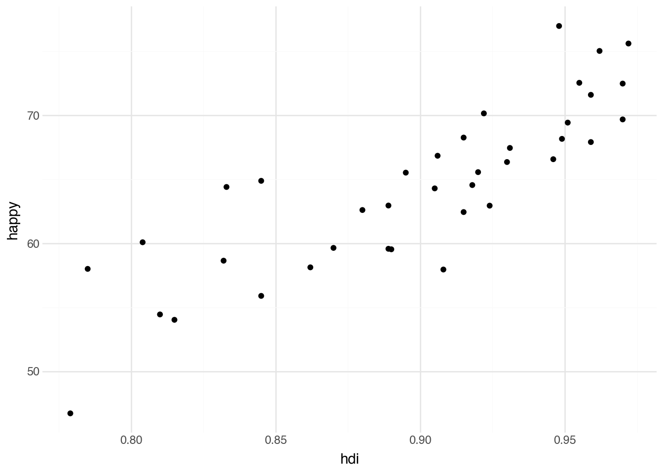
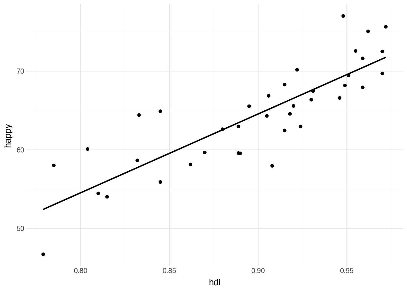
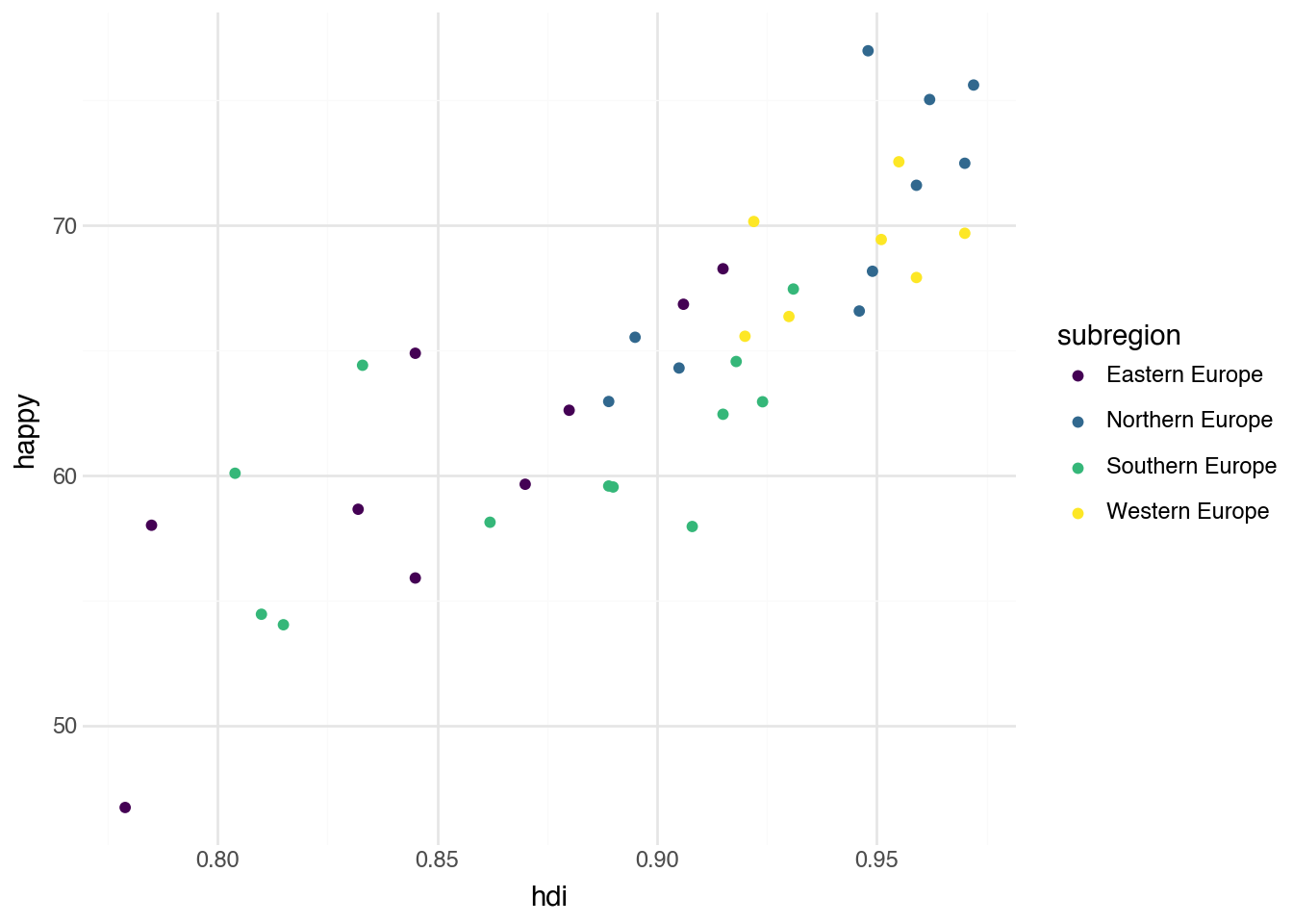
We can demonstrate the grammar of graphics by using the countries data, where each row corresponds to a particular country. The first plot we will make is a scatter plot that investigates the relationship between the Human Development Index (HDI)—a “composite index of life expectancy, education (mean years of schooling completed and expected years of schooling upon entering the education system), and per capita income indicators, which is used to rank countries into four tiers of human development”—and perceived happiness. In the language of the grammar of graphics, we begin describing this visualization by specifying the Python variable containing the data (country). Next, we associate the horizontal axis (the x aesthetic) with the column in the data named hdi. The vertical axis (the y aesthetic) can similarly be associated with the column named happy. We will make a scatter plot, with each point describing one of our metropolitan regions, which leads us to use a point geometry. Our plot will allow us to understand the relationship between city density and rental prices.
In Python, we need to use some special functions to indicate all of this information and to instruct the program to produce a plot. We start by specifying the name of the underlying dataset and applying the special method .pipe with its first argument set to the function ggplot. This indicates that we want to create a data visualization. In the second argument of that function we use the aes (short for aesthetics) function to specify the names of the x and y aesthetics corresponding to columns in the dataset. The plot itself is created by adding—literally, with the plus sign—the geom_point function. This function adds a point geometry (a layer of points) to the plot. Code to do this using the values described above is given below.
(
    country
    .filter(c.region == "Europe")
    .pipe(ggplot, aes("hdi", "happy"))
    + geom_point()
)
Choosing x and y aesthetics
When we have a scatter plot showing the relationship between two columns in a dataset, the usual convention is to put the quantity that is more likely to be a cause on the x-axis and the variable more likely to be the effect or outcome on the y-axis. Here, we put the HDI on the x-axis because it seems more likely that investment in human development leads to happier people rather than the other way around. This general rule can be broken when needed to make the plot more readable or to make it easier to compare with other related visualizations.
Running the code above will show the desired visualization directly below the code block. In this plot, each row of our dataset — a country — is represented as a point. The location of each point is determined by the country’s HDI and happiness score. Notice that Python has automatically made several choices for the plot that we did not explicitly indicate in the code. For example, the range of values on the two axes, the axis labels, the grid lines, and the tick marks. Python has also automatically picked the color, size, and shape of the points. While the defaults are a good starting point, it’s often useful to modify them; we will see how to change these aspects of the plot in later sections of this chapter.
As shown in the example, we can include data-manipulation code before the call to .pipe. This lets us seamlessly combine data manipulation and data visualization.
Scatter plots are typically used to examine the relationship between two numeric variables. What does our first plot tell us about the relationship between HDI and happiness? It appears that, at least in Europe, there is a generally positive relationship between investment in human development and the reported happiness of a population.
3.4 Optional Aesthetics
The point geometry requires x and y aesthetics. In addition to these required aesthetics, each geometry type also has several optional aesthetics that add information to the plot. For example, most geometries have a color aesthetic. The syntax for specifying this is similar to the required aesthetics, with the only difference being that we place the aesthetics inside the geom_point() function using another call to aes(). This is true for all aesthetics other than x and y. Let’s see what happens when we add a color aesthetic to our scatter plot by mapping the column subregion to the color aesthetic.
(
    country
    .filter(c.region == "Europe")
    .pipe(ggplot, aes("hdi", "happy"))
    + geom_point(aes(color="subregion"))
)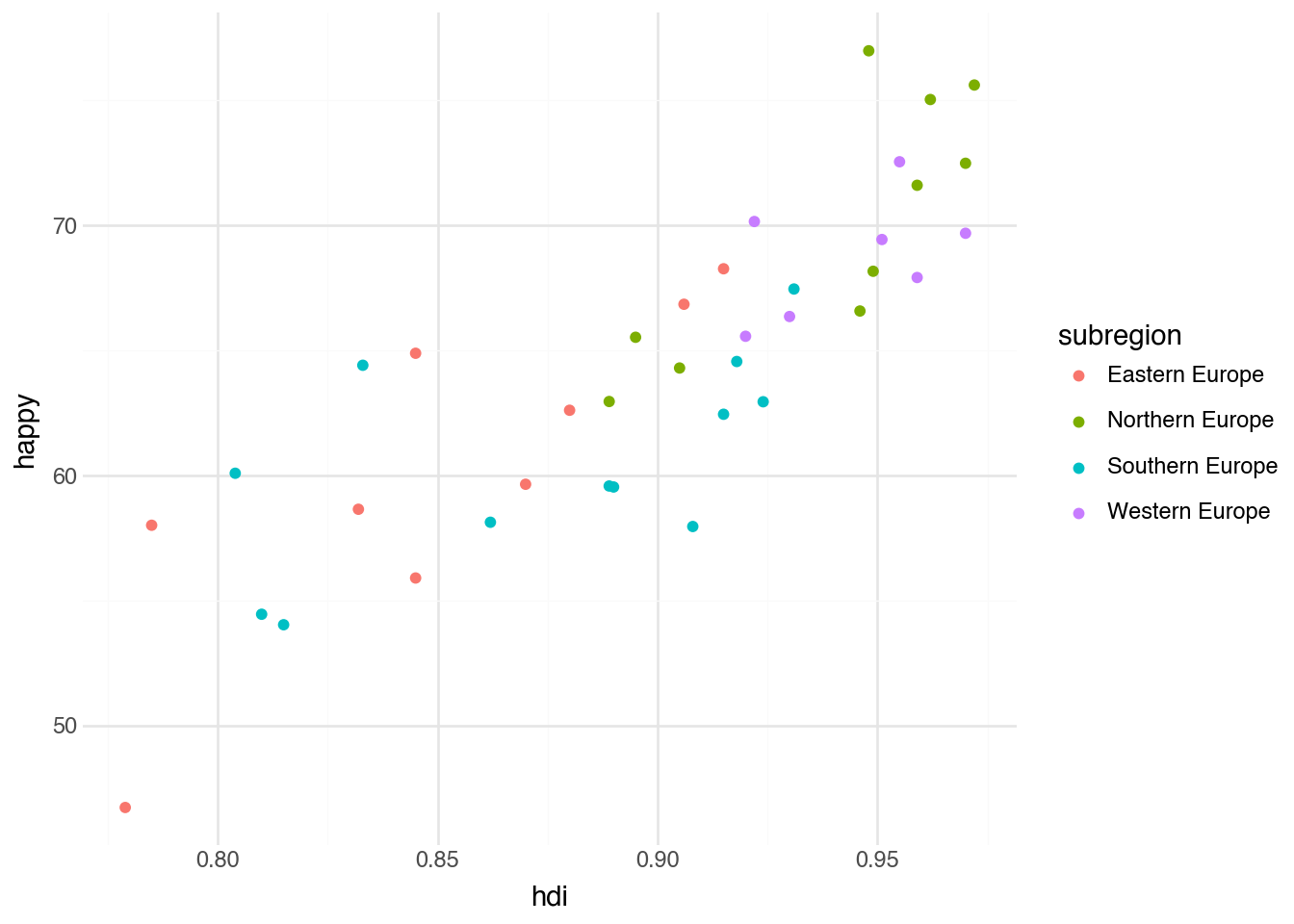
The result of associating a column in the dataset with a color produces a new variation of the original scatter plot. We have the same set of points and locations on the plot, as well as the same axes. However, now each subregion has been automatically associated with a color, and every point has been colored according to the subregion value in each row of the data. The mapping between colors and region names is shown in an automatically created legend on the right-hand side of the plot. The ability to add additional information to the plot by specifying a single aesthetic mapping illustrates how powerful the grammar of graphics is for quickly producing informative visualizations.
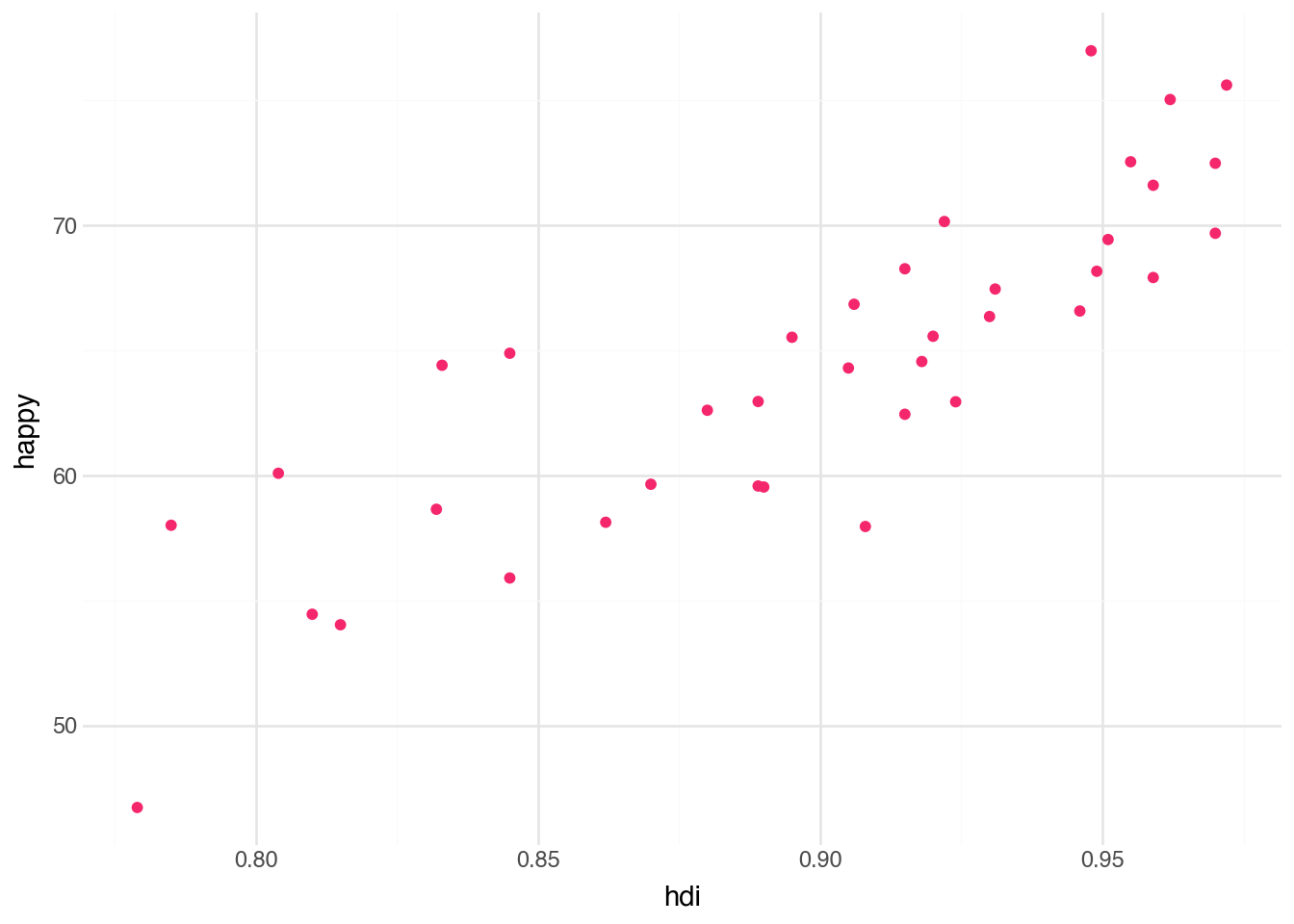
In the previous example, we changed the color aesthetic from the fixed default color of black to a color that varies with another variable. It is also possible to specify an alternative fixed value for any aesthetic. We can use the color names available in Python; for example, we might want all of the points to be a shade of green. This can be done with a small change to the function call: set the color aesthetic to the name of a color, such as “red”. However, unlike with variable aesthetics, the mapping needs to be done outside of the aes() function but still within the geom_* function. Below is an example of the code to recreate our plot with a different color. We use a color called “#F5276C”, which is a bright reddish-pink.
(
    country
    .filter(c.region == "Europe")
    .pipe(ggplot, aes("hdi", "happy"))
    + geom_point(color="#F5276C")
)
Hexadecimal color codes
The color code below uses a format called an HTML hexadecimal color code. These codes let us unambiguously describe a large number of colors with a single string. The first two characters specify the amount of red, the next two the amount of green, and the last two the amount of blue. The values are written in base-16 (hexadecimal) notation, where the digits a–f correspond to the numbers 10 through 15. Usually, people use an interactive website to determine the hex code for a desired color. One good choice is htmlcolorcodes.
Although minor, the change in notation for specifying fixed aesthetics is a common source of confusion for users new to the grammar of graphics; follow the correct argument syntax shown in the code above. You can interchange the fixed and variable aesthetic commands; the relative order should not affect the output. Just be sure to put fixed terms after finishing the aes() call.
While each geometry may have different required and optional aesthetics, the plotnine package tries, as much as possible, to use a common set of terms across geometries. Here are some typical aesthetics we’ll see for most geometries:
color: the color of points, lines, or the insides of boxesfill: the interior color of boxes and polygonsalpha: controls the opacity of objects; set to a number between 0 and 1size: controls the size of the points, boxes, font etc. of the layershape: controls the shape of the pointsgroup: groups together data without changing the color; useful for lines
Some of these, such as alpha, are most frequently used with fixed values. If needed, however, almost all can be provided with a variable mapping.
3.5 Text Geometry
A common critique of computational methods is that they obscure close understanding of each individual object of study by focusing on numeric patterns. This is an important caution: computational analysis should be paired with close analysis. However, visualizations do not always have to reduce complex collections to a few numerical summaries, especially when the dataset contains a relatively small number of observations. Looking back at our first scatter plot, how could we recover a closer analysis of individual countries while also looking for general patterns between the two variables? One option is to add labels indicating the names of the countries. These labels allow viewers to bring their own knowledge of the countries as an additional layer of information when interpreting the plot.
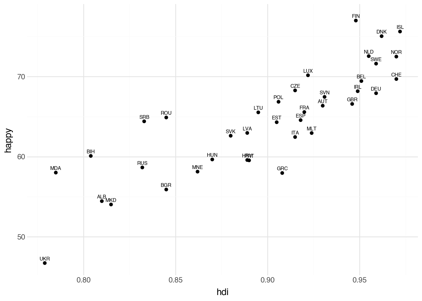
Adding the names of the countries can be done by using another type of geometry, called text geometry. This geometry is created with the function geom_text. For each row of a dataset, this geometry adds a small textual label. As with the point geometry, we must specify which columns of our data correspond to the x and y aesthetics; these values tell the plot where to place the label. Additionally, the text geometry requires an aesthetic called label that provides the text for each label. In our case, we will use the column called iso to make textual labels on the plot based on the three-letter ISO abbreviation of the country. The code block below produces a plot with text labels by changing the geometry type and adding the label aesthetic.
(
    country
    .filter(c.region == "Europe")
    .pipe(ggplot, aes("hdi", "happy"))
    + geom_text(aes(label="iso"))
) 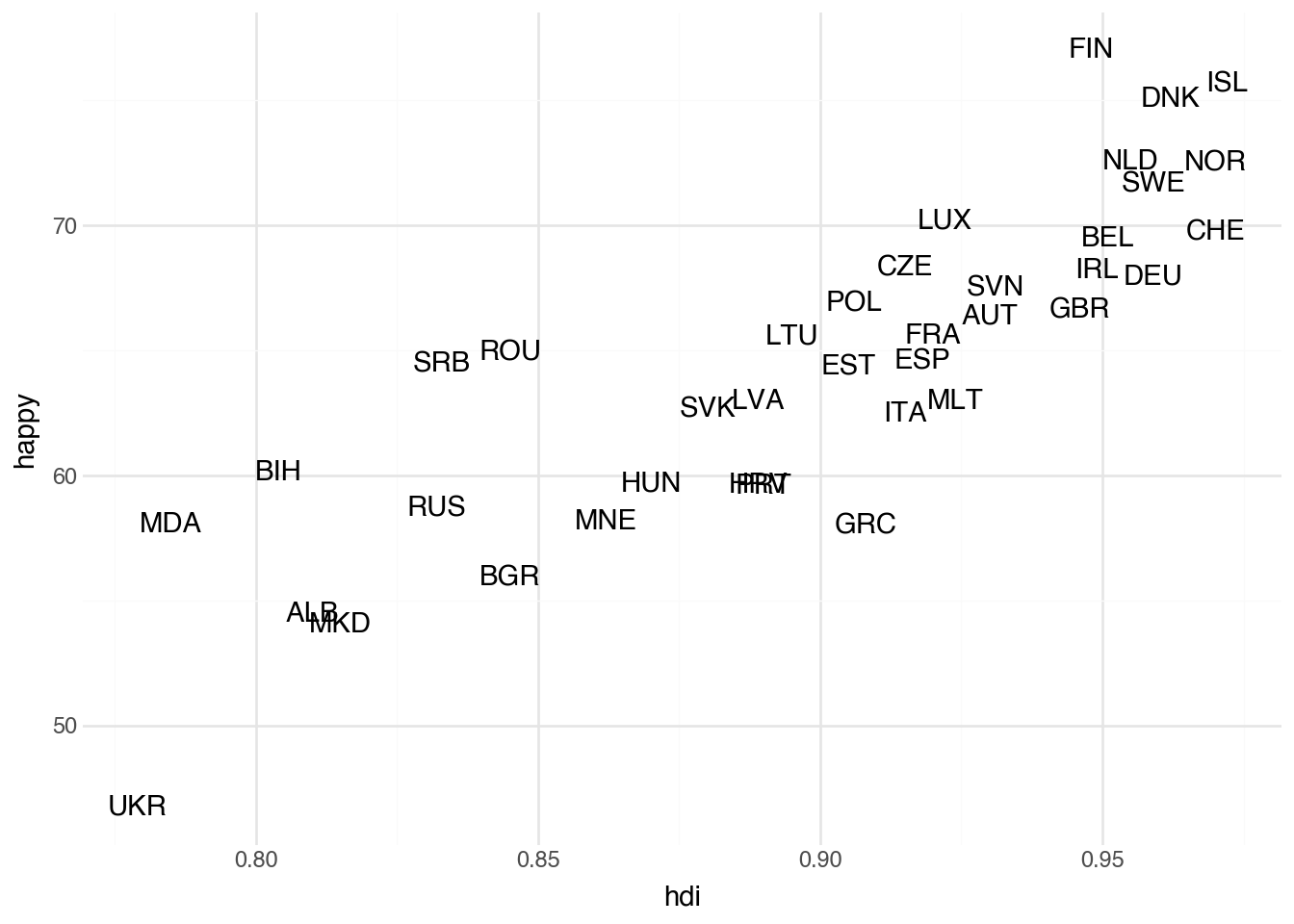
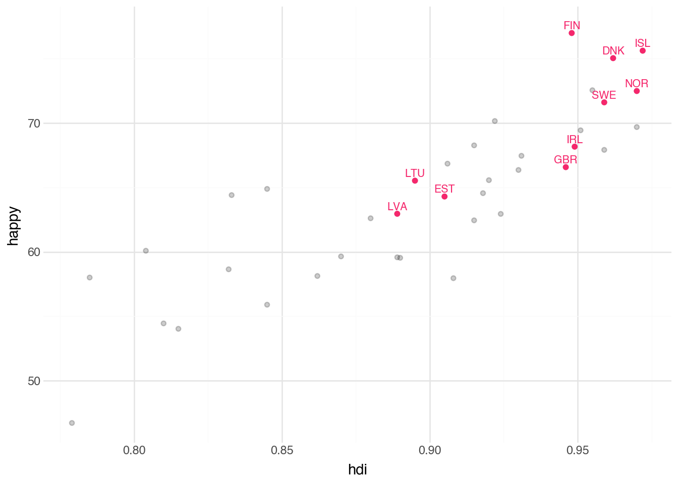
The plot generated by the code now allows us to see which countries have the highest levels of happiness (Finland, Iceland, and Denmark) and which have the highest levels of HDI (Iceland, Norway, and Switzerland (CHE)). While we added only a single additional piece of information to the plot, each label uniquely identifies a row of the data. This allows anyone familiar with them to bring many more characteristics of each data point to the plot through their own knowledge. For example, although the plot does not include any information about geography, anyone familiar with Europe will note that the Scandinavian countries are clustered together in the upper-right corner of the plot.
Although the text plot adds contextual information compared with the scatter plot, it has some shortcomings. Some labels overlap and become difficult to read, and these issues will only worsen if we increase the number of regions in our dataset. It is also unclear which part of a label corresponds to a country’s HDI or happiness score: the center, the start, or the end? We could add a note that the value refers to the center of the label, but that becomes cumbersome to remember and to keep reminding others about.
To start addressing these issues, we can add the points back into the plot, with labels. We do this in Python by adding the two geometry layers (geom_point and geom_text) one after the other. This makes it clearer where each region is located on the x-axis, but it also makes the country names harder to read. To fix that, we’ll add options to the text geometry to nudge the labels upward and reduce their size. Below is the code that makes both of these modifications.
(
    country
    .filter(c.region == "Europe")
    .pipe(ggplot, aes("hdi", "happy"))
    + geom_point()
    + geom_text(aes(label="iso"), size=6, nudge_y=0.5)
) 
The plot with points and text labels shows that we attempted to avoid overlapping labels by nudging them slightly. The points indicate the specific HDI and happiness scores, while the labels identify which country each point represents.
Another alternative is to use the special geom_text_repel geometry, which takes into account overlapping labels, trying to move them if possible and removing those that cannot be placed easily. Often it is useful to change the color of the points so that the labels can partially sit on top of the points while still being readable.
(
    country
    .filter(c.region == "Europe")
    .pipe(ggplot, aes("hdi", "happy"))
    + geom_point(color="#dddddd")
    + geom_text_repel(aes(label="iso"), size=6)
) 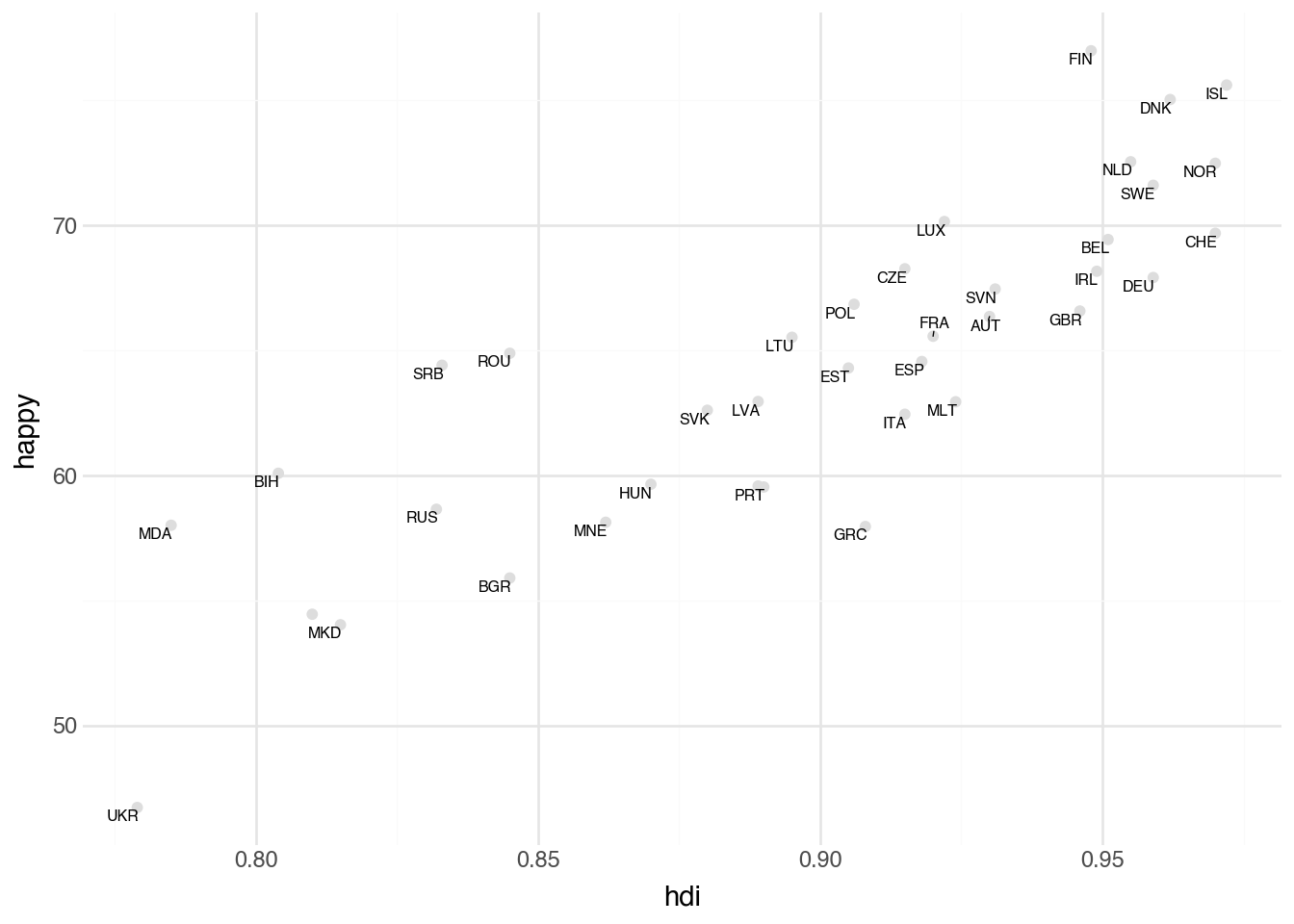
Notice that we need no custom nudging of the data and all of the labels shown are easily readable. The downside is that Albania (ALB) is no longer labelled. We could try to be more aggresive in retaining labels by setting box_scale (default 1.0) to a smaller value, at the risk of creating overlapping text.
3.6 Lines and Bars
The plotnine package supplies a large number of different geometries. In this section, we will look at two additional geometry types that allow us to investigate common relationships among the columns of a dataset.
For a moment, we look at the cellphone dataset that shows the number of cellphones per one-hundred people over a twenty-year period for each country. Consider a visualization showing the change in the number of cellphones over time. We could create a scatter plot where each point represents a row of the data, the x aesthetic captures the year of each record, and the y aesthetic measures the number of phones. This visualization would be fine and would roughly help us understand changes in cellphone ownership. A more common visualization for data of this format, however, is a line plot, where the values in each year are connected by a line to the values in the subsequent year. To create such a plot, we can use the geom_line geometry. It is most commonly used when the horizontal axis measures some unit of time but can represent other quantities that we expect to change continuously and smoothly between measurements on the x-axis. The line geometry uses the same aesthetics as the point geometry and can be created with the same syntax, as shown in the following block of code.
(
    cellphone
    .filter(c.iso.is_in(["USA", "GBR", "IRL", "CAN"]))
    .pipe(ggplot, aes("year", "cell"))
    + geom_line(aes(color="iso"))
)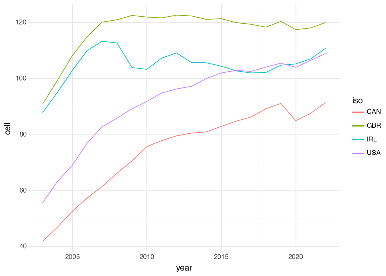
The output of this visualization shows how the number of cell phones changes over time. The numbers generally increase slowly in North American countries. In Great Britain, they plateau near 2010, while in Ireland they decrease slightly from a peak around 2007.
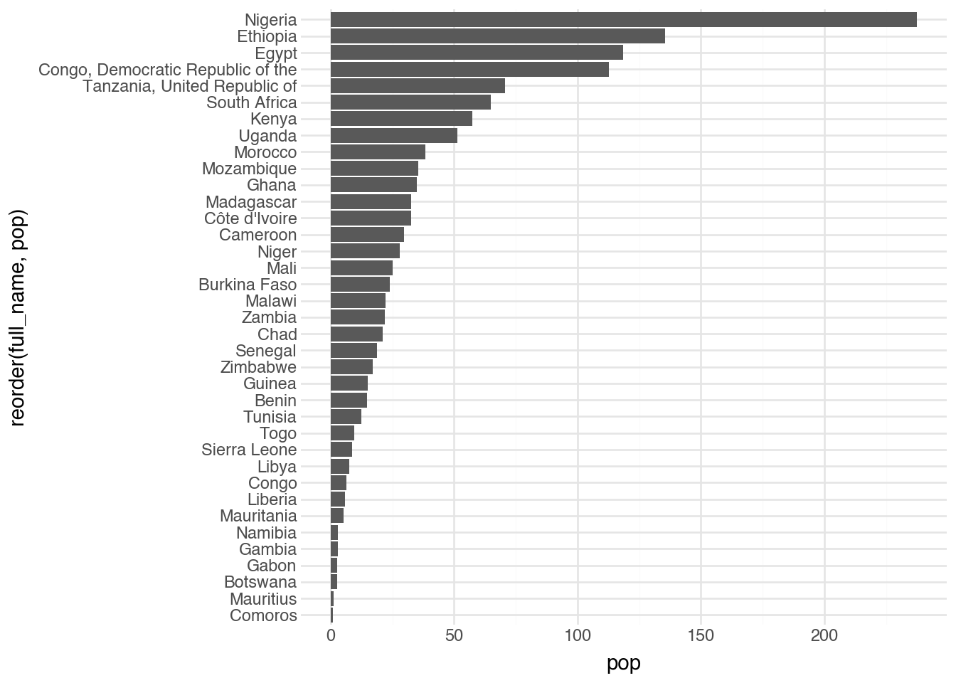
Another common use of visualization is to compare the values of a numeric column with the categories of a categorical column. You can represent this relationship with a geom_point layer, but it is often more meaningful visually to use a bar for each category, with the height or length of the bar representing the numeric value. This type of plot is common for showing counts of categories (something we will see in the next chapter), but it can be used whenever a numeric value is associated with different categories. To create a plot with bars, we use the geom_col function, providing both x and y aesthetics. By default the categorical variable maps to x and the numeric variable maps to y, but it is often easier to read the other way around. To address this, we add the coord_flip() layer, which flips the axes. The code block below shows the complete commands to create a bar plot of the population for each country in Africa from our dataset.
(
    country
    .filter(c.region == "Africa")
    .pipe(ggplot, aes("full_name", "pop"))
    + geom_col()
    + coord_flip()
)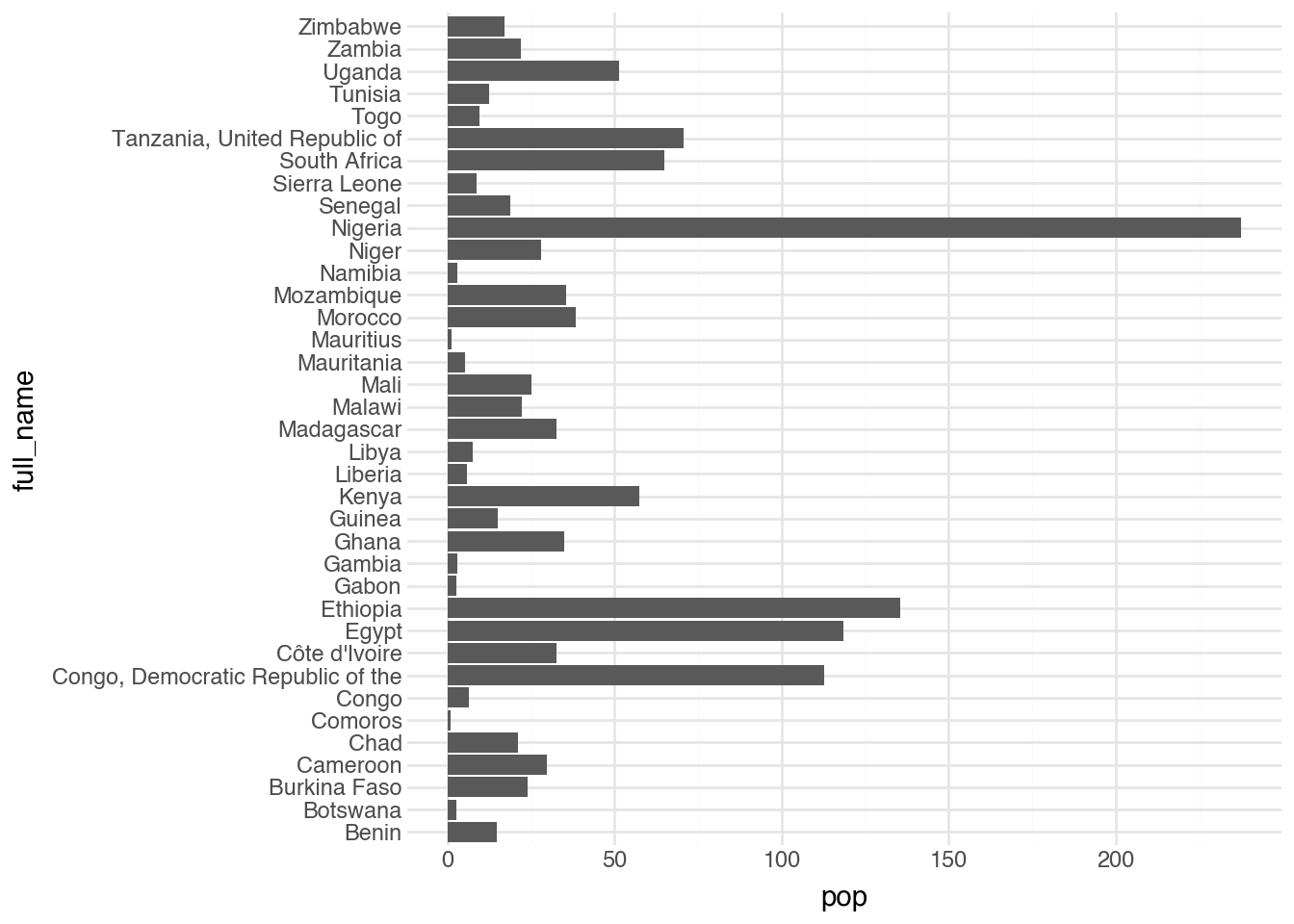
One of the first things that stands out in the output is that the regions are ordered alphabetically from bottom to top. The visualization would be much more useful and readable if we could reorder the categories on the y-axis. To do this, we apply the helper function reorder directly inside the graphics code. The function needs to know the name of the variable being reordered and the name of the variable by which it is being reordered.
(
    country
    .filter(c.region == "Africa")
    .pipe(ggplot, aes("reorder(full_name, pop)", "pop"))
    + geom_col()
    + coord_flip()
)
This function can be applied to other aesthetics, including color, to change the order of categories in the corresponding legend. There is another similar function called factor() that is also added inside of the quotes passed to plotnine functions. This forces a variable to be treated as categorical, even if it is stored as a number. This can be helpful for a number of different applications as we will see in the notebooks.
3.7 Statistics
All the geometries we’ve seen so far directly visualize the rows in the dataset, with one element in the output corresponding to each row in the data. Several geometries first compute summary statistics before plotting. Their aesthetics correspond to the data-summarization process rather than to individual elements in the output. Let’s look at a few common examples.
We can use the geom_smooth() geometry, with the option method = "lm", to add a line of best fit to the dataset. By default, it adds a confidence band, which we turn off in the code below by setting se = FALSE.
(
    country
    .filter(c.region == "Europe")
    .pipe(ggplot, aes("hdi", "happy"))
    + geom_point()
    + geom_smooth(method="lm", se=False)
)
We can produce more complex, non-linear smoothing curves by calling geom_smooth() without additional parameters.
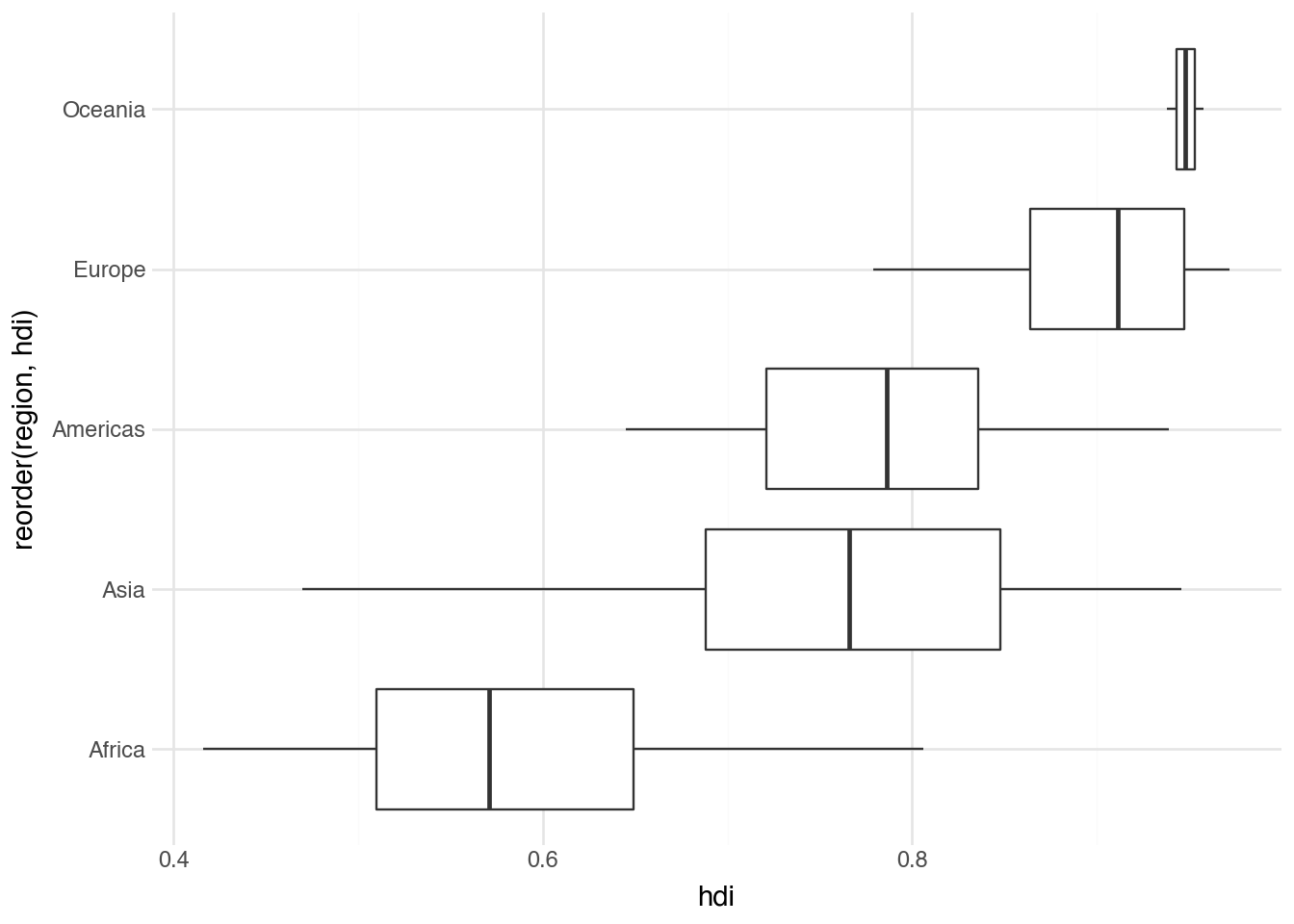
A boxplot lets us see the relationship between a categorical variable and a continuous one. For each category, we plot the 25th, 50th (median), and 75th percentiles as a box with a solid line for the median. A pair of lines, called “whiskers,” extend outward to indicate where most of the remaining data lie. Outliers are plotted as individual points. Often, this involves using reorder() and coord_flip(). Below is an example showing the distribution of HDI values within each region.
(
    country
    .pipe(ggplot, aes("reorder(region, hdi)", "hdi"))
    + geom_boxplot()
    + coord_flip()
)
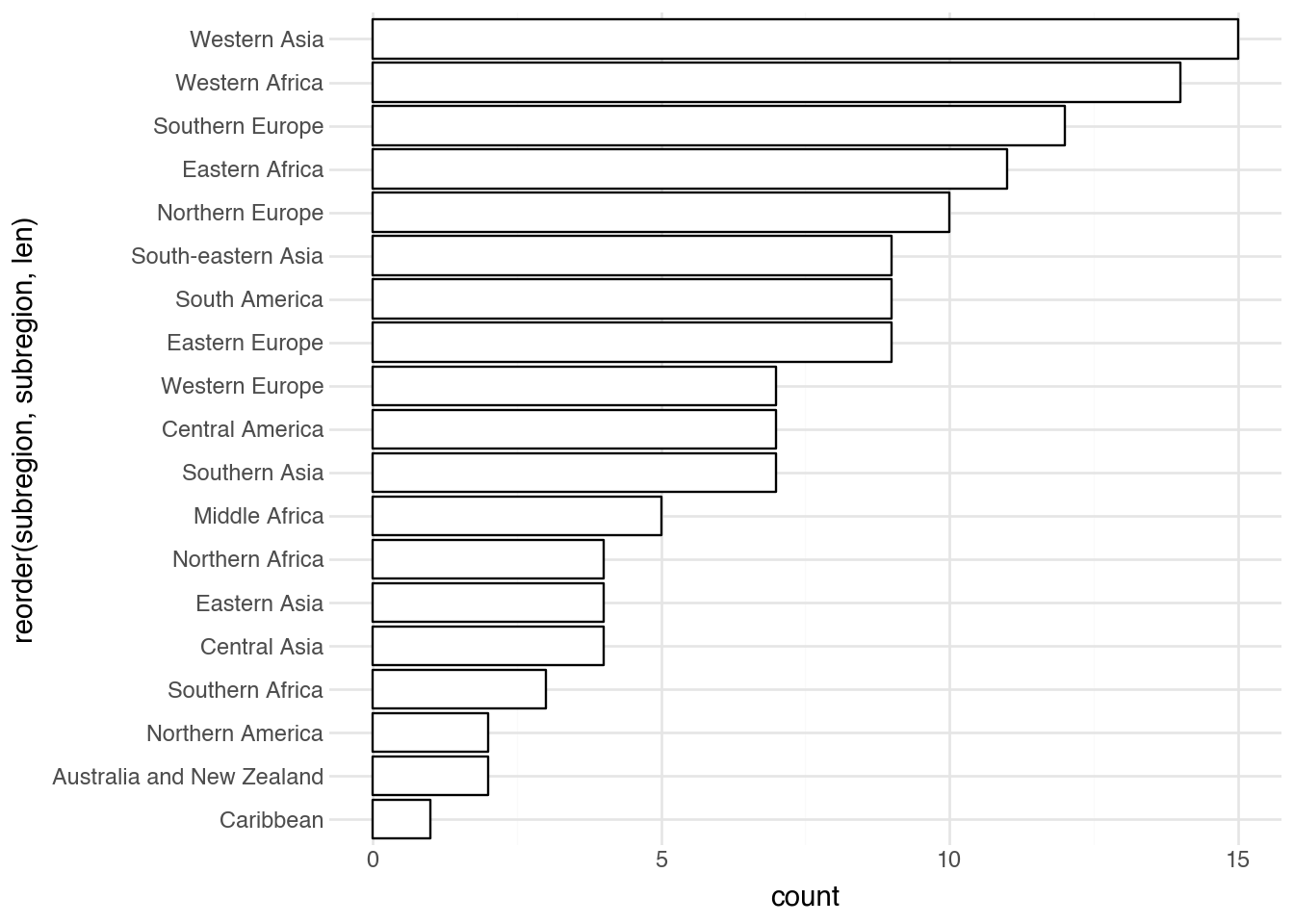
Certain statistics-based geometries create the y aesthetic directly from the data. These are used to show the univariate distribution of a variable in our dataset. For example, a bar plot using geom_bar takes a categorical variable as a single aesthetic and counts the number of values in each category. The default colors are hard to read, so we change them and flip the coordinates to prevent labels from overlapping. Finally, we can use a special call to reorder to display the results in order of frequency.
(
    country
    .pipe(ggplot, aes("reorder(subregion, subregion, len)"))
    + geom_bar(fill="white", color="black")
    + coord_flip()
)
To summarize the distribution of a numeric variable, the equivalent of a bar plot is a histogram, which we create with geom_histogram. The output is easiest to interpret if we set binwidth and boundary to control the width of each bin and how bins are offset from zero. For example, the code below creates histograms that align neatly in groups with a bin width of 0.1. The output shows how many countries fall into each bin.
(
    country
    .pipe(ggplot, aes("hdi"))
    + geom_histogram(fill="white", color="black", binwidth=0.1, boundary=0)
)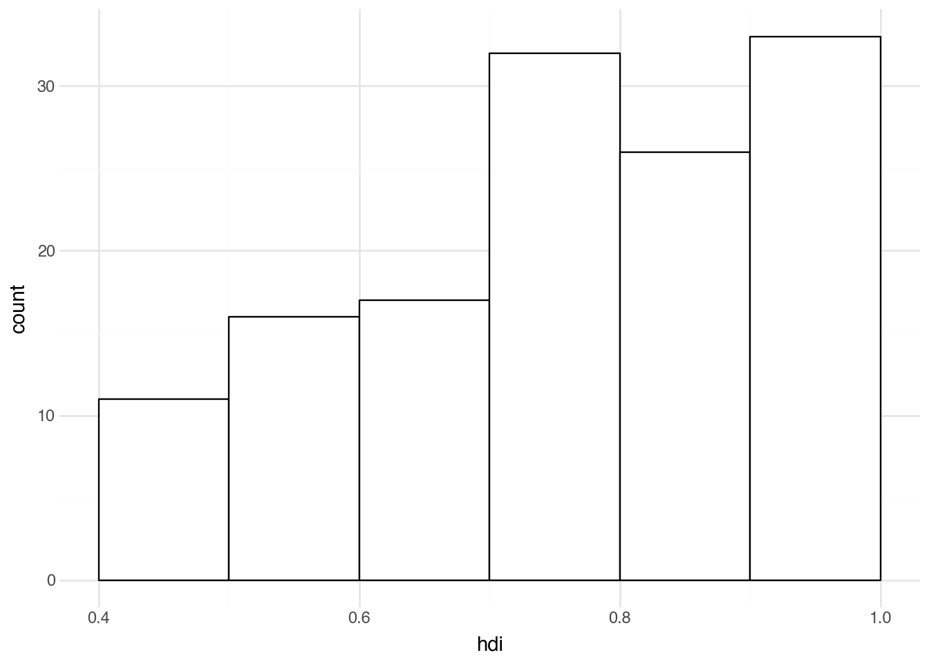
Interpreting a histogram
If you find interpreting a histogram difficult, it can help to walk through a concrete example. Take the example above and look at the first bar, which spans from 0.4 to 0.5 on the x-axis. The height on the y-axis appears to be 11, indicating that there are 11 countries in the dataset with an HDI value between 0.4 and 0.5. Similarly, it appears there are around 26 countries with an HDI between 0.8 and 0.9, and around 33 with a value between 0.9 and 1.0.
We can also simply set bins=<int> to define the total number of bins. This is an easier way to quickly create results without knowing the scale of the data. However, the resulting counts can be harder to interpret directly.
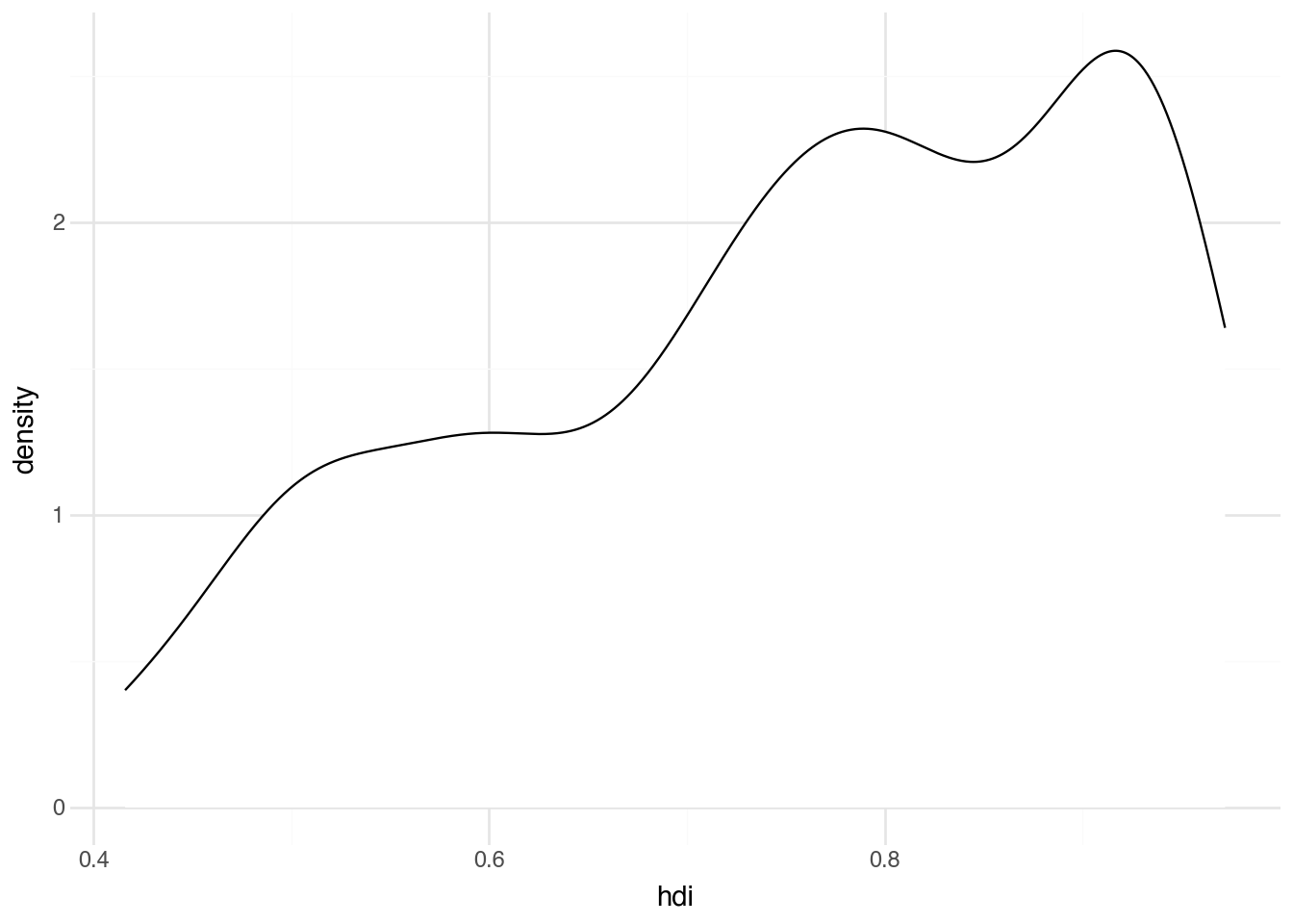
An alternative to a histogram is a density plot. This attempts to model, rather than just counting, the distribution of a continuous variable. The adjust option, which defaults to 1, controls how smooth the distribution is. Higher values produce smoother curves, while lower values more closely fit the data. Trying different values can help you find the one that best reveals the relationship you are interested in.
(
    country
    .pipe(ggplot, aes("hdi"))
    + geom_density(fill="white", color="black", adjust=0.8)
)
Interpreting a density plot
The total area under a density plot equals 1. The integral of the density function between two points (i.e., the area under the curve between those bounds) gives the proportion of observations that fall between those values. With a larger dataset, the density should resemble the histogram’s shape, differing only by scale and being slightly smoother.
All of the statistics-based geometries in the section can take an aesthetic called group or color that causes the summaries to be done separately for each unique value of group or color. This quickly becomes very messy and is advisable only when there are a small number (at most 4–5) of groups.
3.8 Scales
Python makes many choices for us automatically when creating any plot. In the example above, where we set the color of the points to follow another variable in the dataset, Python handles the details of how to pick the specific colors and sizes. It has figured out how large to make the axes, where to add tick marks, and where to draw grid lines. Letting Python deal with these details is convenient because it frees us to focus on the data itself. Sometimes, such as when preparing plots for external distribution or when the defaults are particularly hard to interpret, it is useful to manually adjust these details. This is exactly what scales are designed for.
Each aesthetic within the grammar of graphics is associated with a scale. Scales detail how a plot maps aesthetics to concrete, perceivable features. For example, a scale for the x aesthetic describes the smallest and largest values on the x-axis and encodes how to label that axis. Similarly, a color scale describes what colors correspond to each category in a dataset and how to format a legend for the plot. To modify the default scales, we add an additional function to the code. The order of the scales relative to the geometries does not affect the output; by convention, scales are usually grouped after the geometries.
For example, a popular alternative to the default color palette shown in our previous plot is the function scale_color_cmap_d(). It constructs a set of colors that are color-blind friendly, print well in black and white, and display clearly on poor projectors. After mapping a geometry’s color to a column in the dataset, add this scale by including the function as an extra line in the plot. An example is shown in the following code.
(
    country
    .filter(c.region == "Europe")
    .pipe(ggplot, aes("hdi", "happy"))
    + geom_point(aes(color="subregion"))
    + scale_color_cmap_d()
)
The output shows that the colors now range from dark purple to bright yellow instead of the rainbow of colors in the default plot. As with the categories in the bar plot, the ordering of the unique colors is determined by putting the categories in alphabetical order. Changing this requires modifying the dataset before passing it to the plot, which we will discuss in the next chapter. Note that the _d at the end of the scale function indicates the colors are used to create mappings for a character variable (it stands for “discrete”). There is also a complementary function scale_color_cmap() that produces a similar set of colors when making the color of the points vary according to a numeric variable.
Many other scales exist to control various aesthetics. For example, scale_size_area can make point sizes proportional to another column in the dataset. Several scales control the x and y axes; for example, we can add scale_x_log10() and scale_y_log10() to a plot to display values on a logarithmic scale, which is useful with heavily skewed datasets. We’ll use these in later chapters as needed.
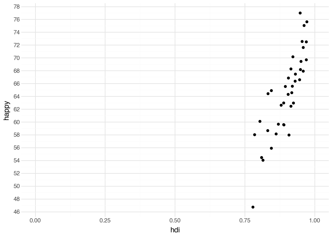
The default scale for the x-axis is called scale_x_continuous. A corresponding function, scale_y_continuous, is the default for the y-axis. Adding these to a plot by themselves has no visible effect. However, there are many optional arguments we can provide to these functions that change how a plot is displayed. Setting breaks within one of these scales tells Python how many labels to put on the axis. Usually we use a helper function to set them, such as breaks_width. We can set limits to a pair of numbers to specify the start and end of the plotted range. Below is the code to produce a plot that shows the same data as our original scatter plot but with modified grid lines, axis labels, and vertical range.
(
    country
    .filter(c.region == "Europe")
    .pipe(ggplot, aes("hdi", "happy"))
    + geom_point()
    + scale_x_continuous(breaks=True, limits=(0, 1))
    + scale_y_continuous(breaks=breaks_width(2))
)
Finally, there are two special scale types that can be useful for working with colors. In some cases, a column in the dataset already specifies the color of each observation; in that case, it’s sensible to use those colors directly. To do that, add the scale scale_color_identity to the plot. Another useful scale for colors is scale_color_manual; with it, you can specify exactly which color should be used for each category. Below is the syntax for specifying manual colors for each region in the countries dataset.
(
    country
    .filter(c.region == "Europe")
    .pipe(ggplot, aes("hdi", "happy"))
    + geom_point(aes(color="subregion"))
    + scale_color_manual(values={
        "Eastern Europe": "lightblue",
        "Northern Europe": "navy",
        "Southern Europe": "peachpuff",
        "Western Europe": "wheat"
    })
)
Using manual colors is generally advisable when there are well-known colors associated with the groups in the dataset. For example, when plotting data about political parties, it may be helpful to use the colors traditionally associated with each party. The plotnine documentation includes additional ways to customize visualizations using a variety of alternative scales.
3.9 Multiple Datasets
So far, we have seen how to create visualizations using multiple layers with a single dataset. It is also possible to use different datasets in each layer by defining the data= argument for a specific geometry. When setting the data= argument for a geometry, it affects only that geometry; all other geometries will continue to use the default dataset.
A common reason to use two different datasets in the same plot is to highlight a subset of points within a larger dataset.
country_ne = country.filter(c.subregion == "Northern Europe")
(
    country
    .filter(c.region == "Europe")
    .pipe(ggplot, aes("hdi", "happy"))
    + geom_point(alpha=0.2)
    + geom_point(color="#F5276C", data=country_ne)
    + geom_text(
        aes(label="iso"),
        color="#F5276C",
        nudge_y=0.5,
        size=8,
        data=country_ne
    )
)
This approach makes it easy to highlight the relationship between a subset of the data and the full dataset.
3.10 Facets
Another way to show differences across groups of a categorical variable is through facets. These create a grid of small plots in which the data is separated by one or two variables. This is done by adding the facet_wrap() function to the plot and supplying the grouping variable. Often, as in the example below, we add color mapped to the grouping variable and turn off the legend to visually indicate which data appears in each facet.
(
    country
    .pipe(ggplot, aes("hdi", "happy"))
    + geom_point(aes(color="region"), show_legend=False)
    + facet_wrap("region")
)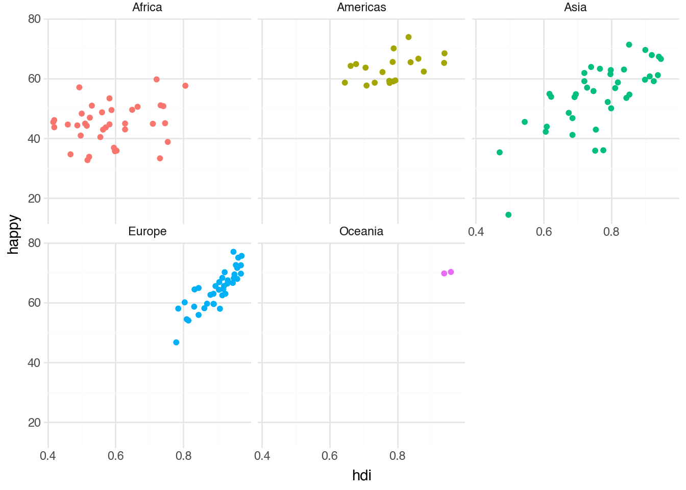
The space option can be set to fixed (the default), free_x, free_y, or free to control whether subplots share the same scales. The facet_grid function lets you supply two variables to arrange across rows and columns.
Facets can be very powerful and useful for making certain kinds of relationships more readable and make your outputs look very professional. However, take care in using them, as most people getting started in data science have a tendency to significantly overuse facets. Typically, they are best when we have only a small set of categories and have already used all of the other tricks in the sections above to visualize the patterns in the data.
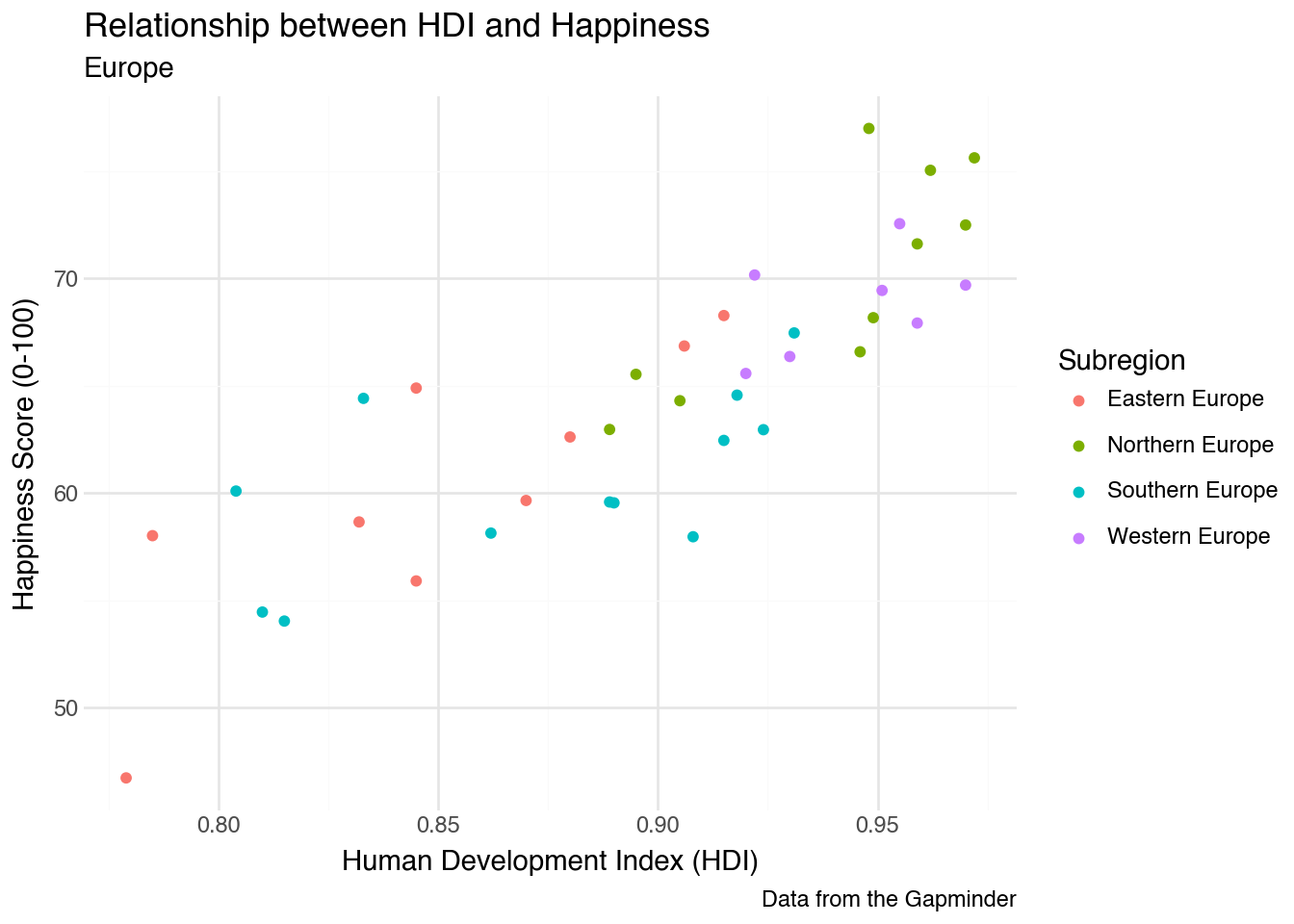
3.11 Labels and Themes
Throughout this chapter, we have seen a number of ways to create and modify data visualizations. One thing we did not cover was how to label our axes. While many data visualization guides stress the importance of labeling axes, it is often best to use the default labels provided by Python during the exploratory phase of analysis. These defaults are useful for several reasons. First, they require minimal effort and make it easy to change axes, variables, and other settings without spending time adjusting labels. Second, the default labels use the variable names in our dataset. When writing code, those names are exactly what we need to refer to a variable in additional plots, models, and data-manipulation tasks. Of course, when we want to present our results to others, it is essential to provide more detailed descriptions of the axes and legends in our plots. Fortunately, these can be added directly using the grammar of graphics.
In order to change the labels in a plot, we can use the labs function as an additional layer of our plot. Inside the function, we assign labels to the names of aesthetic values that we want to describe. Leaving a value unspecified will keep the default value in place. Labels for the x-axis and y-axis will be placed on the sides of the plot; labels for other aesthetics such as size and color will be placed in the legend. We can also add title, subtitle, and a caption to labs to provide additional information describing the plot as a whole. Here is an example of our color-coded scatter plot that includes a variety of labels.
(
    country
    .filter(c.region == "Europe")
    .pipe(ggplot, aes("hdi", "happy"))
    + geom_point(aes(color="subregion"))
    + labs(
        x="Human Development Index (HDI)",
        y="Happiness Score (0-100)",
        color="Subregion",
        title="Relationship between HDI and Happiness",
        subtitle="Europe",
        caption="Data from the Gapminder"
    )
)
Another way to prepare our graphics for distribution is to modify the theme of a plot. Themes affect the appearance of plot elements such as axis labels, ticks, and the background. Throughout this book, we’ve set the default plot theme to theme_minimal(). We think it’s a great choice for exploring a dataset. As the name implies, it removes much of the clutter of other themes while keeping grid lines and other visual cues that help with interpretation. When presenting information for external publication, we often prefer a theme based on the work of Edward Tufte, a well-known scholar in the field of data visualization. To set the theme, we can add theme_minimal() or another theme function to our plot, as in the example below.
theme_set(theme_minimal())Now, whenever we construct a plot, it will use the newly assigned theme. Minimal themes are designed to use as little “ink” as possible, focusing the reader on the data [3]. They can be a bit too minimal when first exploring a dataset, but are a great tool for presenting results. Again, there are many resources online to customize them according to our needs.
3.12 Best Practices
While the focus of this chapter has been how to create certain graphics, it will be helpful to have a few guiding principles about which graphics to create for certain applications. These are general best practices that you may need to break for specific tasks.
- Use barplots, histograms, and density plots to understand the distribution of a single variable.
- Use scatter plots (points) and boxplots to understand the relationship between two variables.
- Use scatter plots with text labels to understand individal data points, either as a whole or in relationship to a larger set.
- Only use variable color scales when you have already made use of the x- and y-aesthetics as much as possible.
- Size and color for continuous variables should be used as an extra element, not the primary one. Do not use size for categorical variables.
- Color and shape should only be used when we have a small set of categories. The exact cut-off depends on the overall datasize and application, but 8 is a good rough number.
- Line plots should be reserved for the case where a single quantity is measured over time, space, or another continuous variable.
The best way to understand which plots to make for applications — and when it’s appropriate to break those rules — is to see many examples. We’ll do this throughout the remainder of this text.
3.13 Coming from R
There is a relatively small gap between R’s ggplot2 package and plotnine. plotnine was intentionally created to mirror R’s ggplot2 as closely as possible in Python. The only differences are that variable names must be quoted, the entire code block is enclosed in parentheses, and the plus sign is placed at the start of the line rather than the end. Placing the plus sign at the start helps avoid many common errors and makes it easier to comment out particular lines of code when testing.
References
[1]
Lavanya, A, Gaurav, L, Sindhuja, S, Seam, H, Joydeep, M, Uppalapati, V, Ali, W and SD, V S (2023 ). Assessing the performance of python data visualization libraries: A review. Int. J. Comput. Eng. Res. Trends. 10 28–39
[2]
Wilkinson, L (2012 ). The Grammar of Graphics. Springer
[3]
Tufte, E (1987 ). The Visual Display of Quantitative Information. Graphics Press