import numpy as np
import polars as pl

from funs import *
from plotnine import *
from polars import col as c
theme_set(theme_minimal())

country = pl.read_csv("data/countries.csv")12 Unsupervised Learning
12.1 Setup
Load all of the modules and datasets needed for the chapter.
12.2 Introduction
In the previous chapter, we explored supervised learning, where we used labeled data to train models that predict outcomes for new observations. Every training example had both input features and a known target value, and our goal was to learn the relationship between them. In this chapter, we turn to a fundamentally different task: extracting structure from data when no target variable exists. This is the domain of unsupervised learning.
Unsupervised learning addresses two primary questions. First, can we reduce the complexity of high-dimensional data while preserving its essential structure? A dataset with dozens or hundreds of variables is difficult to visualize and may contain redundant information. Dimensionality reduction techniques compress such data into a smaller number of dimensions that capture the most important patterns. Second, can we discover natural groupings in data without being told what those groups should be? Clustering algorithms identify observations that are similar to each other and different from observations in other groups, revealing structure that might not be apparent from examining individual variables.
These techniques are valuable in their own right for exploratory analysis and visualization, but they also serve as preprocessing steps for supervised learning. Reducing dimensions before fitting a predictive model can improve computational efficiency, reduce overfitting, and sometimes even improve predictive accuracy by eliminating noise. Similarly, cluster labels can become features in a supervised model or help identify distinct subpopulations that might benefit from separate modeling approaches.
The methods in this chapter differ from those in previous chapters in an important way: there is no obvious measure of success. In supervised learning, we can evaluate a model by comparing its predictions to known outcomes on held-out data. In unsupervised learning, we lack this external benchmark. Whether a dimensionality reduction captures the “right” structure or a clustering produces “meaningful” groups depends on the goals of the analysis and often requires domain expertise to assess. This subjectivity does not make these methods less useful—it simply means we must be thoughtful about interpreting and validating their results.
We organize this chapter around the two main tasks of unsupervised learning. We begin with dimensionality reduction, covering principal component analysis (PCA) as a foundational linear method, then introduce UMAP and t-SNE as nonlinear alternatives better suited for visualization. We then turn to clustering, examining k-means as a classic approach and DBSCAN as a density-based alternative. We conclude by showing how unsupervised methods can be combined with the supervised techniques from the previous chapter.
12.3 Principal Components (PCA)
Principal component analysis, commonly known as PCA, is the most widely used technique for dimensionality reduction. The core idea is to find new variables, called principal components, that are linear combinations of the original variables and capture as much of the variation in the data as possible. The first principal component is the direction along which the data vary the most. The second principal component is the direction of maximum remaining variation, subject to being perpendicular (orthogonal) to the first. Subsequent components follow the same pattern, each capturing the maximum variation while remaining perpendicular to all previous components.
To understand this more precisely, suppose we have \(n\) observations and \(p\) variables. For each observation \(i\), we have measurements \(x_{i1}, x_{i2}, \ldots, x_{ip}\). The first principal component is a weighted combination of these variables:
\[ \text{PC}_1 = w_{11} x_1 + w_{12} x_2 + \cdots + w_{1p} x_p \]
The weights \(w_{11}, w_{12}, \ldots, w_{1p}\) are chosen to maximize the variance of \(\text{PC}_1\) across all observations, subject to the constraint that the sum of the squared weights equals one (this normalization prevents us from making the variance arbitrarily large by simply increasing the weights). The second principal component takes the same form:
\[ \text{PC}_2 = w_{21} x_1 + w_{22} x_2 + \cdots + w_{2p} x_p \]
Here the weights are chosen to maximize variance subject to two constraints: the squared weights sum to one, and \(\text{PC}_2\) is uncorrelated with \(\text{PC}_1\). This process continues until we have \(p\) principal components, though in practice we typically keep only the first few.
The power of PCA lies in the fact that, for many datasets, the first few components capture the vast majority of the total variation. If two or three components explain 90% of the variance, we can visualize the data in two or three dimensions without losing much information. Even when visualization is not the goal, reducing from hundreds of variables to tens can dramatically speed up subsequent analyses while preserving the signal in the data.
Standardization
Before applying PCA, it is standard practice to center each variable (subtract its mean) and by dividing by the standard deviation. Centering ensures the principal components pass through the center of the data. Standardization ensures that variables measured on different scales contribute equally to the analysis. Without standardization, a variable measured in thousands (like GDP) would dominate one measured in single digits (like a happiness index) simply because of the units chosen. The DSSklearn class handles standardization automatically, but this is worth keeping in mind when interpreting results or applying PCA in other contexts.
Let’s apply PCA to our country dataset. We select four variables—the Human Development Index (hdi), GDP per capita (gdp), cellphone subscriptions per 100 people (cellphone), and a happiness score (happy)—and reduce them to two dimensions. The DSSklearn.pca method takes a list of feature columns, and the number of components to compute.
(
    country
    .pipe(
        DSSklearn.pca,
        features=[c.hdi, c.gdp, c.cellphone, c.happy],
        n_components=2
    )
    .predict()

)
shape: (135, 2)
| dr0 | dr1 |
|---|---|
| f64 | f64 |
| -1.758354 | 0.147961 |
| -0.394464 | 0.548632 |
| 2.891235 | 0.426905 |
| 1.921109 | -1.266114 |
| -1.176426 | 0.257248 |
| … | … |
| -0.038424 | 0.1643 |
| 0.785001 | 0.317731 |
| 0.243163 | 1.053777 |
| 1.615747 | -0.082606 |
| -2.132016 | -0.170759 |
The output is a DataFrame with two columns, dr0 and dr1, representing the first and second principal components for each country. These new variables are uncorrelated with each other and together capture the maximum possible variance from the original four variables in just two dimensions.
Often we want to retain the original data alongside the principal components for further analysis or visualization. The full=True option accomplishes this by appending the components to the original DataFrame rather than returning only the reduced representation.
(
    country
    .pipe(
        DSSklearn.pca,
        features=[c.hdi, c.gdp, c.cellphone, c.happy]
    )
    .predict(full=True)

)
shape: (135, 19)
| iso | full_name | region | subregion | pop | lexp | lat | lon | hdi | gdp | gini | happy | cellphone | water_access | lang | dr0 | dr1 | dr2 | dr3 |
|---|---|---|---|---|---|---|---|---|---|---|---|---|---|---|---|---|---|---|
| str | str | str | str | f64 | f64 | f64 | f64 | f64 | i64 | f64 | f64 | f64 | f64 | str | f64 | f64 | f64 | f64 |
| "SEN" | "Senegal" | "Africa" | "Western Africa" | 18.932 | 70.43 | 14.366667 | -14.283333 | 0.53 | 4871 | 38.1 | 50.93 | 66.0 | 54.93987 | "pbp|fra|wol" | -1.758354 | 0.147961 | 0.404841 | -0.572315 |
| "VEN" | "Venezuela, Bolivarian Republic… | "Americas" | "South America" | 28.517 | 76.18 | 8.0 | -67.0 | 0.709 | 8899 | 44.8 | 57.65 | 96.8 | 95.66913 | "spa|vsl" | -0.394464 | 0.548632 | 0.453292 | 0.009272 |
| "FIN" | "Finland" | "Europe" | "Northern Europe" | 5.623 | 82.84 | 65.0 | 27.0 | 0.948 | 57574 | 27.7 | 76.99 | 156.4 | 99.44798 | "fin|swe" | 2.891235 | 0.426905 | 0.482956 | -0.214911 |
| "USA" | "United States of America" | "Americas" | "Northern America" | 347.276 | 79.83 | 39.828175 | -98.5795 | 0.938 | 78389 | 47.7 | 65.21 | 91.7 | 99.72235 | "eng" | 1.921109 | -1.266114 | -0.272289 | 0.027414 |
| "LKA" | "Sri Lanka" | "Asia" | "Southern Asia" | 23.229 | 78.51 | 7.0 | 81.0 | 0.776 | 14380 | 39.3 | 36.02 | 83.1 | 90.77437 | "sin|sin|tam|tam" | -1.176426 | 0.257248 | -1.22158 | 0.696395 |
| … | … | … | … | … | … | … | … | … | … | … | … | … | … | … | … | … | … | … |
| "ALB" | "Albania" | "Europe" | "Southern Europe" | 2.772 | 79.67 | 41.0 | 20.0 | 0.81 | 20362 | 30.8 | 54.45 | 91.9 | 98.5473 | "sqi" | -0.038424 | 0.1643 | -0.033963 | 0.448928 |
| "MYS" | "Malaysia" | "Asia" | "South-eastern Asia" | 35.978 | 76.03 | 3.7805111 | 102.314362 | 0.819 | 35990 | 46.2 | 58.68 | 118.2 | 95.69194 | "msa" | 0.785001 | 0.317731 | -0.153479 | -0.012839 |
| "SLV" | "El Salvador" | "Americas" | "Central America" | 6.366 | 76.98 | 13.668889 | -88.866111 | 0.678 | 12221 | 38.3 | 64.82 | 126.9 | 86.19786 | "spa" | 0.243163 | 1.053777 | 0.761397 | -0.536137 |
| "CYP" | "Cyprus" | "Asia" | "Western Asia" | 1.371 | 81.77 | 35.0 | 33.0 | 0.913 | 55720 | 31.2 | 60.71 | 123.1 | 99.41781 | "ell|tur" | 1.615747 | -0.082606 | -0.440613 | 0.104972 |
| "PAK" | "Pakistan" | "Asia" | "Southern Asia" | 255.22 | 66.71 | 30.0 | 71.0 | 0.544 | 5717 | 29.6 | 45.49 | 49.8 | 61.92651 | "eng|urd" | -2.132016 | -0.170759 | 0.082109 | -0.313767 |
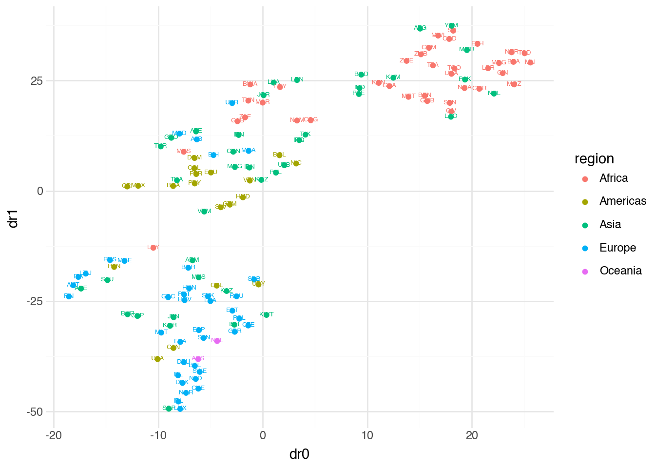
With the components added to our data, we can create a visualization that projects all 188 countries into two dimensions while preserving information about their region and identity. This type of plot reveals structure that would be impossible to see by examining the four original variables separately.
(
    country
    .pipe(
        DSSklearn.pca,
        features=[c.hdi, c.gdp, c.cellphone, c.happy]
    )
    .predict(full=True)
    .pipe(ggplot, aes("dr0", "dr1"))
    + geom_point(aes(color="region"))
    + geom_text(aes(color="region", label="iso"), nudge_y=0.05, size=5)
)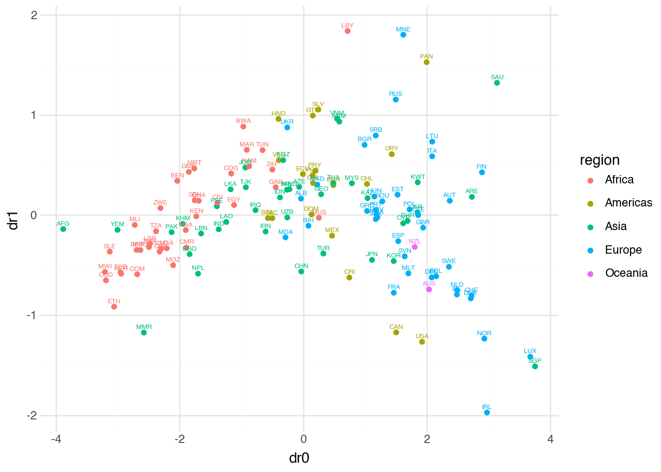
The visualization shows countries positioned according to their scores on the first two principal components. Countries that are similar across the four original variables appear close together in this reduced space. We can see regional patterns emerging: European countries cluster together, as do Sub-Saharan African countries, reflecting shared characteristics in development, wealth, technology adoption, and well-being. The horizontal axis (first principal component) appears to capture an overall development gradient, while the vertical axis (second principal component) picks up variation not explained by this primary dimension.
For certain applications, particularly when feeding the reduced data into another model, it can be convenient to store all components in a single array column rather than separate columns. The array=True option provides this format.
(
    country
    .pipe(
        DSSklearn.pca,
        features=[c.hdi, c.gdp, c.cellphone, c.happy]
    )
    .predict(array=True)

)
shape: (135, 1)
| dr |
|---|
| array[f64, 4] |
| [-1.758354, 0.147961, … -0.572315] |
| [-0.394464, 0.548632, … 0.009272] |
| [2.891235, 0.426905, … -0.214911] |
| [1.921109, -1.266114, … 0.027414] |
| [-1.176426, 0.257248, … 0.696395] |
| … |
| [-0.038424, 0.1643, … 0.448928] |
| [0.785001, 0.317731, … -0.012839] |
| [0.243163, 1.053777, … -0.536137] |
| [1.615747, -0.082606, … 0.104972] |
| [-2.132016, -0.170759, … -0.313767] |
12.4 UMAP
While PCA is powerful and widely applicable, it is fundamentally a linear method. The principal components are linear combinations of the original variables, which means PCA can only capture linear relationships in the data. When the underlying structure is more complex—when similar observations lie along curved surfaces or intricate manifolds in high-dimensional space—linear methods may fail to preserve important relationships.
Uniform Manifold Approximation and Projection, or UMAP, is a nonlinear dimensionality reduction technique designed to preserve both local and global structure in the data. The method works by first constructing a graph that represents the high-dimensional relationships between points, then finding a low-dimensional representation that preserves these relationships as faithfully as possible.
The intuition behind UMAP is that data often lie on or near a lower-dimensional manifold embedded in the high-dimensional space. Imagine a sheet of paper (a two-dimensional surface) crumpled and placed in a three-dimensional room. Points that are close together on the paper remain close when the paper is crumpled, even though they might appear far apart if we only measured straight-line distance in three dimensions. UMAP attempts to “uncrumple” such structures, finding the lower-dimensional representation that best preserves the local neighborhood relationships.
The mathematical details of UMAP involve concepts from topology and manifold learning that go beyond the scope of this text. In practice, what matters is understanding how the method behaves and how its parameters affect the results.
The DSSklearn.umap method provides access to UMAP with the same interface we used for PCA.
(
    country
    .pipe(
        DSSklearn.umap,
        features=[c.hdi, c.gdp, c.cellphone, c.happy]
    )
    .predict(full=True)
    .pipe(ggplot, aes("dr0", "dr1"))
    + geom_point(aes(color="region"))
    + geom_text(aes(color="region", label="iso"), nudge_y=0.05, size=5)
)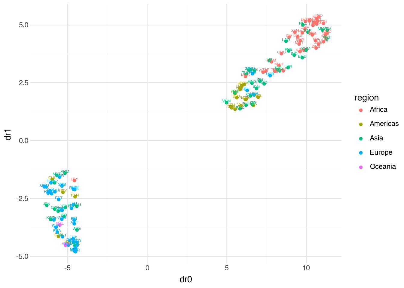
Comparing this visualization to the PCA result, we see both similarities and differences. Regional clusters remain visible, but the overall layout has changed. UMAP often produces tighter, more separated clusters than PCA because it prioritizes preserving local neighborhood structure. Points that were close in high-dimensional space remain close in the UMAP embedding, even if this means distorting larger-scale distances.
Two parameters are particularly important for controlling UMAP’s behavior. The n_neighbors parameter determines how many neighboring points UMAP considers when constructing the high-dimensional graph. Small values cause UMAP to focus on very local structure, potentially fragmenting the data into many small clusters. Large values emphasize global structure, producing smoother embeddings that may lose fine-grained detail. The default is typically 15.
The min_dist parameter controls how tightly UMAP packs points together in the low-dimensional representation. Small values allow points to cluster very closely, which can be useful for identifying tight groupings but may result in overlapping points that are hard to distinguish visually. Larger values spread points out more evenly. The default is 0.1.
Let’s see how changing these parameters affects the embedding.
(
    country
    .pipe(
        DSSklearn.umap,
        features=[c.hdi, c.gdp, c.cellphone, c.happy],
        n_neighbors=4,
        min_dist=0.5
    )
    .predict(full=True)
    .pipe(ggplot, aes("dr0", "dr1"))
    + geom_point(aes(color="region"))
    + geom_text(aes(color="region", label="iso"), nudge_y=0.05, size=5)
)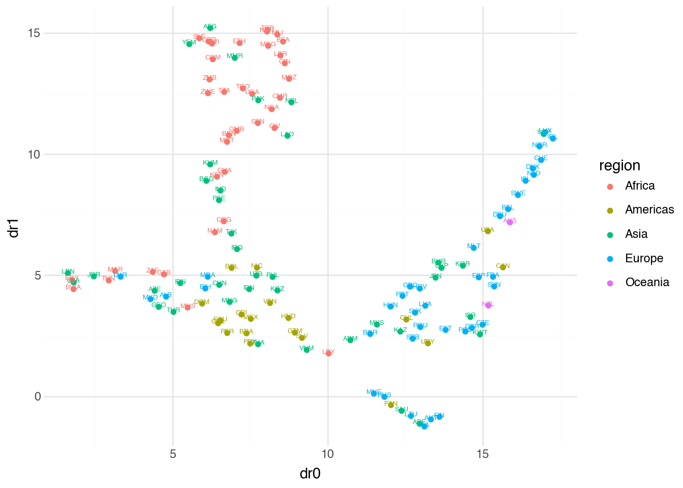
With n_neighbors=4, UMAP focuses on very local relationships, which can reveal fine structure but may fragment larger patterns. The increased min_dist=0.5 spreads points apart, making individual countries easier to distinguish but potentially obscuring cluster boundaries. There is no universally correct choice of parameters—the best settings depend on the specific dataset and analytical goals.
Reproducibility
Unlike PCA, which produces the same result every time given the same input, UMAP involves random initialization and stochastic optimization. Running UMAP twice on the same data may produce different embeddings. For reproducible results, you can set a random seed before fitting. The broad structure should remain similar across runs, but exact positions may vary.
12.5 t-SNE
t-distributed Stochastic Neighbor Embedding, or t-SNE, is another nonlinear dimensionality reduction technique that has become popular for visualizing high-dimensional data. Like UMAP, t-SNE aims to preserve local neighborhood structure, placing similar points close together in the low-dimensional embedding. The method works by converting high-dimensional distances into probabilities, then finding a low-dimensional configuration where the probability distribution matches as closely as possible.
The name comes from the use of the t-distribution (which we encountered in Chapter 10 for hypothesis testing) to model distances in the low-dimensional space. This choice has a specific benefit: the heavy tails of the t-distribution allow moderately distant points in high dimensions to be placed farther apart in low dimensions without incurring a large penalty. This helps t-SNE create clearer separation between clusters.
In mathematical terms, t-SNE first computes, for each pair of points, a probability that reflects their similarity in high-dimensional space. Points that are close together have high probability; points far apart have low probability. It then does the same in the low-dimensional embedding and adjusts the positions of points to minimize the difference between these two probability distributions. The objective function being minimized is the Kullback-Leibler divergence, a measure of how one probability distribution differs from another.
The interface for t-SNE matches what we have seen for PCA and UMAP.
(
    country
    .pipe(
        DSSklearn.tsne,
        features=[c.hdi, c.gdp, c.cellphone, c.happy]
    )
    .predict(full=True)
    .pipe(ggplot, aes("dr0", "dr1"))
    + geom_point(aes(color="region"))
    + geom_text(aes(color="region", label="iso"), nudge_y=0.05, size=5)
)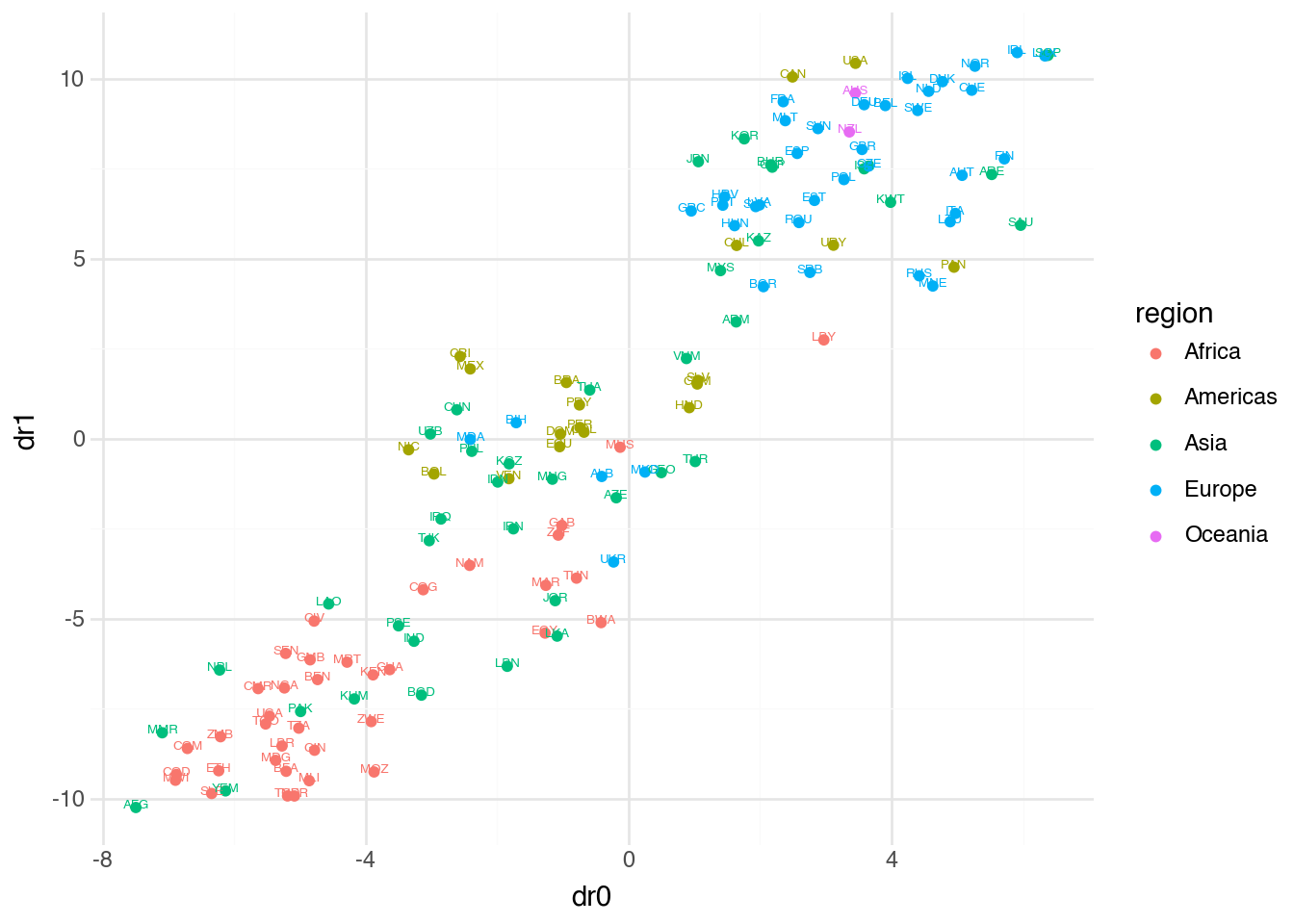
The t-SNE embedding often produces visually striking plots with clear cluster separation. However, interpreting these plots requires caution. Unlike PCA, distances in t-SNE plots are not directly meaningful—two clusters that appear far apart are not necessarily more different than two clusters that appear close together. The method is optimized for preserving local neighborhoods, not global distances.
The most important parameter for t-SNE is perplexity, which can be thought of as a smooth measure of how many neighbors each point considers. The perplexity is related to the effective number of nearest neighbors and typically ranges from 5 to 50. Lower values focus on very local structure, while higher values incorporate more global information. The perplexity must be smaller than the number of observations in the dataset.
(
    country
    .pipe(
        DSSklearn.tsne,
        features=[c.hdi, c.gdp, c.cellphone, c.happy],
        perplexity=10
    )
    .predict(full=True)
    .pipe(ggplot, aes("dr0", "dr1"))
    + geom_point(aes(color="region"))
    + geom_text(aes(color="region", label="iso"), nudge_y=0.05, size=5)
)
With a lower perplexity of 10, the embedding focuses on smaller local neighborhoods. This can reveal finer structure within clusters but may break apart groups that a higher perplexity would keep together. As with UMAP, there is no single correct parameter choice—experimentation and domain knowledge guide the selection.
Choosing between methods
PCA, UMAP, and t-SNE each have their strengths. PCA is fast, deterministic, and interpretable—the components are linear combinations of original variables with known weights. It works well when the data have roughly linear structure. UMAP and t-SNE excel at revealing complex, nonlinear structure and often produce more visually appealing plots for exploratory analysis. Between them, UMAP tends to preserve more global structure and scales better to large datasets, while t-SNE often produces tighter, more separated clusters. For serious analysis, it is often valuable to try multiple methods and compare their results.
12.6 KMeans
Having covered dimensionality reduction, we now turn to clustering: the task of grouping observations so that those within the same group are more similar to each other than to those in other groups. Unlike supervised classification, where we learn to assign observations to predefined categories, clustering discovers the categories themselves from the structure of the data.
K-means is perhaps the most widely used clustering algorithm. The method partitions observations into exactly \(k\) clusters, where \(k\) is specified by the user. Each cluster is represented by its centroid—the mean of all points assigned to that cluster. The algorithm works by iteratively assigning each observation to the nearest centroid, then updating the centroids based on the new assignments, until the assignments stabilize.
More formally, suppose we want to partition \(n\) observations into \(k\) clusters. Let \(\mu_1, \mu_2, \ldots, \mu_k\) denote the centroids of these clusters. The k-means algorithm seeks to minimize the total within-cluster sum of squares:
\[ \sum_{j=1}^{k} \sum_{i \in C_j} \left( x_{i1} - \mu_{j1} \right)^2 + \left( x_{i2} - \mu_{j2} \right)^2 + \cdots + \left( x_{ip} - \mu_{jp} \right)^2 \]
Here \(C_j\) denotes the set of observations assigned to cluster \(j\), and the inner sum measures how spread out the observations are around their cluster’s centroid. The algorithm minimizes this objective by alternating between two steps: assign each observation to the cluster with the nearest centroid, and update each centroid to be the mean of its assigned observations. This process repeats until no observations change their cluster assignment.
The DSSklearn.kmeans method provides access to k-means. The n_clusters parameter specifies the number of clusters to create.
(
    country
    .pipe(
        DSSklearn.kmeans,
        features=[c.hdi, c.gdp, c.cellphone, c.happy],
        n_clusters=5
    )
    .predict()
)
shape: (135, 2)
| label_ | dist_ |
|---|---|
| i64 | f64 |
| 3 | 0.925539 |
| 0 | 0.495665 |
| 2 | 1.290152 |
| 2 | 1.026062 |
| 3 | 1.240003 |
| … | … |
| 0 | 0.506799 |
| 4 | 0.726728 |
| 0 | 1.125599 |
| 4 | 0.458629 |
| 1 | 0.64846 |
The output includes two columns: label_, an integer indicating which cluster each observation belongs to, and dist_, the distance from each observation to its assigned cluster centroid. Observations with larger distances are farther from the center of their cluster and might be considered less typical members of that group.
To visualize the clustering results, we can combine k-means with dimensionality reduction. First we cluster the data in the original four-dimensional space, then we project the data to two dimensions using PCA for visualization. This approach lets k-means use all available information for clustering while still allowing us to see the results.
(
    country
    .pipe(
        DSSklearn.kmeans,
        features=[c.hdi, c.gdp, c.cellphone, c.happy],
        n_clusters=5
    )
    .predict(full=True)
    .pipe(
        DSSklearn.pca,
        features=[c.hdi, c.gdp, c.cellphone, c.happy]
    )
    .predict(full=True)
    .pipe(ggplot, aes("dr0", "dr1"))
    + geom_point(aes(color="factor(label_)"))
)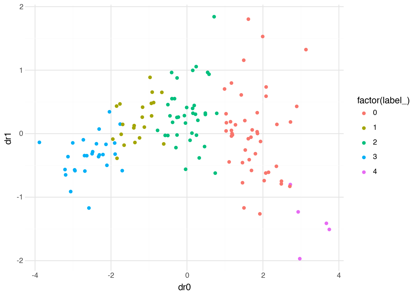
The plot shows countries colored by their k-means cluster assignment, positioned according to their PCA coordinates. We can see that k-means has partitioned the countries into five groups that correspond roughly to different levels of development and well-being. The clusters are reasonably compact in this projection, though some overlap is visible—this is expected when projecting from four dimensions to two.
Choosing k
A fundamental challenge with k-means is selecting the number of clusters. The algorithm requires us to specify \(k\) in advance, but the “correct” number of clusters is often unknown. Several heuristics can help guide this choice. The elbow method plots the total within-cluster sum of squares against different values of \(k\) and looks for a point where adding more clusters yields diminishing returns. The silhouette method measures how similar each observation is to its own cluster compared to other clusters. Ultimately, domain knowledge often plays the most important role—the number of clusters should make substantive sense for the problem at hand.
12.7 DBSCAN
K-means has several limitations. It requires specifying the number of clusters in advance, assumes clusters are roughly spherical (since it uses distance to centroids), and assigns every observation to exactly one cluster. DBSCAN (Density-Based Spatial Clustering of Applications with Noise) addresses these limitations through a fundamentally different approach based on the density of points in the feature space.
The core idea of DBSCAN is that clusters are dense regions of points separated by sparser regions. The algorithm identifies two types of points: core points that have at least a minimum number of neighbors within a specified distance, and border points that fall within the neighborhood of a core point but don’t have enough neighbors themselves to be core points. Points that are neither core nor border points are classified as noise and not assigned to any cluster.
Two parameters control DBSCAN’s behavior. The eps parameter (epsilon) specifies the maximum distance between two points for them to be considered neighbors. The min_samples parameter specifies how many neighbors a point needs within distance eps to be considered a core point. Clusters form by connecting core points that are neighbors of each other, along with any border points in their neighborhoods.
More precisely, a point \(x_i\) is a core point if at least min_samples points (including itself) lie within distance eps of \(x_i\). Two core points belong to the same cluster if they are within distance eps of each other, or if there is a chain of core points connecting them where each consecutive pair is within distance eps. Border points are assigned to the cluster of the nearest core point within their eps neighborhood.
Let’s apply DBSCAN to the country data with default parameters.
(
    country
    .pipe(
        DSSklearn.dbscan,
        features=[c.hdi, c.gdp, c.cellphone, c.happy]
    )
    .predict()
)
shape: (135, 2)
| label_ | dist_ |
|---|---|
| i64 | f64 |
| -1 | NaN |
| 0 | 0.500632 |
| -1 | NaN |
| -1 | NaN |
| -1 | NaN |
| … | … |
| 0 | 0.446973 |
| 3 | 0.765656 |
| -1 | NaN |
| 3 | 0.497674 |
| 1 | 0.305086 |
The output shows cluster labels for each country. A label of -1 indicates that the observation was classified as noise—it doesn’t belong to any cluster. This is a key difference from k-means, which forces every observation into a cluster.
We can visualize the DBSCAN results using the same approach we used for k-means: cluster in the original space, then project to two dimensions for plotting.
(
    country
    .pipe(
        DSSklearn.dbscan,
        features=[c.hdi, c.gdp, c.cellphone, c.happy],
    )
    .predict(full=True)
    .pipe(
        DSSklearn.pca,
        features=[c.hdi, c.gdp, c.cellphone, c.happy]
    )
    .predict(full=True)
    .pipe(ggplot, aes("dr0", "dr1"))
    + geom_point(aes(color="factor(label_)"))
)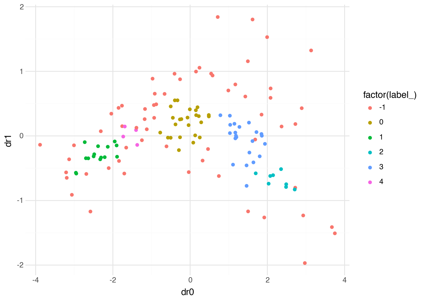
With default parameters, DBSCAN identifies distinct clusters while leaving some points unassigned. The noise points (label -1) often correspond to countries that don’t fit neatly into any dense group—they may have unusual combinations of characteristics that make them outliers.
The eps parameter is the most important tuning parameter for DBSCAN. Smaller values of eps require points to be closer together to be considered neighbors, resulting in more and smaller clusters. Larger values allow more distant points to be grouped together, producing fewer and larger clusters. Finding the right value requires experimentation and understanding of the data’s scale.
(
    country
    .pipe(
        DSSklearn.dbscan,
        features=[c.hdi, c.gdp, c.cellphone, c.happy],
        eps=1
    )
    .predict(full=True)
    .pipe(
        DSSklearn.pca,
        features=[c.hdi, c.gdp, c.cellphone, c.happy]
    )
    .predict(full=True)
    .pipe(ggplot, aes("dr0", "dr1"))
    + geom_point(aes(color="factor(label_)"))
)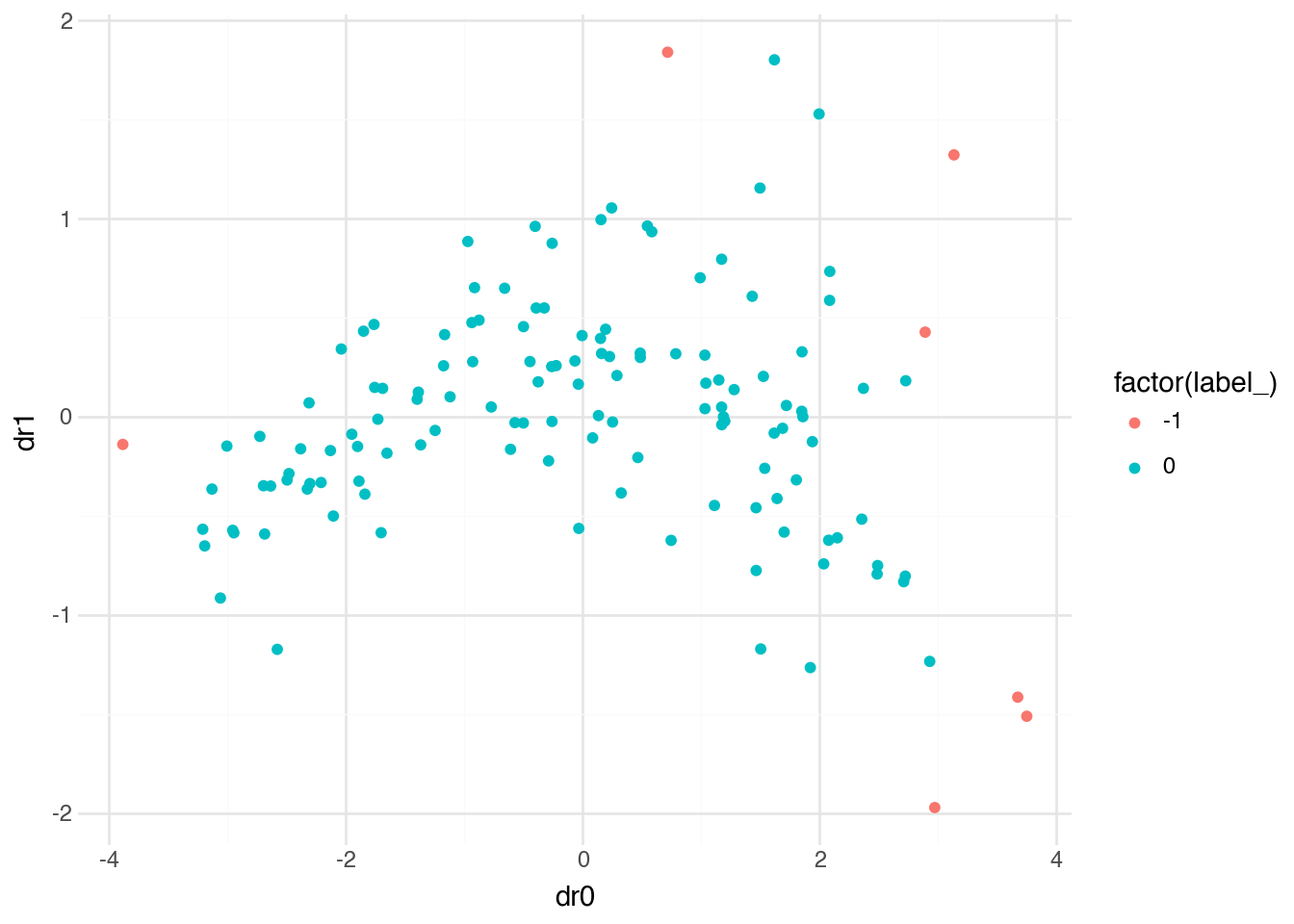
With eps=1, the neighborhood radius is much larger, and DBSCAN groups almost all countries into a single cluster. The few remaining points are either in their own small cluster or classified as noise. This illustrates how sensitive DBSCAN can be to parameter choices—the structure it finds depends heavily on what we consider “close enough” to be neighbors.
K-means versus DBSCAN
These two clustering algorithms make different assumptions and excel in different situations. K-means works well when clusters are roughly spherical and similar in size, when you have a good sense of how many clusters to expect, and when every observation should belong to some cluster. DBSCAN works well when clusters have irregular shapes, when the number of clusters is unknown, and when some observations may genuinely be outliers that don’t belong to any group. In practice, trying both methods and comparing their results often provides useful insights about the structure of the data.
12.8 Unsupervised + Supervised
The unsupervised methods we have covered—dimensionality reduction and clustering—are valuable not only for exploration and visualization but also as preprocessing steps for supervised learning. Reducing the dimensionality of features can improve the performance and interpretability of predictive models, while cluster labels can serve as new features that capture structure not easily represented by the original variables.
To illustrate this combination, let’s use PCA to reduce our four country indicators to two principal components, then use these components as features in a regression model predicting life expectancy.
model = (
    country
    .pipe(
        DSSklearn.pca,
        features=[c.hdi, c.gdp, c.cellphone, c.happy],
        n_components=2
    )
    .predict(full=True, array=True)
    .pipe(
        DSSklearn.elastic_net_cv,
        target=c.lexp,
        features=[c.dr],
        l1_ratio=1
    )
)
model.coef()
shape: (3, 2)
| name | param |
|---|---|
| str | f64 |
| "Intercept" | 75.147766 |
| "col0" | 5.659064 |
| "col1" | -0.507537 |
The model uses the two principal components (stored in the array column dr) to predict life expectancy. The coefficients tell us how changes in each principal component relate to changes in life expectancy. Since the first principal component typically captures overall development, we would expect it to have a strong positive relationship with life expectancy.
We can apply the same approach to classification tasks. Here we use the principal components to predict which region a country belongs to.
model = (
    country
    .pipe(
        DSSklearn.pca,
        features=[c.hdi, c.gdp, c.cellphone, c.happy],
        n_components=2
    )
    .predict(full=True, array=True)
    .pipe(
        DSSklearn.logistic_regression_cv,
        target=c.region,
        features=[c.dr],
        l1_ratios=[1],
        solver="saga"
    )
)
model.coef()
shape: (3, 6)
| name | Africa | Americas | Asia | Europe | Oceania |
|---|---|---|---|---|---|
| str | f64 | f64 | f64 | f64 | f64 |
| "Intercept" | -0.478677 | 0.791887 | 1.467307 | 0.537408 | -2.317925 |
| "col0" | -3.470023 | 0.0 | -0.681261 | 1.329418 | 1.501544 |
| "col1" | 1.130565 | 0.440474 | -0.039347 | -0.039844 | -0.365062 |
The coefficient table now shows, for each region, how the two principal components contribute to the probability of a country belonging to that region. The multinomial logistic regression (introduced in Chapter 11) estimates these relationships jointly across all regions.
model.predict(full=True)
shape: (135, 19)
| iso | full_name | region | subregion | pop | lexp | lat | lon | hdi | gdp | gini | happy | cellphone | water_access | lang | dr | index_ | target_ | prediction_ |
|---|---|---|---|---|---|---|---|---|---|---|---|---|---|---|---|---|---|---|
| str | str | str | str | f64 | f64 | f64 | f64 | f64 | i64 | f64 | f64 | f64 | f64 | str | array[f64, 2] | str | str | str |
| "SEN" | "Senegal" | "Africa" | "Western Africa" | 18.932 | 70.43 | 14.366667 | -14.283333 | 0.53 | 4871 | 38.1 | 50.93 | 66.0 | 54.93987 | "pbp|fra|wol" | [-1.758354, 0.147961] | "train" | "Africa" | "Africa" |
| "VEN" | "Venezuela, Bolivarian Republic… | "Americas" | "South America" | 28.517 | 76.18 | 8.0 | -67.0 | 0.709 | 8899 | 44.8 | 57.65 | 96.8 | 95.66913 | "spa|vsl" | [-0.394464, 0.548632] | "train" | "Americas" | "Asia" |
| "FIN" | "Finland" | "Europe" | "Northern Europe" | 5.623 | 82.84 | 65.0 | 27.0 | 0.948 | 57574 | 27.7 | 76.99 | 156.4 | 99.44798 | "fin|swe" | [2.891235, 0.426905] | "test" | "Europe" | "Europe" |
| "USA" | "United States of America" | "Americas" | "Northern America" | 347.276 | 79.83 | 39.828175 | -98.5795 | 0.938 | 78389 | 47.7 | 65.21 | 91.7 | 99.72235 | "eng" | [1.921109, -1.266114] | "train" | "Americas" | "Europe" |
| "LKA" | "Sri Lanka" | "Asia" | "Southern Asia" | 23.229 | 78.51 | 7.0 | 81.0 | 0.776 | 14380 | 39.3 | 36.02 | 83.1 | 90.77437 | "sin|sin|tam|tam" | [-1.176426, 0.257248] | "train" | "Asia" | "Africa" |
| … | … | … | … | … | … | … | … | … | … | … | … | … | … | … | … | … | … | … |
| "ALB" | "Albania" | "Europe" | "Southern Europe" | 2.772 | 79.67 | 41.0 | 20.0 | 0.81 | 20362 | 30.8 | 54.45 | 91.9 | 98.5473 | "sqi" | [-0.038424, 0.1643] | "train" | "Europe" | "Asia" |
| "MYS" | "Malaysia" | "Asia" | "South-eastern Asia" | 35.978 | 76.03 | 3.7805111 | 102.314362 | 0.819 | 35990 | 46.2 | 58.68 | 118.2 | 95.69194 | "msa" | [0.785001, 0.317731] | "test" | "Asia" | "Europe" |
| "SLV" | "El Salvador" | "Americas" | "Central America" | 6.366 | 76.98 | 13.668889 | -88.866111 | 0.678 | 12221 | 38.3 | 64.82 | 126.9 | 86.19786 | "spa" | [0.243163, 1.053777] | "train" | "Americas" | "Americas" |
| "CYP" | "Cyprus" | "Asia" | "Western Asia" | 1.371 | 81.77 | 35.0 | 33.0 | 0.913 | 55720 | 31.2 | 60.71 | 123.1 | 99.41781 | "ell|tur" | [1.615747, -0.082606] | "train" | "Asia" | "Europe" |
| "PAK" | "Pakistan" | "Asia" | "Southern Asia" | 255.22 | 66.71 | 30.0 | 71.0 | 0.544 | 5717 | 29.6 | 45.49 | 49.8 | 61.92651 | "eng|urd" | [-2.132016, -0.170759] | "train" | "Asia" | "Africa" |
The predictions show the most likely region for each country based solely on its principal component scores. This demonstrates a complete pipeline: we start with four economic and social indicators, compress them to two dimensions that capture the most important variation, and then use those dimensions to predict a categorical outcome. The dimensionality reduction simplifies the modeling problem while (ideally) retaining the information most relevant for prediction.
When to reduce dimensions
Dimensionality reduction before supervised learning is not always beneficial. When the original features are few and interpretable, using them directly may produce more useful models. When features are many and correlated, or when visualization of the feature space would aid interpretation, dimensionality reduction can help. The choice depends on the specific problem, and comparing models with and without reduction is often worthwhile.
12.9 Conclusion
This chapter introduced the core methods of unsupervised learning: techniques for finding structure in data without the guidance of labeled outcomes. We covered two main tasks—dimensionality reduction and clustering—each with multiple algorithmic approaches suited to different situations.
For dimensionality reduction, we examined PCA as the foundational linear method that finds directions of maximum variance, and UMAP and t-SNE as nonlinear alternatives that preserve local neighborhood structure for visualization. These methods compress high-dimensional data into a form that can be plotted, interpreted, and used as input to other analyses.
For clustering, we contrasted k-means, which partitions data into a specified number of spherical clusters, with DBSCAN, which discovers clusters of arbitrary shape based on density and can identify outliers. Both methods reveal groupings in data that may correspond to meaningful categories in the domain of application.
Throughout, we emphasized that unsupervised learning lacks the clear evaluation criteria of supervised learning. There is no ground truth against which to measure success. Whether a dimensionality reduction captures meaningful structure or a clustering produces useful groups depends on the goals of the analysis and requires human judgment to assess. This makes unsupervised methods particularly valuable for exploration—they can reveal patterns and generate hypotheses that might not be apparent from examining variables individually.
Finally, we demonstrated that unsupervised and supervised methods can work together. Dimensionality reduction can preprocess features before fitting a predictive model, and cluster labels can become features in their own right. The methods in this chapter expand the toolkit available for understanding data, whether that understanding is the ultimate goal or a stepping stone toward prediction.